
 Worksheets
Intro to Stat Graphs
Total questions: 25
Worksheet time: 50mins

What is the chart called?
histogram
frequency polygon
histograph
frequency graph
Which of the following graphs may be used when you have qualitative data?
frequency polygon
pie chart
bar graph
histogram

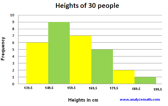
What do you call the given chart?
histogram
bar graph
frequency polygon
hisograph

What is this table called?
contingency table
frequency distribution table
frequency table
2-way table
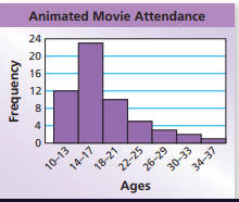
What is the shape of the data?
symmetrical
skewed left
skewed right
bell curve
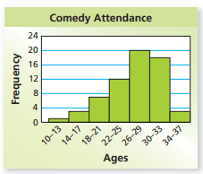
What is the shape of the data?
symmetrical
skewed left
skewed right
bell curve



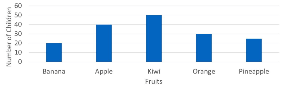
Which of the following statements is true?
pineapple is the most popular
only apple is liked more than orange
kiwi is the least popular fruit
apple is the second most popular fruit


Use the ogive to approximate the cumulative frequency for a height of 72 inches.
36
43
48
51


which graph is this?
stem and leaf
dot plot
partero chart
pie chart

which graph is this?
scatter plot
time chart
dot plot
splash plot

which graph is this?
percentage chart
pie chart
scatter plot
pizza chart

What is the median of this data?
40
90
100
140
150

How many students were in the sample?
Cannot be determined.
27
67
12


Identify the set of data that represents the dot plot.
50, 55, 60, 65, 70, 75
50, 55, 65, 70, 70, 71, 71, 71, 72, 72
50, 55, 64, 70, 71, 72, 72, 72, 73, 73
50, 55, 60, 64, 65, 70, 71, 72, 72, 72, 73, 73

How many students were surveyed to collect this data?
11
13
15
17


