
NEW
Font size
 Worksheets
Unit 4- Scatter Plot Practice
Total questions: 18
Worksheet time: 9mins

The scatter plot below shows the average traffic volume and average vehicle speed on a certain freeway for 50 days in 1999. Which statement best describes the relationship between average traffic volume and average vehicle speed shown on the scatter plot?
As traffic volume increases, vehicle speed increases.
As traffic volume increases, vehicle speed decreases.
As traffic volume increases, vehicle speed increases at first, then decreases.
As traffic volume increases, vehicle speed decreases at first, then increases.

Ms. Ochoa recorded the age and shoe size of each student in her physical education class. The graph below shows her data. Which of the following statements about the graph is true?
The graph shows a positive trend.
The graph shows a negative trend.
The graph shows a constant trend.
The graph shows no trend.

Which graph best shows a positive correlation between the number of hours studied and the test scores?
Diagram A
Diagram B
Diagram C
Diagram D

Use the scatter plot below to answer the following question. The police department tracked the number of ticket writers and the number of tickets issued for the past 8 weeks. The scatter plot shows the results. Based on the scatter plot, which statement is true?
More ticket writers results in fewer tickets issued.
There were 50 tickets issued every week.
When there are 10 ticket writers, there will be 800 tickets issued.
More ticket writers results in more tickets issued.

Mr. Thomas wanted to know if the amount of class time that he gave students to study affected their test scores. What kind of relationship between class study time and test scores is shown on the scatter plot?
no correlation
positive correlation
negative correlation
positive then negative correlation

A fifth grade class conducted a 5-minute experiment that involved heating time and water temperature. What prediction can be made based on the information gathered?
The water temperature remains the same as the heating time continues.
The water temperature decreases as the heating time continues.
A pattern cannot be determined between these measurements.
The water temperature increases as the heating time continues.

The following scatter plot shows the weights and lengths of some dinosaurs. Which statement accurately describes the information in the scatter plot?
The information shows a positive correlation. The weight of a dinosaur tends to increase according to its length.
The information shows a negative correlation. The weight of a dinosaur tends to decrease according to its length.
The information shows no correlation. The weight and length vary according to the type of dinosaur.
The information shows no correlation. The relationship between the weight and length of a dinosaur is uncertain.

The table shows the number of students on a basketball team and the number of free throws each student made during practice. Based on this information, which best describes the relationship between the number of students and the number of free throws each student made?
Positive linear
No relationship
Negative linear
Quadratic

The scatterplot shows the number of absences in a week for classes of different sizes. Trevor concluded that there is a positive correlation between class size and the number of absences. Which statement best describes why Trevor's conclusion was incorrect?
The largest class does not have the most absences.
The smallest class does not have the least number of absences.
The data show no relationship between class size and number of absences.
The data show a negative relationship between class size and number of absences.
Which data will most likely show a negative correlation when graphed on a scatterplot?
the outside temperature and the number of people wearing gloves
the distance a student lives from school and the amount of time it takes to get to school
the number of visitors at an amusement park and the length of the lines for the rides
a student's height and grade point average

This scatterplot could show the relationship between which two variables?
speed of an airplane (x) vs. distance traveled in one hour (y)
outside air temperature (x) vs. air conditioning costs (y)
age of an adult (x) vs. height of an adult (y)
distance traveled (x) vs. gas remaining in the tank (y)
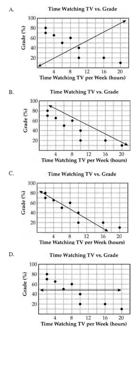
Which graph shows a line of best fit for the scatter plot?
Diagram A
Diagram B
Diagram C
Diagram D

For which scatter plot would the line of best fit be represented by the equation y = ½x + 2?
A
B
C
D
A researcher gathered data to predict the number of new types of plants (y) that will be in a state park after x years. After making a scatter plot of the data, she determined the equation of a line of best fit. The equation is shown below: y = 0.25x + 8. Based on the equation, what is the number of new types of plants that will be in the park after 24 years?
8
14
32
64

A group of friends recorded the time it took to ride their bikes around the park. The scatter plot below shows their results with the line of best fit. Using the line of best fit, which is closest to the number of minutes it would take to complete 9 laps?
4
5
6
7

Use the scatter plot to answer the question. Oren plants a new vegetable garden each year for 14 years. This scatter plot shows the relationship between the number of seeds he plants and the number of plants that grow. Which number best represents the slope of the line of best fit through the data?
-10
-1/10
1/10
10

The scatterplot below shows the relationship between the length of a long-distance phone call and the cost of the phone call. Based on the line of best fit for the scatterplot, which of the following amounts is closest to the cost of a 120-minute phone call?
$10
$12
$15
$20

The scatter plot below shows the relationship between the number of bags of popcorn that are sold and the price per bag. Which of these graphs shows the line of best fit?
A
B
C
D

