
NEW
Font size
 Worksheets
Layout and Composition
Total questions: 25
Worksheet time: 13mins
What is Typography and how is it used in design?
Typography is the study of rocks and minerals used in design
Typography is a form of calligraphy used in design
Typography is the art and technique of arranging type to make written language legible, readable, and appealing when displayed. In design, typography is used to communicate a message effectively by selecting appropriate fonts, sizes, spacing, and colors.
Typography is a type of photography used in design
Define Kerning and its importance in typography.
Kerning refers to the process of selecting fonts for a design.
Kerning is the alignment of text to the left margin in typography.
Kerning is the adjustment of space between individual letter pairs in typography to improve visual appeal and readability.
Kerning is the adjustment of line spacing in typography to improve visual appeal.
How is Hierarchy established in design?
By organizing elements based on their importance through visual cues like size, color, contrast, and placement.
By randomly placing elements without any consideration
By making all elements the same size
By using only one color for all elements
Discuss the concept of Proximity in design.
Proximity in design is about placing related elements close together to create a visual connection.
Proximity in design is irrelevant and unnecessary
Proximity in design means scattering elements randomly on a page
Proximity in design refers to the use of bright colors
Why is Alignment crucial in design?
Alignment has no impact on design
Alignment makes the design look messy and disorganized
Alignment helps in creating a visually cohesive and organized layout, improving readability, enhancing user experience, and establishing a sense of balance and harmony.
Alignment is only important for text, not for other design elements
Explain the significance of Repetition in design.
Repetition in design is insignificant and should be avoided
Repetition in design leads to confusion and chaos
Repetition in design is only useful for amateur designers
Repetition in design is significant for creating consistency, rhythm, visual hierarchy, branding reinforcement, and memorability.
How does Contrast play a role in design?
Contrast only confuses the viewer
Contrast has no impact on design
Contrast plays a role in design by creating visual interest, hierarchy, and emphasis through the arrangement of opposite elements.
Contrast is only used in black and white designs
What is the importance of White Space in design?
White space in design is important for readability, balance, and aesthetics.
White space in design is used to fill empty gaps, not for aesthetics
White space in design is only important for balance, not readability
White space in design is unnecessary and should be avoided

RED + BLUE =
what color do they make?


YELLOW + RED =
what color do they make?


BLUE + YELLOW =
what color do they make?


Another word for color is:
value
saturation
hue
scheme
The intensity of a color, whether it is subtle or deeper, refers to:
hue
value
saturation
color schemes
When you change a color's lightness/darkness, you edit its:
hue
value
saturation
color scheme
When different shades of one hue are used in coordinating colors, it is referred to as:
monochromatic
analogous
complementary
Colors that are directly opposite each other on the color wheel are referred to as:
monochromatic
analogous
complementary

this is called
color spectrum
color circle
color wheel
color pallet

Which color scheme formula selects colors that are across from each other on the color wheel?
complementary
split complementary
triadic
analogous

How can a tetradic color scheme be effectively used?
Focusing on secondary colors only
Using only primary colors
By letting one color dominate and the others serve as an accent
Applying four shades of the same hue
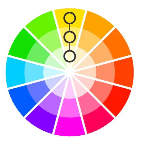
What is the simplest formula for creating color harmony?
Analogous
Triadic
Complementary
Monochromatic



Which image shows a display font?



