
 Worksheets
2024 6th Grade science Review #3
Total questions: 119
Worksheet time: 5hrs 45mins

Which graph shows you walking slowly at first, and then steadily increasing your walking speed?

Which graph shows: The daily sales declined at a steady rate.
Which graph shows: The daily sales did not change.
Which graph shows: The daily sales rose rapidly, then leveled off, and then declined rapidly.
Which graph shows: The daily sales rose at a steady rate.
Which graph shows: The daily sales dropped rapidly at first and then at a slower rate.

Which graph shows you walking at a steady pace of 5 feet per second?

What is the AVERAGE SPEED for the test ride?
72 miles per hour
6 miles per hour
19 miles per hour
12 miles per hour

What is the independent variable on this graph?
Time of Day
Cans of Juice
Vending Machines
20, 40, 60, etc.

What is the dependent variable on this graph?
Time of Day
Cans Sold
Vending Machines
Count by 20s

Is this popcorn sales data be a linear pattern?
yes
no

A school held a fundraiser for their recycling program. Three teams (baseball, soccer, and volleyball) and three clubs (science, math, and ecology) collected money. The results of the fundraiser are shown in the bar graph. Which is greater, the percent of money collected by teams by the baseball team or the percent of money collected by clubs by the science club?
science club
volleyball team
baseball team

The bar graph shows a company's income and expenses over the last 5 years.
Which statement is supported by the information in the graph?
Expenses have increases $200,000 each year over the last 5 years.
The income in Year 5 was twice the income in Year 1.
The combined income in Years 1, 2, and 3 are equal to the combined expenses in Years 1, 2, and 3.
The combined expenses in Years 3 and 4 were $300,000 more than combined income in Years 3 and 4.

The graph shows the favorite colors chosen by some middle school students.
Which statement is supported by the information in the graph? Select all that apply.
Fewer than 30% of students chose red, yellow, or orange as
their favorite color.
Less than 1/10 choose pink as their favorite color.
More than half of the students chose Black, Red, Blue, and
Orange as their favorite color.
Exactly ⅖ of the students chose green, black, or purple as
their favorite color.
Exactly 18% of the students chose blue as their favorite
color.

Maribel surveyed 55 people to find out their favorite types of music. The results are shown in the bar graph below.
Based on the information in the graph, which types of music were chosen by the 40% of the people surveyed?
Country and opera
Jazz and opera
Jazz, opera, and rock
Country, jazz, and rock

The bar graph shows the number of student members in school clubs. Which club has twice as many student members as the robotics club?
Art club
French Club
Astronomy club
Chess Club

The bar graph displays the number of vegetable plants in a garden.
Based on the information in the graph, which plants are 56% of the vegetables in the garden?
Carrots and tomatoes
Onions and tomatoes
Peas, onions, and tomatoes
Peas, spinach, and onions


At what time is the rocket the highest according to the graph?
60 seconds
80 seconds
100 seconds
120 seconds

What information is shown for the dependent variable in this graph?
Rainfall in mm
Day of the month
Rainfall during the first 9 days of a month

What is the label on the x-axis of this graph?
Number of visitors
Year
Visitors to a Park

What is the trend in New York snowfall between January and May?
It increased
It decreased
It stayed the same

What is the y-axis in this graph?
Student Membership (in millions)
Year
US Public School Student Membership

What is the y-axis labeled?
Instagram Stories vs Snapchat Daily Users
Daily Users (Millions)
Year

According to the graph, in the beginning of 2017, approximately how many daily users did Snapchat have?
50 million users
150 users
150 million users
100 users

When did Instagram stories begin?
Beginning 2015
Middle of 2016
Middle of 2017

During which year did Instagram pass Snapchat’s number of average daily users?
2015
2016
2017

Why is a bar graph used for THIS data?
The data shows a time period.
All data uses bar graphs.
The data shows parts of a whole.
The data shows a comparison of scores.
A bar graph can be oriented horizontally or vertically.
True
False

How many students answered the question correctly?
7
44
5

How many people answered the question incorrectly?
7 or less.
between 5 and 7.
12
44
Which type of graph is most used in science?
Line Graph
Bar Graph
Pie Chart
all of the above

"Points scored" is also known as...
y-axis, dependent variable
y-axis, independent variable
x-axis, dependent variable
x-axis, independent variable

What is the interval for the data on the y-axis?
5
10
15
20

How many total people took the survey?
50
150
100
200
At what time is the rocket the highest according to the graph?
60 seconds
80 seconds
100 seconds
120 seconds
What information is shown for the dependent variable in this graph?
Rainfall in mm
Day of the month
Rainfall during the first 9 days of a month
What is the label on the x-axis of this graph?
Number of visitors
Year
Visitors to a Park
What is the trend in New York snowfall between January and May?
It increased
It decreased
It stayed the same
What is the y-axis in this graph?
Student Membership (in millions)
Year
US Public School Student Membership
What is the y-axis labeled?
Instagram Stories vs Snapchat Daily Users
Daily Users (Millions)
Year
According to the graph, in the beginning of 2017, approximately how many daily users did Snapchat have?
50 million users
150 users
150 million users
100 users
When did Instagram stories begin?
Beginning 2015
Middle of 2016
Middle of 2017
During which year did Instagram pass Snapchat’s number of average daily users?
2015
2016
2017
How confident are you that you can analyze data from a graph?
not...
kinda?
I'm pretty good.
LET'S DO THIS.

What was the highest score on the pre-test?
50
42
28
13
Why is a bar graph used for THIS data?
The data shows a time period.
All data uses bar graphs.
The data shows parts of a whole.
The data shows a comparison of scores.
A bar graph can be oriented horizontally or vertically.
True
False
How many students answered the question correctly?
7
44
5
How many people answered the question incorrectly?
7 or less.
between 5 and 7.
12
44
Which type of graph is most used in science?
Line Graph
Bar Graph
Pie Chart
all of the above
How did you feel about this quiz?
I had no clue what was going on.
It was hard but I knew some answers.
I remembered nearly everything.
Piece of pie (PUN INTENDED)
"Points scored" is also known as...
y-axis, dependent variable
y-axis, independent variable
x-axis, dependent variable
x-axis, independent variable
What is the interval for the data on the y-axis?
5
10
15
20
What is an abiotic factor?
A living thing (Ex: Water, Soil, etc.)
A Non-living thing (Ex: Grass, Animals, etc.)
A living thing (Ex: Trees, Birds, etc.)
A Non-living thing (Ex: Rocks, Rain, etc.)
What is a Biotic factor?
A living thing (Ex: Water, Soil, etc.)
A living thing (Ex: Trees, Birds, etc.)
A Non-living thing (Ex: Grass, Animals, etc.)
A Non-living thing (Ex: Rocks, Rain, etc.)

What are Moon phases?
The phases of the moon goes through within a month due to it's revolution around Earth.
The phases the moon goes through within a month due to it's rotation around Earth.
The phases the moon goes through within a year due to it's revolution around the Sun.
The phases the moon goes through within a month due to Earth's rotation around it.
What is a Food Chain?
A network of lines that shows one thing an organism eats.
A network of arrows that shows what an organism eats, and what eats that organism.
A network of arrows that shows what organisms eat, and what eats those organisms .
A network of lines that shows multiple things an organism eats.

What moon phase is this?
Full Moon
1st Quarter
3rd Quarter
New Moon

What moon phase is this?
Waning Crescent
Waxing Crescent
Waxing Gibbous
Waning Gibbous

What moon phase is this?
Waning Gibbous
Waxing Crescent
Waning Crescent
Waxing Gibbous

What moon phase is this?
1st Quarter
3rd Quarter
Waning Gibbous
Waxing Gibbous

What moon phase is this?
Waxing Gibbous
Waning Gibbous
3rd Quarter
1st Quarter

What moon phase is this?
3rd Quarter
Full Moon
1st Quarter
New Moon
If you could rate yourself, how good are you at science?
1-2
3-4
5-6
7-8
9-10

Which law?
1st
2nd
3rd

Which law?
1st
2nd
3rd

Which law?
1st
2nd
3rd

Which law?
1st
2nd
3rd
Action/Reaction
1st
2nd
3rd

What is the tendency of an object to resist a change in motion?
force
motion
inertia
gravity
Letting go of a balloon full of air is demonstrating Newton's ______ _______ ________ _________ because the air comes out of the back and the balloon moves forward.
1st law of motion
2nd law of motion
3rd law of motion
13th law of motion
Henry sees a basketball and decides to put it in motion. What kind of force does Henry use to move the ball?
small
balanced
equal
unbalanced
Mary is riding in a car when the driver suddenly slams on the brakes. Mary is jerked forward out of her seat. This is an example of which law of motion?
2nd Law
1st Law
3rd Law
A jellyfish swims through the water by pulling in water and then pushing the water back out in the opposite direction. This is an example of which law of motion?
1st Law
2nd Law
3rd Law
Billy pushes his little brother on a sled through the snow. He then tries to push his father on the the same sled. He noticed that it was much harder to push his father. Which law is this an example of?
1st Law
2nd Law
3rd Law

According to the bar graph, what percent of the people choose Country or Rock as their favorite type of music??
20%
40%
45%
60%

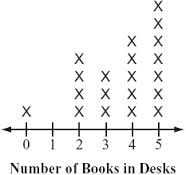
There are 20 students in a class. What percent of the students have 4 books in their desk?
20%
25%
30%
32%


A
B
C
D


The range of the data for Fun Fit is less than the range of the data for Greg’s Gym.
The median for Greg’s Gym is less than the median for Fun Fit.
The minimum attendance for Fun Fit is less than the minimum attendance for Greg’s Gym.
The interquartile range for Greg’s Gym is greater than the interquartile range for Fun Fit.


A
B
C
D

F
G
H
J

F
G
H
J

A middle school conducted a survey of randomly selected 6th graders about their favorite class. The table shows the results of the survey.
Which inference about all 7th graders at this school is best supported by this information?
The number of 7th graders who chose Language Arts as their favorite class is greater than the number of 7th graders who chose Science.
The number of 7th graders who chose Math as their favorite class is less than the number of 7th graders who chose Language Arts.
The number of 7th graders who chose Math and Social Studies as their favorite class is less than the number of 7th graders who chose Science.
The number of 7th graders who chose Science as their favorite class is triple the number of 7th graders who chose Social Studies.

Based on the graph,how many more sunny days than rainy days did this city have during the months of April, May, and June?

f
g
h
j

The school counselors conducted a survey of randomly selected seventh and eighth graders about the way the students get home from school. The graph shows the results of the survey.
Based on the results, which of the following does NOT represent the data? (7.12B, SS).
60% of the 8th graders rode the bus home.
A total of 50 students were surveyed.
Exactly half of the students surveyed rode the bus.
The number of car riders and walkers in 8th grade is equal to the number of car riders in 7th grade.

Sci-Fi and Action
Sci-Fi and Musicals
Action and Musicals
Action and Cartoons

The data table below shows that as the pressure of a gas sample was changed, the volume of the gas changed. The pressure was measured in atmospheres (atm) and the volume was measured in milliliters (mL).
According to the data table, as the pressure of the gas increases, the volume of the gas:
decreases
increases
remains the same

How many more average daily calories are needed by a 17 year old male than by a 17 year old female?
300
500
2700
3000

What is the difference between the number of frogs in the pond when the rainfall was 5cm and when the rainfall was 20cm?
20
40
50
60

The graph below shows tidal changes at an ocean beach over a 24-hour time period.
What is the approximate time interval between the two high tides?
6 hours
9 hours
13 hours
24 hours

What type of graph is this?
line plot
line graph
bar graph
frequency table

What is the main purpose of a line graph?
to compare two things
To show change over time
to have an independent variable
so you don't have to read words
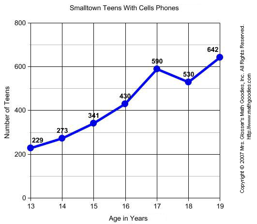

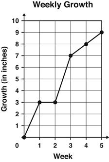
The graph shows the number of inches a plant grew each week.
Between which 2 weeks did the plant grow the MOST?
Week 1 and Week 2
Week 2 and Week 3
Week 3 and Week 4
Week 4 and Week 5

Students collected trash on a beach over a one-year period and organized the data in the table below.
Which graph is best to display the data shown in the table?


Examine the population curves for wolves and moose in the graph below.
Which statement correctly describes the population relationship between the wolves and moose from 1968 to 1973?
As the moose population increased the wolf population increased.
As the moose population increased the wolf population decreased.
As the wolf population decreased the moose population decreased
As the wolf population increased, the moose population decreased.

A scientist wanted to see if the amount of garbage that Americans threw away changed over time. He collected information and then showed his results in the graph below.
Based on this graph, what could the scientist say about the amount of garbage that each person threw away?
It increased over time
it decreased over time
it increased the most in 1980
It decreased the most in 1990

