
 Worksheets
4/5 EASY A DAY - Interpreting Graphs
Total questions: 40
Worksheet time: 21mins
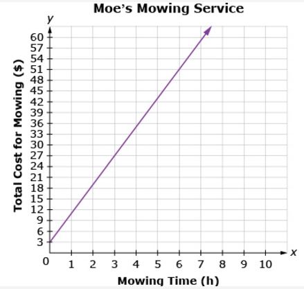
What is the general trend of this line graph?
The more you mow, the less money you make.
You make the same amount of money regardless of how long you mow.
The more you mow, the more money you make.
Mowing is dangerous.
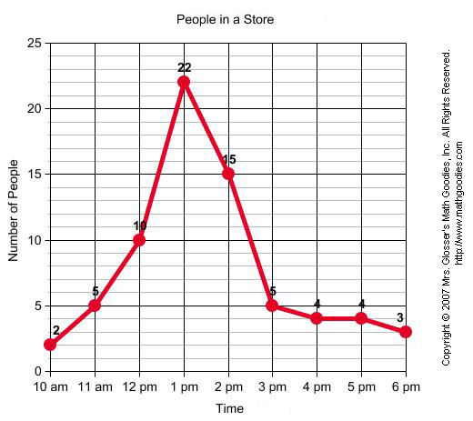
At what time were the greatest amount of shoppers at the store?
10am
1pm
6pm
2pm
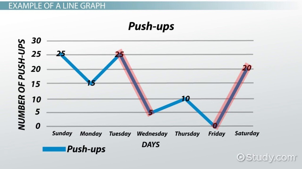
Between which two days was the greatest decrease in push-ups?
Friday and Saturday
Tuesday and Wednesday
Sunday and Monday
Thursday and Friday
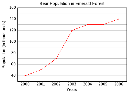
What was the bear population in 2001?
40,000
50
50,000
5
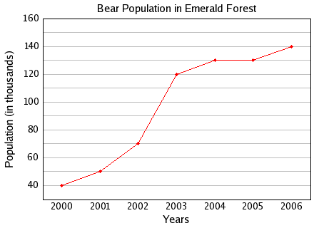
Between which two years did the bear population remain constant or the same?
2004 and 2005
2001 and 2002
2005 and 2006
2000 and 2001
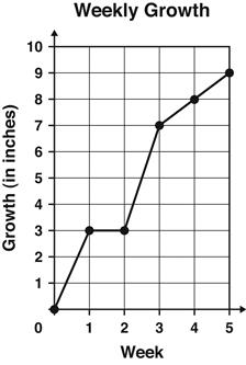
The graph shows the number of inches a plant grew each week.
Between which 2 weeks did the plant grow the MOST?
Week 1 and Week 2
Week 2 and Week 3
Week 3 and Week 4
Week 4 and Week 5
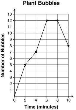
During an experiment, students counted the number of bubbles given off by water plants every 2 minutes during a 10-minute period. The results are graphed below.
At which two times were the same number of bubbles given off?
2 and 4 minutes
4 and 6 minutes
6 and 8 minutes
8 and 10 minutes

The graph shows the number of cars sold from January to April. How many more cars were sold in March than in January?
2,000
5,000
7,000
8,000

What percentage of the houses are semi-detached?
60%
40%
33%

How many pies were sold on Friday?
120
6
60
12

How many more chickens are there than sheep are on Madeline's farm?
4
5
6
3
How many horses are on Madeline's farm?
4
8
6
10
How many cows and pigs are on Madeline's farm?
4
7
11
12

How many kids like Art?
8
14
18
16

How many pizzas were sold on Wednesday?
4
15
20
25
How many pies were sold on Friday?
120
6
60
12
How many kids like dance or math?
7
11
18
16
How many more kids like Science than Language?
3
2
11
8
How many more pizzas were sold on Tuesday than on Monday?
4
20
10
25
How many pizzas were sold on Thursday and Friday?
70
14
10
65
How many more pies were sold on Saturday than Thursday?
3
6
60
220
How many more kids liked Art and Dance than Math and Science.
9
27
18
11
How many students like Science?
5
5.5
10
11

Which animal was the least common pet?
Rabbit
Dog
Hamster
Goldfish
Which animal was the most common pet?
Rabbit
Dog
Cat
Goldfish

How many students liked cornflakes the best?
3
8
4
2
Which Cereal was the most popular?
Life
Kix
Cheerios
Corn Flakes
What was the difference between the number of students that liked Life and the number of students that liked Cheerios?
5
2
6
4
Which Cereal was the most popular?
Life
Kix
Cheerios
Corn Flakes
How many students voted all together?
12
15
17
16

How many people liked Mangoes the most?
3
9
6
2
More people voted for apples than bananas
True
False

Did brown or yellow get less votes?
Brown
Yellow
They have the same number of votes
Did orange or purple get less votes?
Orange
Purple
They have the same number of votes
How many people picked either blue or orange?
8
28
29
7 and a half
How many people does one smiley face represent?
1
2
4
3

How many people picked either blue or orange?
7 and a half
28
29
8
How many different types of pets were owned?
30
11
5
34
What is the title of this graph?
All of these are part of the title
Favorite Cereal
Number of Votes
Types of Cereal
What type of graph is this?
line graph
bar graph
picture graph
color graph

