
 Worksheets
Scatter plots
Total questions: 172
Worksheet time: 7hrs 39mins



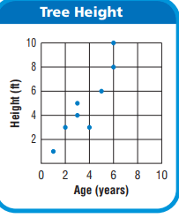
What is the age of the tree that is 8 feet tall?
6 Years
7 Years
8 Years
9 Years
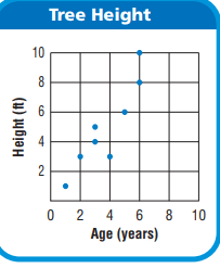
How many trees are 3 years old?
1
2
0
3

Which relationship could be represented by this scatter plot?
As the number of muffins in a box increases, the price increases.
As the speed of a car increases, the distance the car travels increases.
As the population of a city increases, the number of schools in the
city increases.
As the number of daylight hours increases, the number of night hours decreases.


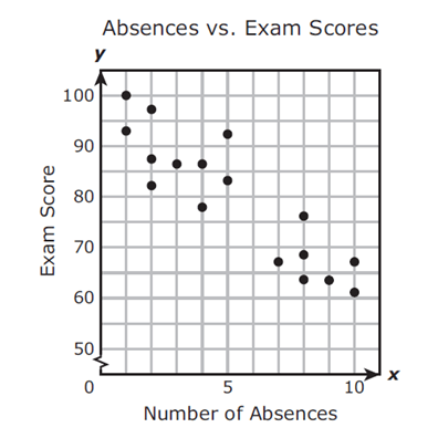
Mrs. Collins made a scatterplot to show the relationship between the number of absences and a student’s final exam score. Based on this scatterplot, a student with 12 absences should get approximately what score on the final exam?
60
92
70
76

Describe the correlation in the graph shown.
Strong Negative
Strong Positive
Weak Negative
Weak Positive


y = 2 x + 40
y = - (1/2) x + 40
y = - 2 x + 40
y = (1/2) x + 40
The equation of the line of best fit of a scatter plot is y = 6x − 9. What is the slope of the equation?
-6
-9
6
9
The equation of the line of best fit of a scatter plot is y = 12x + 7. What is the slope of the equation?
12
-12
-7
7
The equation of the line of best fit of a scatter plot is y = −5x − 2. What is the slope of the equation?
-5
-2
2
5


Which graph represents a positive linear association between x and y?

Which graph represents a positive nonlinear association between x and y?
Graph A
Graph B
The equation of the line of best fit of a scatter plot is y = −4x − 6. What is the the y-intercept?
6
4
-4
-6
The equation of the line of best fit of a scatter plot is y = −7x − 2. What is the the y-intercept?
-2
-7
2
7

What type of association does the graph show between x and y?
Linear positive association
Nonlinear positive association
y = –4x – 6. What is the the y-intercept?
y = –7x – 2. What is the the y-intercept?
y = –8x + 3. What is the the y-intercept?

The outside temperature and the amount of layers you wear.
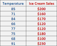

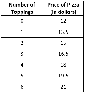

Identify the correlation.
Positive Correlation
Negative Correlation
No Correlation
None of the above

Identify the correlation.
Positive Correlation
Negative Correlation
No Correlation
None of the above

Determine the correlation
Positive Correlation
Negative Correlation
No Correlation
None of the above

Determine the correlation
Positive Correlation
Negative Correlation
No Correlation
None of the above

Which statement is true?
As x increases y also increases
As x increases y decreases
As x increases y remains the same
None of the above

Which statement is true?
As x increases y also increases
As x increases y decreases
As x increases y stays the same
None of the above

How can we determine the line of best fit using our calculator?
Quadratic Regression
Exponential Regression
Linear Regression
None of the above

What is another name for the line of best fit?
Scatter plot line
Middle Line
Trend line
All of the above?

How tall would you expect a 7 year old to be based on the scatter plot?
45 inches
48 inches
50 inches
52 inches

How much money would you make for working 10 hours?
$64
$68
$70
$72

What type of correlation does this graph have?
Negative
no association
positive

What type of correlation does this graph have?
positive
negative
none
all of the above
Mrs. Collins made a scatterplot to show the relationship between the number of absences and a student’s final exam score. Based on this scatterplot, a student with 12 absences should get approximately what score on the final exam?
60
92
70
76

Which sentence describes the relationship shown on this scatter plot?
As the temperature decreases, the visitors increase.
As the temperature increases, the number of visitors increases.
As the visitors increase, the temperature decreases.
No correlation

Describe the correlation in the graph shown.
Strong Negative
Strong Positive
Weak Negative
Weak Positive

What type of correlation does this scatter plot show?
positive
negative
no correlation
nonlinear association

Mrs. Collins made a scatterplot to show the relationship between the number of absences and a student’s final exam score. Based on this scatterplot, a student with 6 absences should get approximately what score on the final exam?
85
92
70
76

Mrs. Collins made a scatterplot to show the relationship between the number of absences and a student’s final exam score. Based on this scatterplot, a student with 6 absences should get approximately what score on the final exam?
65
92
70
76

Based on the graph, if Joe earned $400, how many hours did he work?
25 hours
35 hours
45 hours
15 hours
Describe the correlation in the graph shown.
Strong Negative
Strong Positive
Weak Negative
Weak Positive


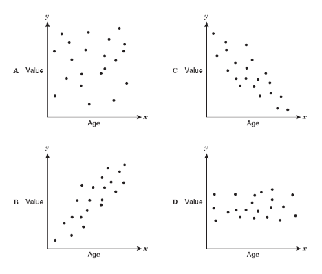
Which scatter plot show a positive relationship?
Graph A
Graph B
Graph C
Graph D

Based on the scatterplot, which of the following conclusions about the relationship between her height and weight is true?
There is a negative relationship between height and weight
There is a positive relationship between height and weight
There is a constant relationship between height and weight
There is no relationship between height and weight


What type of correlation does this graph have?
Negative
no association
positive
What type of correlation does this graph have?
positive
negative
none
all of the above
Mrs. Collins made a scatterplot to show the relationship between the number of absences and a student’s final exam score. Based on this scatterplot, a student with 12 absences should get approximately what score on the final exam?
60
92
70
76
Which sentence describes the relationship shown on this scatter plot?
As the temperature decreases, the visitors increase.
As the temperature increases, the number of visitors increases.
As the visitors increase, the temperature decreases.
No correlation
Mrs. Collins made a scatterplot to show the relationship between the number of absences and a student’s final exam score. Based on this scatterplot, a student with 6 absences should get approximately what score on the final exam?
85
92
70
76
Based on the graph, if Joe earned $400, how many hours did he work?
25 hours
35 hours
45 hours
15 hours
Which scatter plot show a positive relationship?
Graph A
Graph B
Graph C
Graph D
Based on the scatterplot, which of the following conclusions about the relationship between her height and weight is true?
There is a negative relationship between height and weight
There is a positive relationship between height and weight
There is a constant relationship between height and weight
There is no relationship between height and weight


The outside temperature and the amount of layers you wear.
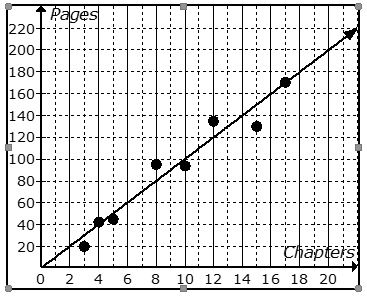

How can we describe the FORM of the scatter plot below?
Linear
Non-linear
Negative
Positive

How can we describe the FORM of the scatter plot below?
Linear
Non-linear
Strong
Moderate

How can we describe the DIRECTION of the scatter plot below?
Positive
Negative
Linear
Non-linear

How can we describe the DIRECTION of the scatter plot below?
Positive
Negative
Weak
Moderate

How can we describe the STRENGTH of the relationship?
Non-linear
Moderate
Strong
Linear

How can we describe the STRENGTH of the relationship?
Weak
Moderate
Positive
Negative

The scatter plot is
Linear, negative and weak
Linear, positive and weak
Non-linear, positive and moderate
Linear, negative, and moderate

The scatter plot is
Linear, positive, moderate
Linear, negative, moderate
Non-linear, positive, moderate
Linear, positive, weak

The relationship illustrated by this scatter plot is
Non-linear, strong, positive
Linear, strong, positive
Non-linear, strong, negative
Linear, moderate, negative

The relationship illustrated by this scatter plot is
Non-linear, strong, positive
Linear, strong, positive
Non-linear, strong, negative
Linear, moderate, negative

The relationship illustrated by this scatter plot is
Non-linear, strong, positive
Linear, strong, positive
Non-linear, strong, negative
Linear, moderate, negative

The relationship illustrated by this scatter plot is
Non-linear, strong, positive
Linear, strong, positive
No pattern, no correlation
Linear, moderate, negative

The relationship illustrated by this scatter plot is
Non-linear, strong, negative
Linear, strong, positive
No pattern, no correlation
Linear, moderate, negative
A scatter plot is a graph with points plotted to show a possible relationship between (a) sets of data
As x increases, y increases
correlation coefficient
no correlation
positive correlation
negative correlation
What type of correlation?
The outside temperature and the amount of layers you wear.
Positive correlation
Negative correlation
No correlation
All of the above
What type of association?
The number of siblings you have and your weight.
Positive correlation
Negative correlation
No correlation
All of the above
If a scatterplot has no association then...
...it has no ordered pairs
...it has ordered pairs that have a negative pattern
...its ordered pairs have no predictable pattern
...it has ordered pairs that have a negative pattern
What type of correlation does this graph have?
Negative
no association
positive
What type of correlation does this graph have?
positive nonlinear
positive linear
negative nonlinear
negative linear
no correlation
Describe the correlation in the graph shown.
Strong Negative
Strong Positive
Weak Negative
Weak Positive
Mrs. Collins made a scatterplot to show the relationship between the number of absences and a student’s final exam score. Based on this scatterplot, a student with 6 absences should get approximately what score on the final exam?
85
92
70
76
Which sentence describes the relationship shown on this scatter plot?
As the temperature decreases, the visitors increase.
As the temperature increases, the number of visitors increases.
As the visitors increase, the temperature decreases.
No correlation
What type of correlation does this scatter plot show?
positive
negative
no correlation
nonlinear association
Describe the correlation in the graph shown.
Strong Negative
Strong Positive
Weak Negative
Weak Positive
Based on the scatterplot, which of the following conclusions about the relationship between her height and weight is true?
There is a negative relationship between height and weight
There is a positive relationship between height and weight
There is no relationship between height and weight

Which table correlates to the following scatter plot?


The scatter plot below shows John’s scores in the seven math and science chapter tests this semester. Which statement best describes the association between his math and science test scores?
positive, linear, no outliers
negative, linear, no outliers
positive, linear, one outlier at (63, 99)
negative, linear, one outlier at (99, 63)
positive, linear, one outlier at (99, 63)
A point that does not follow that overall pattern on a graph of the data set is considered...
the origin
a cluster
an outlier
linear
A set of closely grouped data points is considered...
the origin
a cluster
an outlier
linear

The horizontal axis of a line graph is called the __________.
slope
line of best fit
x-axis
y-axis

The vertical axis of a line graph is called the __________.
slope
line of best fit
x-axis
y-axis

What does the x-axis represent?
Cheetos rating
Takis rating
10
cheetos rating vs. takis rating (2nd)
What does the y-axis represent?
Cheetos rating
Takis rating
10
cheetos rating vs. takis rating (2nd)

The relationship of the scatter plot is ....
Positive
Negative
No relationship
Lots of correlation
The strength of the relationship of the scatter plot is ....
strong
moderate
weak
no relationship

The relationship of this scatterplot is ...
Negative relationship
No relationship
Lots of relationship
Positive relationship
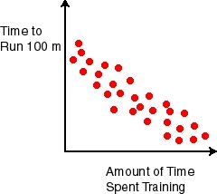
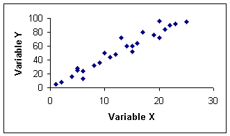
The the strength of the relationship of this scatterplot is...
strong
moderate
weak
No relationship

The relationship of this scatterplot is ...
positive
negative
none
all of the above

Describe the association for the scatterplot based on data plotted.
As the time in weeks increase, the amount of money increases.
As the time in weeks decrease, the amount of money increases.
As the time in weeks decrease, the amount of money decreases.
As the time in weeks increase, the amount of money decreases.


What is the y-intercept?
-2
3
2
-3

Pick the best description of the association
Positive linear weak association with clusters
Positive linear strong association
Negative non linear weak association
positive non linear association


which scatterplot shows the correct trend line (line of best fit) for the relationship showing the number of bags of chocolates that are sold and the price per bag?
A
B
C
D

A local car salesperson created a scatter plot to display the relationship between a car's sale price in dollars, y, and the age of the car in years, x. The scatter plot and the line of best fit are displayed in the graph.
The equation of the line of best fit (LSRL) is y=−24800x+27000
What does the slope mean in context?
Every 2 years, the car loses $5000 in value
Every 2 years, the car loses $27000 in value
Every 4800 years, the car loses $2 in value
Every 2 years, the car gains $4800 in value
A local car salesperson created a scatter plot to display the relationship between a car's sale price in dollars, y, and the age of the car in years, x. The scatter plot and the line of best fit are displayed in the graph.
The equation of the line of best fit (LSRL) is y=−24800x+27000
What does the y-intercept mean in context?
Every 2 years, the car loses $5000 in value
After 0 years, the car is worth $4800
The starting value of the care is $27000
At 11.5 years, the car is worth $0.

