
 Worksheets
Carbon Graphing Assignment
Total questions: 10
Worksheet time: 7mins

On this graph the Y axis shows (a) while the X axis shows (b) .

The topic of this graph is
The amount of chlorofluorocarbons in the atmosphere between 1958 and 2024.
The amount of chlorofluorocarbons in the atmosphere between 1970 and 1994.
The amount of carbon dioxide in the atmosphere between 1958 and 2024.
The amount of carbon dioxide in the atmosphere between 1970 and 1994.

What does the graph of Atmospheric Carbon Dioxide show?
The monthly average carbon dioxide measurements in parts per million (ppm)
The annual average carbon dioxide measurements in parts per million (ppm)
The monthly average carbon dioxide measurements in parts per billion (ppb)
The annual average carbon dioxide measurements in parts per billion (ppb)
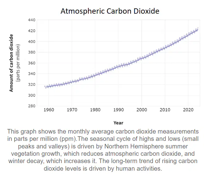
What drives the seasonal cycle of highs and lows in atmospheric carbon dioxide levels?
Human activities
Northern Hemisphere summer vegetation growth and winter decay
Ocean currents
Volcanic eruptions

What is a reasonable prediction that could be made based off of the data on this graph?
The levels of atmospheric carbon dioxide will quickly level off
The levels of atmospheric carbon dioxide will continue to increase each year
The levels of atmospheric carbon dioxide will continue to decrease each year
The levels of atmospheric carbon dioxide will remain constant
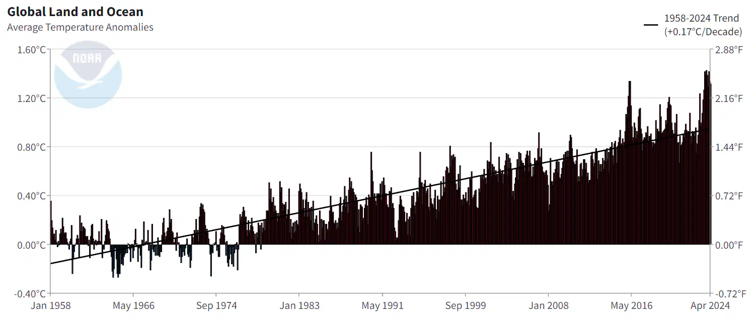
On this graph the Y axis shows (a) while the X axis shows (b) .
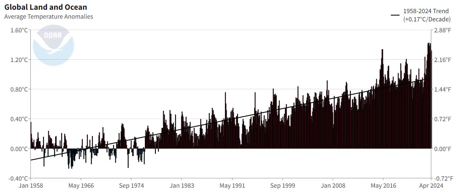
What is the topic of this graph?
Atmospheric levels of carbon dioxide.
Atmospheric levels of chlorofluorocarbons.
The average temperature anomalies between 1958 and 2024.
The average temperature anomalies between 1970 and 1994.
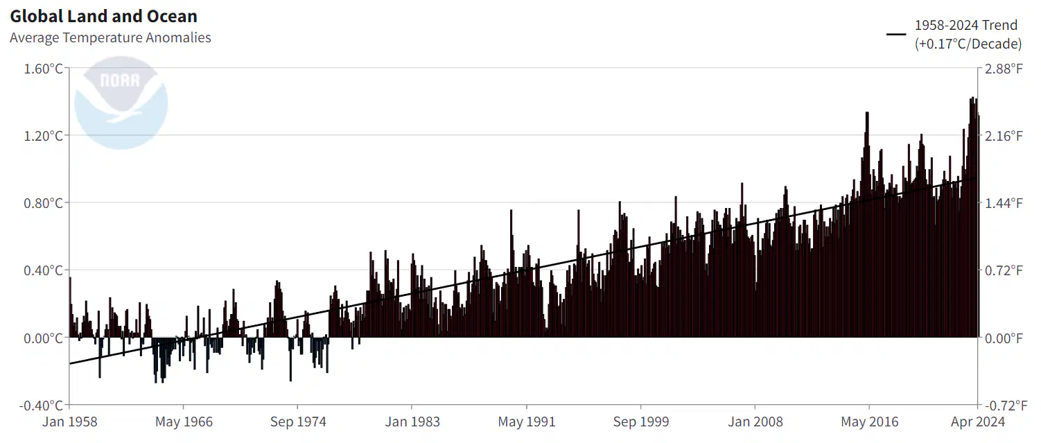
What is a reasonable prediction that could be made based off of the data on this graph?
Average temperature anomalies will continue to increase over time, despite some natural fluctuations.
Average temperature anomalies will begin to decrease on average.
Average temperature anomalies will soon level out and stabilize.
Average temperature anomalies will remain constant.

What year shows the highest average temperature?
1967
1996
2007
2023

Which statement below accurately describes the overall relationships between the two graphs?
As the atmospheric carbon dioxide level rises so does the average temperature.
There is an inverse relationship causing the average temperatures to decrease as carbon dioxide increases.
There is no relationship between the graphs.

