
 Worksheets
Principles of Graphic Design
Total questions: 40
Worksheet time: 31mins

Unity: How are these shapes unified?
(There may be more than one answer)
By colour
By shape
By size
By alignment
Variety: How are these shapes varied?
By colour
By shape
By size
By tone

Unity: How are these shapes unified?
By colour
By shape
By size
By tone
Variety: How are these shapes varied?
(There may be more than one answer)
By colour
By shape
By size
By tone

Visual Balance: How are these shapes balanced?
Symmetrically balanced
Asymmetrically balanced
Radially balanced
Unbalanced

Visual Balance: How are these shapes balanced?
Symmetrically balanced
Asymmetrically balanced
Radially balanced
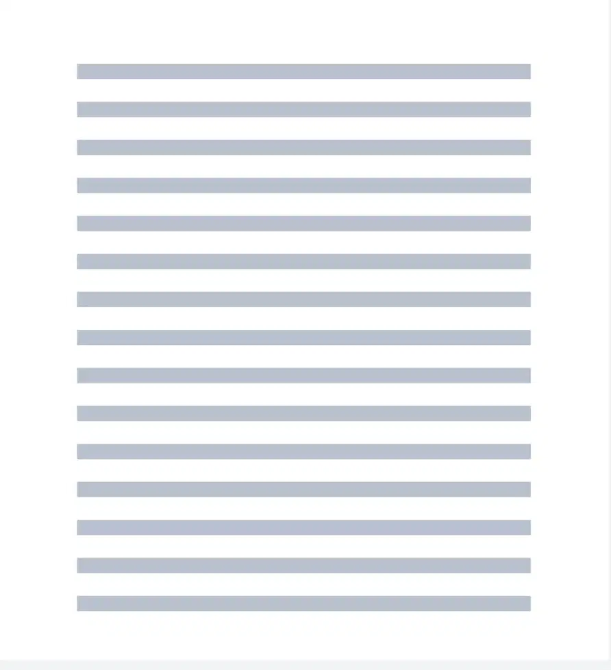
Hierarchy: How could hierarchy be used to draw first attention to some of the lines on this page?
Make the lines you want noticed more colourful
Make the lines you want noticed bigger
Make the lines you want noticed smaller
Put the lines you want noticed first nearer the bottom of the page

Hierarchy: How has the designer of this page used hierarchy to draw first attention to some information?
Increased contrast of blocks against the background
Made less important blocks lighter grey
Made some blocks larger in comparison to others
Made less important lines bigger and bolder.
Contrast: In which image are the shapes contrasted by COLOUR?


Contrast: In which image are the shapes contrasted by SCALE?
Contrast: In which image are the shapes contrasted by LAYOUT?
Contrast: In which image are the shapes contrasted by SHAPE?
What's white space?
A plain colour
Any area on a final graphic that is blank
Any area on a final graphic that is white
Space that is white
The area that an object takes up is called?
positive space
neutral space
negative space
Rectangle, circles, triangles and polygons are examples of
organic shapes
geometric shapes
positive space
Negative space is
the space around an object
the space an object takes up
neither of these
Negative space is always black
True
False

The black area in this drawing is...
Positive Space
Negative Space

The black area in this drawing is...
Positive Space
Negative Space
The object itself is an example of:
Negative Space
Picture Plane
Positive Space
Depth of Illusion

What is the positive space in the image shown?
The sunset background
The animals only
The animals and the trees
The water
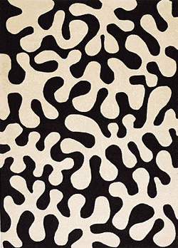

The black area of this image is the?
Positive Space
Negative Space

The white area of this image is the?
Positive Space
Negative Space
The white area of this image is the?
Positive Space
Negative Space


Which principle does this image illustrate?
balance
contrast
alignment
proximity

How would you describe the alignment of the lines in this image?
left aligned
tight tracking
centred
right aligned

Which 'other' term is sometimes used by designers to describe text that is left aligned?
left aligned
right aligned
centre
ragged left
Which principle is demonstrated when elements are evenly distributed around a central point?
Symmetrical Balance
Asymmetrical Balance
Radial Balance
Unbalanced
What is the term for shapes that are irregular and often found in nature?
Geometric Shapes
Organic Shapes
Ambiguous Shapes
Form Shapes
The look and feel of a surface in Graphic Design is known as
Texture
Line
Space
Shape
We call the absence of text and graphics in a design ________ .
white space
blank area
empty space
open area
The difference between two or more elments is known as?
Contrast
Balance
Proximity
Unity
The placement of elements on the page so they are evenly distributed
Balance
Proximity
Unity
Contrast
The closeness of elements, often for the purpose of grouping them visually
Proximity
Unity
Contrast
Balance
How well the parts of a design work together in Graphic Design is known as
Unity
Contrast
Balance
Proximity
Repetition is
Choosing the different font styles within the same category
Purposely duplicating elements or aspects of elements within the same document
Alignment of clipart to appear behind the text
Using an ornamental font style for title text
Which of the following font categories should you AVOID when creating long paragraphs of text?
Cursive
Serif
Display
Sans Serif
A method of design that uses spatial properties to purposely place related items together is
Proximity
Approximation
Arrangement
Alignment

