
Font size
 Worksheets
Design Analysis Quiz (Australia VCD)
Total questions: 18
Worksheet time: 23mins
Organize these options into the right categories
Point
Line
Shape
Form
Tone
Texture
Type
Colour
Scale
Proportion
Pattern
Cropping
Contrast
Figure-ground
Hierarchy
Balance
Socio-economic status
Interest
Religion/Culture
Location
Draw the finished illustration for the design elements memory trick.

The memory trick for TARGET AUDIENCE is...
(a)
What is the memory trick for the design principles?

What is the difference between symmetrical and asymmetrical balance in terms of visual weight distribution? How do you achieve each type of balance in a design?
Symmetrical balance is achieved by placing unequal elements on each side; asymmetrical balance is achieved by placing equal elements on each side.
Symmetrical balance involves mirroring elements on either side of a central axis, while asymmetrical balance involves placing different elements in a way that still creates a sense of equilibrium.
Symmetrical balance uses colors to balance a design, whereas asymmetrical balance uses shapes.
Symmetrical balance is used for dynamic compositions, while asymmetrical balance is used for static compositions.
Describe how a pattern of alternating shapes can create a rhythm in a design. How does this rhythm contribute to visual flow?
Alternating shapes create a static rhythm that does not contribute to visual flow.
A rhythm of alternating shapes creates a sense of movement and continuity, helping to guide the viewer’s eye through the design.
Alternating shapes disrupt the flow and create a chaotic visual effect.
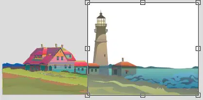
How does cropping a design element affect its visual impact and the overall composition of a design?
Cropping makes design elements larger and more prominent.
Cropping eliminates unnecessary details, focusing attention on the important aspects and enhancing the composition.
Cropping distorts the design element and makes it less effective.

How can you use hierarchical principles to prioritize information in a design? What role does size and color play in establishing hierarchy?
Hierarchical principles are used to ensure all elements have the same size and colour.
Hierarchical principles prioritize information by varying size, colour, and position, making more important elements larger, bolder, or more colourful.
Hierarchical principles are only relevant for text-based designs, not visual designs.
Hierarchy is created by randomly placing elements without regard to size or colour.
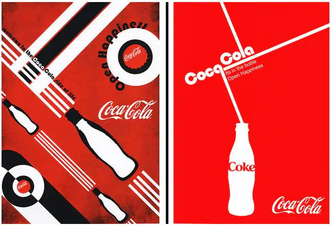
How does the principle of movement guide the viewer's eye through a design? Describe a technique to create a sense of movement in a static image.
Movement is created by using uniform spacing between elements to maintain static positioning.
Movement is guided by leading lines, curves, or patterns that direct the viewer’s eye through the design.
Movement is not important in static designs.
Movement is achieved by using a single colour throughout the design.

What are the characteristics of a straight line versus a curved line in design, and how can each type influence the overall composition?
Straight lines create a sense of movement, while curved lines create a sense of stability.
Straight lines create rigidity and structure, while curved lines create fluidity and softness.
Curved lines are used to create sharp angles, while straight lines are used for smooth transitions.
Both straight and curved lines have the same impact on composition.
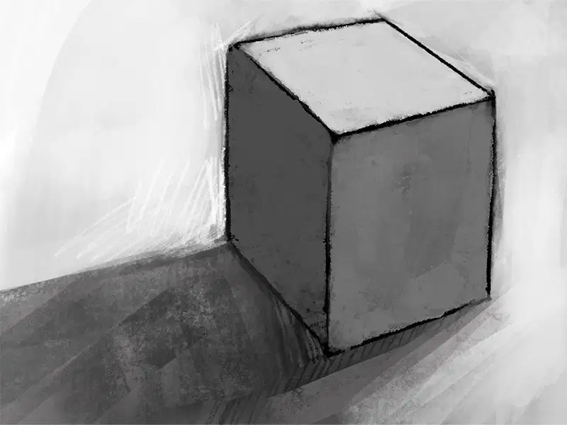
What techniques can be used to create the illusion of three-dimensional form on a two-dimensional surface? How do shading and perspective contribute to this effect?
Shading and perspective are used to add colour to flat designs.
Techniques such as shading, gradients, and perspective lines create depth and volume, giving the illusion of three-dimensionality on a flat surface.
Three-dimensional form is only achievable through physical models, not in two-dimensional designs.
Depth is created by using only flat colours without gradients or shading.

Explain the concept of tone in design. How can varying the tone create depth and contrast in a design?
Tone refers to the use of multiple colors in a design.
Varying the tone in a design involves changing the lightness and darkness of a single color to create contrast and depth.
Tone is the application of texture to create contrast in monochromatic designs.
Tone involves using only one shade of a color to maintain a flat appearance.
What methods can be used to simulate texture in a digital design, and how do these methods compare to using actual texture in physical objects?
Digital texture can be simulated through patterns and gradients, while actual texture involves physical materials that can be felt.
Actual texture is achieved by using color variations alone.
Digital texture requires the use of multiple physical materials.
Simulated texture in digital designs cannot create a realistic effect compared to actual texture.
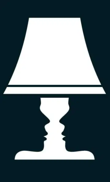
What role does negative space play in a design, and how can it be used effectively to enhance visual communication?
Negative space is used to fill empty areas with additional design elements.
Negative space is the area around and between design elements that can be used to create focus, balance, and clarity by giving the design breathing room.
Negative space refers to the use of dark colors only.
Negative space is irrelevant in design composition.
Tone involves adjusting the lightness and darkness of colours to create contrast and focus. How can gradients be applied to achieve this effect?
Tone refers to the texture of a design element and does not affect contrast.
Gradients help to smoothly transition between these tones to highlight or de-emphasize elements.
Tone is only relevant for text elements, not visual elements.
Gradients are used to maintain uniform colour across a design.
What are the differences between actual texture and implied texture in design, and how can implied texture be used to suggest tactile qualities?
Actual texture involves physical materials that can be felt, while implied texture is a visual representation that suggests texture through patterns or effects, such as using a rough brush stroke effect to simulate a textured surface.
Implied texture is used exclusively in physical design, while actual texture is used only in digital designs.
Actual texture cannot be represented visually, while implied texture is the only method used in design.
Both actual and implied textures are physical and cannot be simulated in design.
What is the role of color theory in design, and how can complementary colors be used to create visual interest?
Color theory is irrelevant in design.
Color theory helps in understanding how colors interact, and complementary colors can be used to create visual interest by providing high contrast and vibrant looks.
Complementary colors are used to create a monochromatic design.
Color theory only applies to black and white designs.
What is the significance of contrast in design, and how can it be achieved using different design elements?
Contrast is not important in design.
Contrast can be achieved by using different colors, sizes, and shapes to make certain elements stand out and create visual interest.
Contrast is achieved by using the same color for all elements.
Contrast is only relevant for digital designs, not print designs.

