
 Worksheets
Data Management Test Grade 8
Total questions: 22
Worksheet time: 1hrs 27mins
Madison bowled 7 games last weekend. Her scores are: 155, 165, 138, 172, 127, 193, 142. What is the range of Madison's scores?
193
127
60
66
The scores awarded to 25 students for an assignment at Whaley's were as follows:
4 7 5 9 8 6 7 7 8 5 6 9 8 5 8 7 4 7 3 6 8 9 7 6 9
What is the mode?
6
7
8
9
5,11,2,12,4,2
The number of miles that Sahil cycled each week for a 7-week period is shown:
36, 42, 28, 52, 48, 36, 31
What is the median number of miles Sahil cycled?
24
36
39
52


What is the difference between Ameya's 12th grade math score and his 7th grade math score?
72
91
21
19
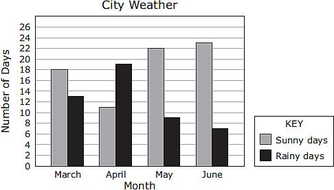
Based on the graph,how many more sunny days than rainy days did this city have during the months of April, May, and June?

What type of correlation does this graph have?
Negative
no association
positive

What type of correlation does this graph have?
positive
negative
none
all of the above

Which sentence describes the relationship shown on this scatter plot?
As the temperature decreases, the visitors increase.
As the temperature increases, the number of visitors increases.
As the visitors increase, the temperature decreases.
No correlation

What type of correlation does this scatter plot show?
positive
negative
no correlation
nonlinear association

Based on the information in the graph, which inference about the general population of students is valid?
Girls like country music more than all other genres combined.
More girls than boys like rock music.
Boys like country music more than rock music.
Boys like rock music more than girls like rap music.

Which of these inferences BEST suits the graph of species 5?
A population of bacteria goes through periods of activity and inactivity
A population of mice increases and becomes stable
A population of birds increases in the spring, but decrease 2 weeks later
A population of wolves slowly increases and then rapidly increases

This graph shows how a population of whales has changed over many years. During this time, the whales were affected by a deadly disease with a very high death rate. Eventually, however, the population developed immunity to the virus.
which of these inferences is best supported by the graph?
The predator population increased in 1993
The ecosystem can on contain less than 85 whales
The ecosystem is healthiest with a population below 75
The population recovered in 1985 and 2001 from high death rates/population drops
You are collecting data on how many minutes it takes sponge eggs to hatch at different water temperatures. Which type of graph should you use?
line
bar
pie
scatter plot

Which is the correct type of graph to use with this data table?
Bar graph
Line graph
Scatter plot
Pie Chart

Which is the correct type of graph to use with this data table?
Bar graph
Line graph
Scatter plot
Pie Chart

Which is the correct type of graph to use with this data table?
Bar graph
Line graph
Scatter plot
Pie Chart

Which is the correct type of graph to use with this data table?
Bar graph
Line graph
Scatter plot
Pie Chart

Which is the correct type of graph to use with this data table?
Bar graph
Line graph
Scatter plot
Pie Chart

