
 Worksheets
Unit 6 NYT Climate Data Analysis II
Total questions: 15
Worksheet time: 8mins
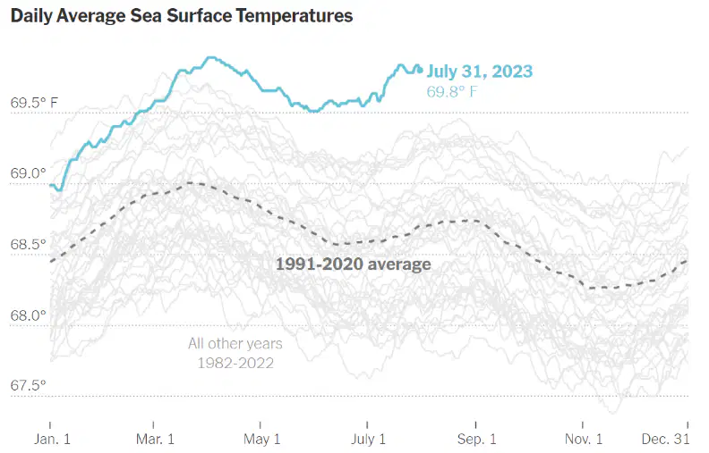
What does the dashed line represent in the graph?
The sea surface temperature on July 31, 2023
The average sea surface temperature from 1982-2022
The temperature on January 1st, 2023
The 1991-2020 average sea surface temperature
What does the blue line (top) in the graph represent?
The temperature average for 1982-2022
The global sea temperature for December
The sea surface temperature on July 31, 2023
The temperature for the year 1991
How does the temperature on July 31, 2023 compare to the 1991-2020 average?
It is lower than the average
It is slightly higher than the average
It is equal to the average
It is much higher than the average
What is the trend of the temperature lines from 1982 to 2022?
The temperatures have increased over time.
The temperatures have decreased steadily.
The temperatures have remained constant.
There is no change in the temperature trend.
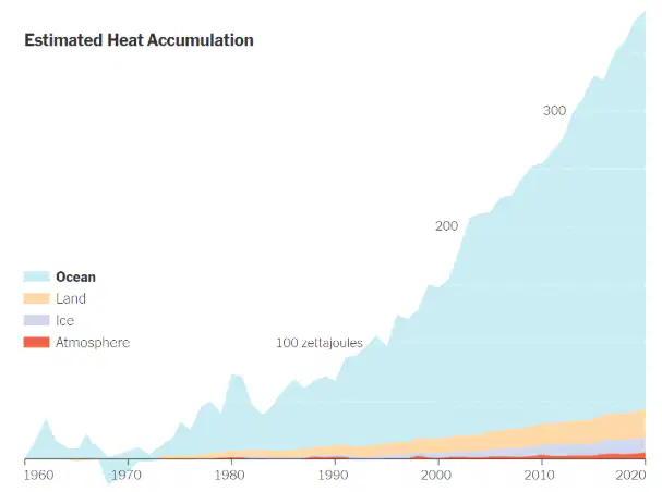
Which component has the largest heat accumulation over time?
Ice
Land
Ocean
Atmosphere
By 2020, what is the approximate heat accumulation in the ocean, according to the graph?
50 zettajoules
150 zettajoules
250 zettajoules
350 zettajoules
One time in recent history, there was a noticeable dip in ocean heat, which resulted from a combination of natural climate phenomena and changes in ocean circulation rather than from any long-term decrease in global temperatures. Which time period was it?
Late 1960's
late 1980's
Late 1990's
Late 2000's
Which component contributed the least to the total heat accumulation by 2020?
Ocean
Land
Atmosphere
Ice

What does the dotted line represent in the graph?
The average sea ice extent for 2023.
The average sea ice extent from 1979 to 2010.
The max sea ice extent in the Southern Hemisphere
The minimum sea ice extent in the Southern Hemisphere
How does the Antarctic sea ice extent typically change over the course of the year?
It increases in winter and decreases in summer.
It remains constant throughout the year.
It fluctuates randomly.
It increases during the summer and decreases during the winter.
What can we infer from the overall trend of this graph?
Antarctic sea ice is increasing steadily since 1979
Antarctic sea ice is decreasing steadily since 1979
Antarctic sea ice is stable with minor fluctuations since 1979
Antarctic sea ice follows a random pattern since 1979.
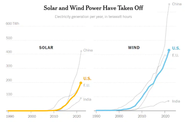
Which country has shown the highest growth in solar power generation by 2020?
U.S.
India
China
E.U.
What is the trend in wind power generation for the U.S. from 1990 to 2020?
Steady increase with occasional dips
No growth in wind power generation
Slow and steady increase
A significant increase starting around 2010
Which region has the smallest increase in solar power generation between 1990 and 2020?
China
U.S.
E.U.
India
Which of the following is true about the E.U.'s solar power generation?
It has a steady growth but at a much slower rate than China.
It exceeds the U.S. generation by 2020.
It is the leading region in solar power generation.
It shows no significant growth in solar power

