
 Worksheets
Color and Typography
Total questions: 37
Worksheet time: 1hrs 14mins
Which of the following refers to the location of a color on the color wheel?
Hue
Value
Saturation
Tint
Select all of the following which are considered true about value.
Shades are hues with black added
Shades are hues with white added
Tints are hues with black added
Tints are hues with white added
Which of the following best describes a color which has gray added to it?
Saturated
Pure
Vibrant
Desaturated

The image is an example of which of the following color schemes?
Complementary
Double Complementary
Split-Complementary
Triadic

The image is an example of which of the following color schemes?
Monochromatic
Analogous
Complementary
Triadic

The image is an example of which of the following color schemes?
Monochromatic
Analogous
Complementary
Triadic

The image is an example of which of the following color schemes?
Complementary
Double Complementary
Split-complementary
Triadic

The image is an example of which of the following color schemes?
Monochromatic
Analogous
Complementary
Triadic
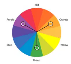
The image is an example of which of the following color schemes?
Monochromatic
Analogous
Complementary
Triadic
Select the correct answer from the choices provided in the underlined section.
Legibility / Readability is the ability for letters to be discernable where enough words can be read.
(a)
Which of the following is NOT a type of typeface?
Serif
Serial
Sans Serif
Symbols
Which of the following is true about script typefaces?
They feature letters which are easy to distinguish from one another
They are legible in smaller sizes and resolutions
They are not used to communicate significant text
They can make designs feel customized or handcrafted
What type of typeface is Wingdings?
Serif
Sans Serif
Script
Symbols
Digital media, like websites and mobile apps, can display limited typefaces.
True
False
Select all of the following statements which describe display typography. (3)
Communicates text intended to be read at length
Is bolder, bigger or more decorative than text typography
Short amounts of text, such as headlines or subtitles
Should be able to be read easily and quickly
Should draw attention to important information
Which of the following typeface is commonly considered more readable in print, especially for larger sizes, but tends to become less legible in sizes below 10 points?
Sans Serif
Decorative
Script
Serif
Which of the following best represents the horizontal stroke connecting two vertical strokes?
Ascenders
Stem
Crossbar
Cross stroke

What does the image show?
Shoulder
Spine
Arm
Tail
The dot above a lowercase “j” or “i” is called which of the following?
Swash
Tittle
Eye
Spur
Photography, videography, print and digital are all examples of which of the following?
Layout Principles
Design Choices
Media
Design Principles
Select all of the following which are goals a design should accomplish. (3)
To appeal to the intended audience
To communicate the intended message
To explore new technologies and look cool
To provide unique insight into the topic
To represent the company, brand, product or author

What do the arrows point to in the image?
Margin
Columns
Gutters
Rows
How many points are in one pica?
6
12
18
24
White space does NOT have visual weight.
True
False
If a designer wants to help users quickly recognize clickable links on a website, what is the best design principle they should use?
Repetition
Variety
Contrast
Hierarchy
What is the small projection from the upper right side of a double-story lowercase “g” called?
Ear
Tittle
Eye
Serif
Which of the following is true about centered alignment?
It is the most readable alignment
It aligns both sides of a paragraph
It is the least readable alignment and should be reserved for brief lines of text rather than full paragraphs
Is relatively readable alignment when the line width is the correct size for the font size
How can designers achieve balance in a design?
By emphasizing a focal point with color and alignment
By using a variety of objects, shapes, colors, movements or white space with equal visual weight on each half of the design
By drawing attention to an element using lines and shapes
By repeating design elements, such as size, color, typeface, spacing or grid structure
Harmony in design is achieved by utilizing all other design principles, also called unity.
True
False
Which of the following is a key consideration when designing multi-page layouts?
Consistency from page to page
The decorative nature of illustrations and images
The visual weight of headings compared to body text
The presence of white space on each page
White space in a layout refers to areas which should be filled with decorative design elements to enhance visual appeal.
True
False
Which of the following is true about "hue" regarding color?
The measurement of lightness or darkness
The location of a color on the color wheel
The combination of tints, shades, and saturations
The amount of gray in a color
Which of the following color schemes is characterized by using three colors next to each other on the color wheel, creating a harmonious and rich appearance?
Complementary color scheme
Monochromatic color scheme
Analogous color scheme
Triadic color scheme
Ragged edges in a paragraph, resulting from left alignment, are considered the least readable alignment type.
True
False
Which of the following is the primary purpose of display typography?
To communicate text intended to be read at length
To draw attention to important information through bolder and more decorative text
To enhance the readability of print materials
To create a harmonious and balanced color scheme
Which of the following is NOT mentioned to establish a visual hierarchy in a design?
Scale
Texture
Placement
Contrast
Symmetry is the only method used to create balance in design, while asymmetry results in visual inconsistency and chaos.
True
False

