wayground logo

Free Printable Worksheets

Font size

S
M
L
XL
Worksheets

Comparing Scatter Plots

Total questions: 157

Worksheet time: 8hrs 16mins

Name
Class
Date
1.

JoBeth draws a scatter plot that shows as the outside temperature increases, sales at her lemonade stand increase. Which best describes the scatter plot?

a)

The points show that as x-values increase, y-values increase.

b)

The points show that as x-values increase, y-values decrease.

c)

The points show that as x-values decrease, y-values stay the same.

d)

The points show that as x-values decrease, y-values increase.

2.

Which of the following best describes a scatter plot that shows no relationship between the x-values and the y-values?

a)

As x-values increase, the points are higher on the graph.

b)

As x-values decrease, the points are higher on the graph.

c)

The points are scattered around the graph.

d)

The points form a horizontal line.

3.

Which statement best describes the relationship between time shopping online and the number of stores visited?

a)

As the number of hours increases, the number of stores decreases.

b)

As the number of hours increases, the number of stores increases.

c)

The number of hours and the number of stores are about the same.

d)

As the number of hours decreases, the number of stores increases.

4.

How much time did the person who visited 3 stores spend shopping online?

a)

2 Hours

b)

10 Hours

c)

4 Hours

d)

3 Hours

5.

Mr. Reynosa plans to shop online for 4 hours for two days in a row. What is a reasonable prediction of how many stores he will visit?

a)

10

b)

8

c)

12

d)

22

6.

Molly collected data about the number of hours students studied and their scores on a test. The results are shown in the scatter plot. Which statement about the data is true?

a)

As study hours increase, test scores decrease.

b)

As study hours increase, test scores increase.

c)

As study hours increase, test scores stay the same.

d)

As study hours decrease, test scores increase.

7.

Which is a reasonable prediction of a test score for a student who studied for 1/2 hour?

a)

80

b)

100

c)

50

d)

5

8.

Which relationship could be represented by this scatter plot?

a)

As the number of muffins in a box increases, the price increases.

b)

As the speed of a car increases, the distance the car travels increases.

c)

As the population of a city increases, the number of schools in the

city increases.

d)

As the number of daylight hours increases, the number of night hours decreases.

9.

As the area of a garden increases, what happens to the number of plants in a garden?

a)

The number of plants decreases.

b)

The number of plants stays the same

c)

The number of plants increases faster.

d)

The number of plants increases.

10.
What type of association does this graph have?
a)
positive 
b)
negative
c)
none
d)
all of the above
11.
What type of correlation (association)?
The outside temperature and the amount of layers you wear. 
a)
Positive correlation
b)
Negative correlation
c)
No correlation
d)
All of the above
12.
The number of siblings you have and your weight. 
a)
Positive correlation
b)
Negative correlation
c)
No correlation
d)
All of the above
13.
As x increases, y increases
a)
correlation coefficient
b)
causation
c)
positive correlation
d)
negative correlation
14.
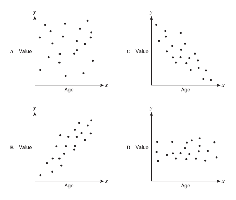
Which scatter plot shows a linear relationship between x and y?
a)
Graph A
b)
Graph B
c)
Graph C
d)
Graph D
15.
What is the correlation?
a)
Negative correlation
b)
No correlation
c)
Positive correlation
d)
All of the above
16.
As the age of the car increases, its value decreases. Which scatterplot represents this relationship?
a)
A
b)
B
c)
C
d)
D
17.
If a scatterplot has no correlation then...
a)
...it has no ordered pairs
b)
...it has ordered pairs that have a negative pattern
c)
...its ordered pairs have no predictable pattern
d)
...if it makes a lion on a graph (roar!)
18.
What type of correlation does this scatter plot show?
a)
positive linear association
b)
negative linear association
c)
no association
d)
nonlinear association
19.
What type of correlation does this graph have?
a)
positive
b)
negative
c)
none
d)
all of the above
20.
What type of correlation does this graph have?
a)
positive 
b)
negative
c)
none
d)
all of the above
21.
The age of a kitten and its weight.
a)
positive association
b)
negative association
c)
no association
22.
What type of association does this graph have?
a)
positive
b)
negative
c)
none
d)
all of the above
23.
What type of correlation (association)?
The outside temperature and the amount of layers you wear. 
a)
Positive correlation
b)
Negative correlation
c)
No correlation
d)
All of the above
24.
The height of students and their scores on a test.
a)
positive correlation
b)
negative correlation
c)
no correlation
25.
The number of notebooks bought and the total cost.
a)
positive association
b)
negative association
c)
no association
26.
What type of association does this scatter plot represent?
a)
positive linear association
b)
negative linear association
c)
no association
d)
nonlinear association
27.
About how many male math teachers were there in 2006?
a)
15
b)
30
c)
35
d)
45
28.
What would be the correlation between study time and test grades?
a)
positive
b)
negative
c)
none
d)
cannot be determined
29.
What type of association does this graph have?
a)
positive 
b)
negative
c)
none
d)
all of the above
30.
What does the slope represent in this situation?
a)
The sloth runs 1 feet in 3 minutes
b)
The sloth runs 3 feet in 1 minute
c)
The sloth runs fast
d)
The sloth runs 6 feet in 1 minute
31.
Which sentence describes the relationship shown on this scatter plot?
a)
As the temperature decreases, the visitors increase. 
b)
As the temperature increases, the number of visitors increases. 
c)
As the visitors increase, the temperature decreases. 
d)
No correlation
32.
What type of association does this scatter plot represent?
a)
positive linear association
b)
negative linear association
c)
no association
d)
nonlinear association
33.
What type of association (correlation) does this graph have?
a)
positive 
b)
negative
c)
none
d)
all of the above
34.
What type of correlation does this graph have?
a)
positive
b)
negative
c)
none
d)
all of the above
35.
Which equation best represents the data?
a)
A.  y= -3/5x + 2
b)
B  y = 5/3x -2 
c)
C  y = -3/5x - 2
d)
D  y= 5/3x + 2
36.
Which equation best represents the data?
a)
A  y = 2x + 2
b)
B  y= 1/2x - 2
c)
C  y = -2x + 2
d)
D  y = -1/2x + 2
37.
Which equation best represents the data?
a)
A  y = 4x
b)
B  y = -4x
c)
C  y = 1/4x
d)
D   y = -1/4 x
38.
Which equation best represents the data?
a)
A  y = x + 2
b)
B  y = -x + 2
c)
C  y = x - 2
d)
D  y = -x - 2 
39.
Which equation best represents the data?
a)
A  y = 3/4x + 1
b)
B  y = 4/3x - 1
c)
C  y = -3/4x - 1
d)
D  y = -4/3x - 1
40.
Which equation best represents the data?
a)
y= -2/3x - 4
b)
y= 2/3x - 4
c)
y= -3/2x - 4
d)
y= 3/2x + 4
41.

What type of correlation does this graph have?

a)

Negative

b)

no association

c)

positive

42.

Which sentence describes the relationship shown on this scatter plot?

a)

As the temperature decreases, the visitors increase.

b)

As the temperature increases, the number of visitors increases.

c)

As the visitors increase, the temperature decreases.

d)

No correlation

43.

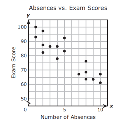
Mrs. Collins made a scatterplot to show the relationship between the number of absences and a student’s final exam score. Based on this scatterplot, a student with 12 absences should get approximately what score on the final exam?

a)

60

b)

92

c)

70

d)

76

44.

Describe the correlation in the graph shown.

a)

Strong Negative

b)

Strong Positive

c)

Weak Negative

d)

Weak Positive

45.

What type of correlation does this scatter plot show?

a)

positive

b)

negative

c)

no correlation

d)

nonlinear association

46.

The scatter plot shows the relationship between the number of chapters and the total number of pages for several books. Use the trend line to predict how many pages would be in a book with 19 chapters.

a)

150 pages

b)

170 pages

c)

190 pages

d)

210 pages

47.

The scatter plot shows the relationship between the number of chapters and the total number of pages for several books. Use the trend line to predict how many pages would be in a book with 19 chapters.

a)

150 pages

b)

170 pages

c)

190 pages

d)

210 pages

48.

Based on the graph, if Joe earned $400, how many hours did he work?

a)

25 hours

b)

35 hours

c)

45 hours

d)

15 hours

49.

Describe the correlation in the graph shown.

a)

Strong Negative

b)

Strong Positive

c)

Weak Negative

d)

Weak Positive

50.

Which scatter plot show a positive relationship?

a)

Graph A

b)

Graph B

c)

Graph C

d)

Graph D

51.

Based on the scatterplot, which of the following conclusions about the relationship between her height and weight is true?

a)

There is a negative relationship between height and weight

b)

There is a positive relationship between height and weight

c)

There is a constant relationship between height and weight

d)

There is no relationship between height and weight

52.

Estimate the correlation coefficient for this scatterplot.

a)

r = 1.2

b)

r = 0.89

c)

r = 0

d)

r = -0.89

53.

Estimate the correlation coefficient for this scatterplot.

a)

r = -0.9

b)

r = 1

c)

r = 0.9

d)

r = -1

54.

r=-0.89

a)

Strong positive

b)

Weak positive

c)

Strong negative

d)

Weak negative

55.

r=0.3

a)

Strong positive

b)

Weak positive

c)

Strong negative

d)

Weak negative

56.

r=-0.89

a)

Strong positive

b)

Weak positive

c)

Strong negative

d)

Weak negative

57.

What type of correlation does this graph have?

a)

positive

b)

negative

c)

none

d)

all of the above

58.
The scatter plot shows the relationship between the number of chapters and the total number of pages for several books.  Use the trend line to predict how many chapters would be in a book with 180 pages. 
a)
12 chapters
b)
15 chapters
c)
18 chapters
d)
21 chapters
59.
What type of correlation (association)?
The outside temperature and the amount of layers you wear. 
a)
Positive correlation
b)
Negative correlation
c)
No correlation
d)
All of the above
60.
Find the equation of the line of best fit for the given data
a)
y=163.41x + 4.19
b)
y=-163.41x + 4.19
c)
y=-4.19x + 163.41
d)
y= 4.19x - 163.41
61.
The number of siblings you have and your weight. 
a)
Positive correlation
b)
Negative correlation
c)
No correlation
d)
All of the above
62.
As x increases, y increases
a)
correlation coefficient
b)
causation
c)
positive correlation
d)
negative correlation
63.
Which scatter plot shows a linear relationship between x and y?
a)
Graph A
b)
Graph B
c)
Graph C
d)
Graph D
64.
What is a trend line that shows the most accurate relationship between x and y and is is very close to most of the data points?
a)
linear regression
b)
no correlation
c)
trend line
d)
line of best fit
65.
As the age of the car increases, its value decreases. Which scatterplot represents this relationship?
a)
A
b)
B
c)
C
d)
D
66.
What is the correlation?
a)
Negative correlation
b)
No correlation
c)
Positive correlation
d)
All of the above
67.
If a scatterplot has no association then...
a)
...it has no ordered pairs
b)
...it has ordered pairs that have a negative pattern
c)
...its ordered pairs have no predictable pattern
d)
...if it makes a lion on a graph (roar!)
68.
Which of the following could be a possible line of best fit for the data?
a)
y = -5/2x + 20
b)
y = -x + 19
c)
y = x + 20
d)
y = 2/3x + 15 
69.
What is a line of best fit used for?
a)
To make predictions
b)
To make the graph look pretty
c)
To connect the points
d)
To make it look like you know what you are doing
70.
What is a scatter plot?
a)
A graph that shows the relationship of two data sets.
b)
A graph drawn using rectangular bars to show how large each value is.
c)
A graph that shows information that is connected in some way.
d)
A graph that shows data changing over time.
71.
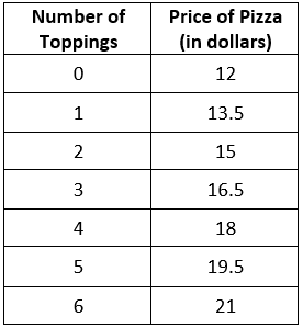
A restaurant sells pizza for the prices in the data table.  Calculate the linear regression equation of the data.
a)
y = 1.5x + 12
b)
y = 12x + 1.5
c)
y = 0.67x - 8
d)
y = -8x + 0.67
72.
The graph above shows a line of best fit for data collected on the distance bicyclists have remaining in relation to the amount of time they have been riding.  What is the equation of the line of best fit?
a)
y = -25x + 170
b)
y = 25x + 170
c)
y = -(5/8) x + 170
d)
y = (5/8) x + 170
73.
The graph above shows a line of best fit for data collected on the amount earned by waiters and waitresses last week in relation to the number of tables they served.  What is the equation of the line of best fit?
a)
y = (5/3) x + 375
b)
y = (1/3) x + 475
c)
y = (5/3) x + 475
d)
y = (1/3) x + 375
74.
A small theme park is trying to determine the number of guests they should expect on a weekend, based on the temperature outside.  Based on the trend line, about how many guests should be expected if the temperature is around 80°?
a)
8,300
b)
8
c)
7,300
d)
9,300
75.
A group of students did an experiment to see how drinking cups of coffee right before bed affected sleep.  The results are shown below in the scatter plot with a line of best fit.  Use the given line of best fit to approximate the rate of change relative to the scatter plot.
a)
(7/5) hours/cup
b)
(5/7) hours/cup
c)
- (7/5) hours/cup
d)
- (5/7) hours/cup
76.
The graph  shows a line of best fit for the data collected on the amount of cell phone bills in relation to the number of minutes used.  What is the equation of the line of best fit.
a)
y = (1/2) x + 3
b)
y = (1/2) x + 15
c)
y = (1/40) x 
d)
y = (1/40) x + 15
77.
Looking at the graph, what is the correlation between the x and y variables?
a)
y increases as x increases
b)
y is constant
c)
y decreases as x descreases
d)
y decreases as x increases
78.
A teacher made the following graph showing absences vs. final grades.  Predict the grade of a student that has 7 absences.
a)
45
b)
50
c)
60
d)
70
79.
Which scatterplot most likely has a line of best fit represented by y = - 2x + 1
a)
W
b)
X
c)
Y
d)
Z
80.
The graph shows a line of best fit for data collected on the amount of income earned by lawn companies in relation to the number of yards mowed.  What is the equation of the line of best fit?
a)
y = (3/2) x
b)
y = 30x
c)
y = 30x + 300
d)
y = (3/2)x + 300
81.
The graph shows a line of best fit for data collected on the value of used cards in relation to the number of  years since they were purchased.  What is the equation of the line of best fit?
a)
y = 750 x + 9500
b)
y = - 750 x +11000
c)
y = (3/4) x + 11
d)
y = - (3/4) x + 11000
82.
Mrs. Moises, the school counselor, keeps a candy jar in her office for students.  During one week, she kept count of how many students came to visit her and the number of candies in the jar, as show in the scatter plot.  Based on the trend line, what is the best prediction for the number of candies in the jar when 30 students visit her?
a)
90
b)
180
c)
135
d)
150
83.
Looking at the graph showing a line of best fit, what is the correlation shown?
a)
Length of life is constant
b)
Length of life increases as amount of sunlight increases
c)
Length of life increases as amount of sunlight decreases
d)
Length of life decreases as amount of sunlight increases
84.
The graph shows a line of best fit for data collected on the amount of time teenagers spend on the computer and watching television.  Based on the line of best fit, how much time does a teenager spend watching television if they spend 2 hours on the computer?
a)
150 minutes
b)
135 minutes
c)
165 minutes
d)
180 minutes
85.
A teacher made the following graph showing the number of hours that a student studied for an exam versus their exam grade.  Predict the grade of a student if they studied for 3.5 hours.  
a)
80
b)
100
c)
85
d)
90
86.
The graph shows a line of best fit for data collected on the price of a unit in relation to the number of units sold.  What is the equation of the line of best fit?
a)
y = - (1/2) x + 10
b)
y = - (1/50) x + 40
c)
y = - (1/2) x + 40
d)
y = - (1/50) x + 10
87.
What type of association does this graph have?
a)
positive 
b)
negative
c)
none
d)
all of the above
88.
Which scatter plot shows a linear relationship between x and y?
a)
Graph A
b)
Graph B
c)
Graph C
d)
Graph D
89.
What type of association does this graph have?
a)
positive
b)
negative
c)
none
d)
all of the above
90.
What type of association does this graph show?
a)
Positive
b)
negative
c)
none
d)
all of the above
91.
What type of association does this scatter plot show?
a)
positive linear association
b)
negative linear association
c)
no association
d)
nonlinear association
92.
What type of association (correlation) does this graph have?
a)
positive
b)
negative
c)
none
d)
all of the above
93.
Which sentence describes the relationship shown on this scatter plot?
a)
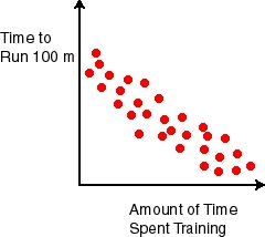
The more time spent training, the longer it takes to run 100 m.  
b)
As the time spent training increases, the time to run 100 m decreases. 
c)
As the time spent training decreases, the time to run 100 m decreases. 
94.
What type of association does this scatter plot represent?
a)
positive linear association
b)
negative linear association
c)
no association
d)
nonlinear association
95.
Which scatter plot shows a linear relationship between x and y?
a)
Graph A
b)
Graph B
c)
Graph C
d)
Graph D
96.
What is shown here? (click to remove words)
a)
trend line
b)
linear regression
c)
no correlation
d)
positive correlation
97.
About how many male math teachers were there in 2006?
a)
15
b)
30
c)
35
d)
45
98.
What type of correlation?
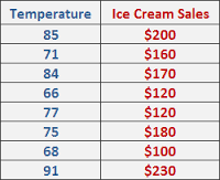
The temperature outside and the amount of ice cream sales. 
a)
Positive correlation
b)
Negative correlation
c)
No correlation
99.
The following scatter plot shows Pam's training as she prepares to run a 6 mile race at the end of the month.  Which of the following would be a reasonable approximation for the length of time it would take for her to run 6 miles? 
a)
A. 50 min
b)
B. 80 min
c)
C. 45 min
d)
D. 60 min
100.
What type of association does this graph show?
a)
Positive
b)
negative
c)
none
d)
all of the above
101.
What type of association does this graph have?
a)
positive
b)
negative
c)
none
d)
all of the above
102.
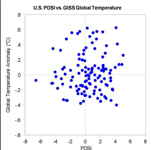
Describe the association of the scatter plot.
a)
Linear; positive association
b)
Linear; negative association
c)
Non-linear
103.
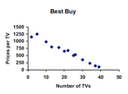
If Gold's Gym paid $250 for each TV, how many did they buy?
a)
35
b)
30
c)
45
d)
20
104.
What type of correlation does this graph have?
a)
positive 
b)
negative
c)
none
d)
all of the above
105.
The scatter plot below shows the number of books read by students in Mrs. Hall’s English class and their final grades. Which statement represents the best description about the line of best fit?
a)
The more books students read, the lower their English grade.
b)
The more books students read, the higher their English grade.
c)
The fewer books students read, the higher their English grade. 
d)
No relationship exists between the number of books students read and their English grades. 
106.
As the age of the car increases, its value decreases. Which scatterplot represents this relationship?
a)
A
b)
B
c)
C
d)
D
107.
What is a scatter plot?
a)
A graph that shows the relationship of two data sets.
b)
A graph drawn using rectangular bars to show how large each value is.
c)
A graph that shows information that is connected in some way.
d)
A graph that shows data changing over time.
108.
You are analyzing a scatter plot that has a negative correlation. What is true of the of the x and y values?
a)
As x increases, y decreases
b)
As x increases, y increases
c)
As x decreases, y decreases
109.
What represents the x axis?
a)
ABC Company
b)
Hours Worked
c)
Amount Earned in Dollars
d)
Hours in Car
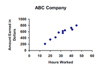
110.
What represents the y axis?
a)
ABC Company
b)
Hours Worked
c)
Amount Earned in Dollars
d)
Hours in Car
111.
What is the correlation between length of running start and distance of jump?
a)
positive:  the further you run the further you jump
b)
negative: the less you run the less distance of your jump
c)
positive: the further your running start the less your distance
112.
What type of correlation is shown in this plot?
a)
Positive
b)
Negative
c)
No Correlation
113.
What type of correlation is shown in this plot?
a)
Positive 
b)
Negative
c)
No Correlation
114.
What type of correlation is shown in this plot?
a)
Positive
b)
Negative
c)
No Correlation
115.
The following scatter plot shows Pam's training as she prepares to run a 6 mile race at the end of the month.  Which of the following would be a reasonable approximation for the length of time it would take for her to run 6 miles? 
a)
A. 50 min
b)
B. 80 min
c)
C. 45 min
d)
D. 60 min
116.
About how many male math teachers were there in 2006?
a)
15
b)
30
c)
35
d)
45
117.
The scatter plot shows the relationship between the number of chapters and the total number of pages for several books.  Use the trend line to predict how many chapters would be in a book with 180 pages. 
a)
12 chapters
b)
15 chapters
c)
18 chapters
d)
21 chapters
118.
The scatter plot shows the relationship between the number of chapters and the total number of pages for several books. Use the trend line to predict how many pages would be in a book with 19 chapters. 
a)
150 pages
b)
170 pages
c)
190 pages
d)
210 pages
119.
Mrs. Collins made a scatterplot to show the relationship between the number of absences and a student’s final exam score. Based on this scatterplot, a student with 6 absences should get approximately what score on the final exam? 
a)
65
b)
92
c)
70
d)
76
120.
The scatter plot below shows the number of books read by students in Mrs. Hall’s English class and their final grades. Which statement represents the best description about the line of best fit?
a)
The more books students read, the lower their English grade.
b)
The more books students read, the higher their English grade.
c)
The fewer books students read, the higher their English grade. 
d)
No relationship exists between the number of books students read and their English grades. 
121.
What is the correlation between length of running start and distance of jump?
a)
positive:  the further you run the further you jump
b)
negative: the less you run the less distance of your jump
c)
positive: the further your running start the less your distance
122.
Which scatter plot show a positive relationship?
a)
Graph A
b)
Graph B
c)
Graph C
d)
Graph D
123.
Which scatter plot shows no relationship?
a)
Graph A
b)
Graph B
c)
Graph C
d)
Graph D
124.
Which scatter plot shows a negative relationship?
a)
Graph A
b)
Graph B
c)
Graph C
d)
Graph D
125.
In the scatter plot, does the image shows a "Line of Best Fit"?
a)
Yes
b)
No
126.
The equation of the trend line
is  y= 1/2x +1. Use the equation to determine the amount of time it would take to bike 20 laps. 
*Look at the x and y axis first before starting the problem
   
a)
38 minutes
b)
11 minutes
c)
41 minutes
d)
10 minutes
127.
Find the slope for the trend line using points (2,2) and (4,3)
a)
2
b)
1/2
c)
-2
d)
-1/2
128.
a)
y = x ; 20
b)
y = x + 2 ; 22
c)
y = 2 ; 2
d)
y = 0.5x + 2 ; 12
129.
The following scatter plot shows Pam's training as she prepares to run a 6 mile race at the end of the month.  Which of the following would be a reasonable approximation for the length of time it would take for her to run 6 miles? 
a)
A. 50 min
b)
B. 80 min
c)
C. 45 min
d)
D. 60 min
130.
Based on this scatter plot, a student with 6 absences should get approximately what score on the final exam? 
a)
≅ 58
b)
≅ 92
c)
≅ 100
d)
≅ 76
131.
Which of the following lines represents the line of best fit for the scatter plot?
a)
A
b)
B
c)
C
d)
D
132.
Based on the graph, if Joe earned $400, how many hours did he work?
a)
20 hours
b)
35 hours
c)
45 hours
d)
15 hours
133.

What is the equation of the line of best fit?

a)

y = -25x + 170

b)

y = -5/8x + 170

c)

y = 25x + 170

d)

y = 5/8x + 170

134.
Which of the following would be the most accurate equation for the scatter plot?
a)
y = -2x - 7
b)
y = -x + 7
c)
y = 3x + 7
d)
y = 15x + 7
135.

Which scatter plot shows both positive and non linear association?

a)
b)
c)
d)
136.

Which of the scatter plots below shows a stronger association, and why?

a)

Scatter plot B; it’s slope is positive.

b)

Scatter plot B; it does not have any data points that are outliers.

c)

Scatter plot A; it’s Slope is greater than B

d)

Scatter plot A; it’s points of data are closer together than B.

137.
The scatterplot below shows the relationship between the number of hours a person exercises and the time it takes to drive to work. Which conclusion does the data most strongly support?
a)
The time it takes to drive to work decreases as the number of hours exercising increases.  
b)
The time it takes to drive to work increases as the number of hours exercising increases.  
c)
The time it takes to drive to work stays the same as the number of hours exercising increases.  
d)
The time it takes to drive to work is not related to the number of hours exercising.  
138.
The scatterplot below suggests which of the following types of data relationship?
a)
Weak, negative
b)
weak, positive
c)
strong, negative
d)
strong, positive
139.
The scatter plot below shows John’s scores in the seven math and science chapter tests this semester. Which statement best describes the association between his math and science test scores?
a)
positive, linear, no outliers
b)
negative, linear, no outliers
c)
positive, linear, one outlier
d)
negative, linear, one outlier
140.
The scatter plot shows the number of hours Mr. Liu’s students spent watching TV compared to the hours they spent playing computer games during a week. Which best describes the association between the two quantities?
a)
weak, positive
b)
weak, negative
c)
strong, positive
d)
strong, negative
141.
A point far away from the other data points is considered a(n) ____?
a)
cluster
b)
scatter plot
c)
outlier
d)
variable
142.
Describe the correlation in the graph shown.
a)
Weak Negative
b)
Weak Positive
c)
Strong Negative
d)
Strong Positive
143.
Describe the correlation in the graph shown.
a)
Strong Negative
b)
Strong Positive
c)
Weak Negative
d)
Weak Positive
144.
Describe the correlation in the graph shown.
a)
Strong Negative
b)
Strong Positive
c)
Weak Negative
d)
Weak Positive
145.
Which of the following lines represents the line of best fit for the scatter plot?
a)
A
b)
B
c)
C
d)
D
146.
The relationship of birthdays to candles
a)
Positive correlation
b)
Negative correlation
c)
No correlation
d)
all of the above
147.
a)
Positive, strong
b)
Positive, weak
c)
Zero
d)
Negative, strong
148.
a)
Positive, strong
b)
Positive, weak
c)
Negative, strong
d)
Negative, weak
149.
a)
Positive, strong
b)
Positive, weak
c)
Negative, strong
d)
Negative weak
150.
a)
Positive, strong
b)
Positive, weak
c)
Negative, strong
d)
Negative, weak
151.
a)
Positive, strong
b)
Positive, weak
c)
Negative, strong
d)
Negative, weak
152.
a)
Positive, strong
b)
Positive, weak
c)
Negative, strong
d)
Negative, weak
153.
a)
Positive, strong
b)
Positive, moderate
c)
Negative, strong
d)
Negative, moderate
154.
a)
Positive, strong
b)
Positive, weak
c)
Negative, strong
d)
Negative weak
155.
Rank these scatter plots according to the intensity of the correlation represented, from weakest to strongest.
a)
1, 2, 3, 4
b)
2, 4, 3, 1
c)
4, 3, 2, 1
d)
1, 3, 4, 2
156.
Rank these scatter plots according to the intensity of the correlation represented, from weakest to strongest.
a)
1, 2, 3, 4
b)
2, 4, 3, 1
c)
4, 3, 2, 1
d)
1, 3, 4, 2
157.

JoBeth draws a scatter plot that shows as the outside temperature increases, sales at her lemonade stand increase. Which best describes the scatter plot?

a)

The points show that as x-values increase, y-values increase.

b)

The points show that as x-values increase, y-values decrease.

c)

The points show that as x-values decrease, y-values stay the same.

d)

The points show that as x-values decrease, y-values increase.