
 Worksheets
Interpreting Data
Total questions: 13
Worksheet time: 16mins
Name
Class
Date
1.

Which sentence correctly describes the graph?
a)
The fewest people chose grapes.
b)
The most people chose pears.
c)
You cannot tell from the graph
2.
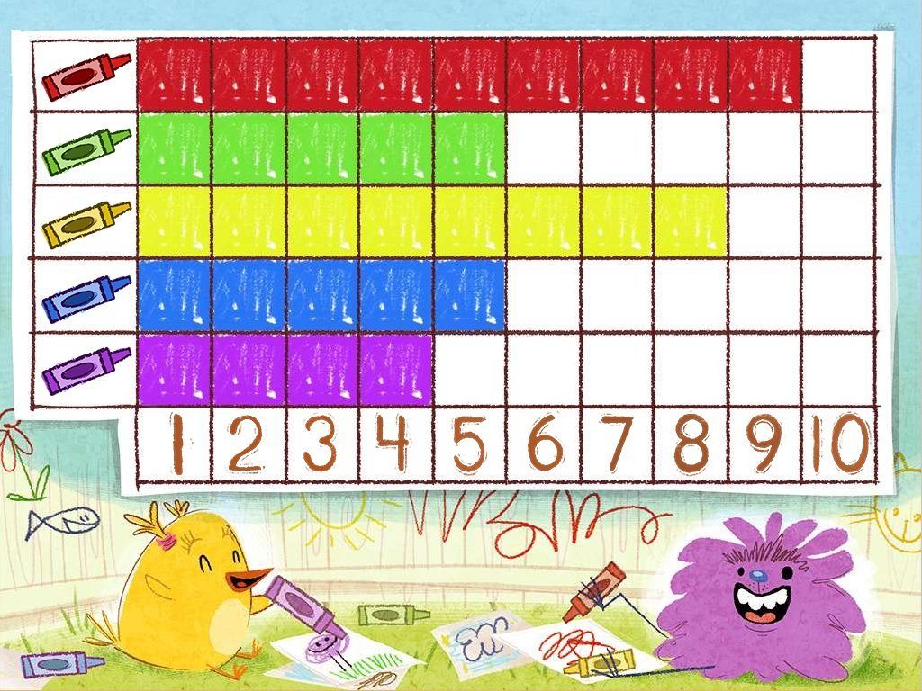
How many people voted for red as their favorite color?
a)
100
b)
2
c)
4
d)
9
3.
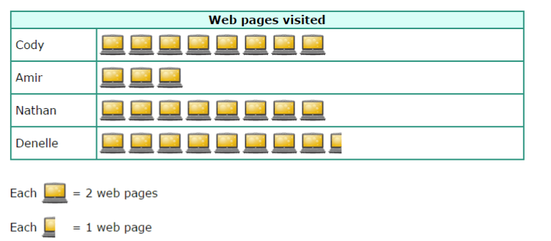
Who visited the same number of web pages?
a)
Cody and Amir
b)
Denelle and Nathan
c)
Cody and Denelle
d)
Cody and Nathan
4.
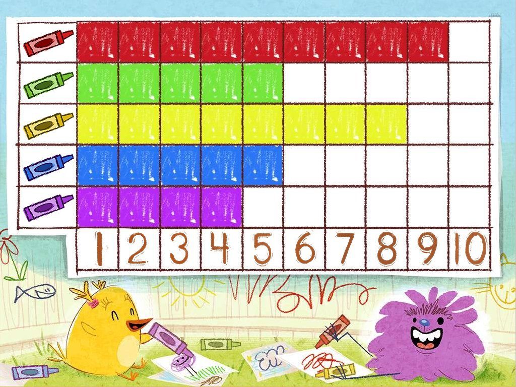
How many more people like red than purple?
a)
100
b)
10
c)
2
d)
5
5.

How many votes do math and reading have together?
a)
8
b)
6
c)
14
d)
3
6.

Which subject received the most votes?
a)
science
b)
reading
c)
social studies
d)
math
7.

How many students take the bus to school?
a)
35
b)
20
c)
10
d)
15
8.

Katie asked her friends their favorite food. Select the number of tally marks for Hot Dog.
a)
3
b)
4
c)
5
d)
6
9.

What would be a good title for this chart?
a)
Favorite Fourth Graders
b)
Fourth Graders' Favorite Foods
c)
Tally Chart of Results
d)
Number of Different Foods
10.

How many total votes were collected?
a)
5
b)
10
c)
15
d)
20
11.

Which insect did the fewest people choose?
a)
ladybug
b)
grasshopper
c)
bumblebee
12.
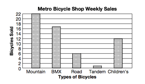
How many mountain bikes were sold?
a)
22
b)
28
c)
16
d)
6
13.

Who sold the least amount of cans?
a)
First Grade
b)
Second Grade
c)
Third Grade
d)
Fourth Grade
100 %

