
 Worksheets
Plotting Data on a Scatter Plot
Total questions: 25
Worksheet time: 18mins
Name
Class
Date
1.

What type of association does this graph have?
a)
positive
b)
negative
c)
none
d)
all of the above
2.

The following scatter plot shows Pam's training as she prepares to run a 6 mile race at the end of the month. Which of the following would be a reasonable approximation for the length of time it would take for her to run 6 miles?
a)
A. 50 min
b)
B. 80 min
c)
C. 45 min
d)
D. 60 min
3.

The scatter plot shows the relationship between the number of chapters and the total number of pages for several books. Use the trend line to predict how many chapters would be in a book with 180 pages.
a)
12 chapters
b)
15 chapters
c)
18 chapters
d)
21 chapters
4.
What type of correlation (association)?
The outside temperature and the amount of layers you wear.
The outside temperature and the amount of layers you wear.
a)
Positive correlation
b)
Negative correlation
c)
No correlation
d)
All of the above
5.
The number of siblings you have and your weight.
a)
Positive correlation
b)
Negative correlation
c)
No correlation
d)
All of the above
6.

Based on the graph, if Joe earned $400, how many hours did he work?
a)
25 hours
b)
35 hours
c)
45 hours
d)
15 hours
7.
As x increases, y increases
a)
correlation coefficient
b)
causation
c)
positive correlation
d)
negative correlation
8.

What is the correlation between length of running start and distance of jump?
a)
positive: the further you run the further you jump
b)
negative: the less you run the less distance of your jump
c)
positive: the further your running start the less your distance
9.

Find the slope for the trend line using points (2,2) and (4,3)
a)
2
b)
1/2
c)
-2
d)
-1/2
10.
A trend line that shows the most accurate relationship between x and y describes...
a)
linear regression
b)
no correlation
c)
trend line
d)
line of best fit
11.

Which scatter plot shows a linear relationship between x and y?
a)
Graph A
b)
Graph B
c)
Graph C
d)
Graph D
12.

What is the correlation?
a)
Negative correlation
b)
No correlation
c)
Positive correlation
d)
All of the above
13.
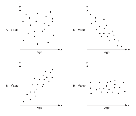
As the age of the car increases, its value decreases. Which scatterplot represents this relationship?
a)
A
b)
B
c)
C
d)
D
14.
If a scatterplot has no association then...
a)
...it has no ordered pairs
b)
...it has ordered pairs that have a negative pattern
c)
...its ordered pairs have no predictable pattern
d)
...if it makes a lion on a graph (roar!)
15.
Which choice best defines the term "linear function"?
a)
An equation that is the bomb diggity
b)
An equation that can be written in slope-intercept form
c)
An equation with an exponent in it
d)
An equation that has a slope but not a y-intercept
16.
In a scatterplot, an outlier...
a)
...is something we didn't learn 8th grade
b)
...is a puppet with a long nose named Pinocchio
c)
...is a point that is far outside the main cluster of points/ordered pairs
d)
...is a really naughty point who doesn't tell the truth when outside
17.

The scatter plot below shows the number of books read by students in Mrs. Hall’s English class and their final grades. Which statement represents the best description about the line of best fit?
a)
The more books students read, the lower their English grade.
b)
The more books students read, the higher their English grade.
c)
The fewer books students read, the higher their English grade.
d)
No relationship exists between the number of books students read and their English grades.
18.

Which of the following could be a possible line of best fit for the data?
a)
y = -5/2x + 20
b)
y = -x + 19
c)
y = x + 20
d)
y = 2/3x + 15
19.

a)
440 turtles
b)
40 turtles
c)
150 turtles
d)
90 turtles
20.

Which of the following could be a possible line of best fit for the data?
a)
y = 3x + 0
b)
y = 5/6x + 490
c)
y = -2x + 470
d)
non linear
21.

Describe the correlation in the graph shown.
a)
Strong Negative
b)
Strong Positive
c)
Weak Negative
d)
Weak Positive
22.

Describe the correlation in the graph shown.
a)
Strong Negative
b)
Strong Positive
c)
Weak Negative
d)
Weak Positive
23.
What is a line of best fit used for?
a)
To make predictions
b)
To make the graph look pretty
c)
To connect the points
d)
To make it look like you know what you are doing
24.
What is a scatter plot?
a)
A graph that shows the relationship of two data sets.
b)
A graph drawn using rectangular bars to show how large each value is.
c)
A graph that shows information that is connected in some way.
d)
A graph that shows data changing over time.
25.

Mrs. Collins made a scatterplot to show the relationship between the number of absences and a student’s final exam score. Based on this scatterplot, a student with 6 absences should get approximately what score on the final exam?
a)
65
b)
92
c)
70
d)
76
100 %

