
 Worksheets
Scatter Plots Lee
Total questions: 157
Worksheet time: 8hrs 16mins
JoBeth draws a scatter plot that shows as the outside temperature increases, sales at her lemonade stand increase. Which best describes the scatter plot?
The points show that as x-values increase, y-values increase.
The points show that as x-values increase, y-values decrease.
The points show that as x-values decrease, y-values stay the same.
The points show that as x-values decrease, y-values increase.
Which of the following best describes a scatter plot that shows no relationship between the x-values and the y-values?
As x-values increase, the points are higher on the graph.
As x-values decrease, the points are higher on the graph.
The points are scattered around the graph.
The points form a horizontal line.

Which statement best describes the relationship between time shopping online and the number of stores visited?
As the number of hours increases, the number of stores decreases.
As the number of hours increases, the number of stores increases.
The number of hours and the number of stores are about the same.
As the number of hours decreases, the number of stores increases.

How much time did the person who visited 3 stores spend shopping online?
2 Hours
10 Hours
4 Hours
3 Hours

Mr. Reynosa plans to shop online for 4 hours for two days in a row. What is a reasonable prediction of how many stores he will visit?
10
8
12
22

Molly collected data about the number of hours students studied and their scores on a test. The results are shown in the scatter plot. Which statement about the data is true?
As study hours increase, test scores decrease.
As study hours increase, test scores increase.
As study hours increase, test scores stay the same.
As study hours decrease, test scores increase.

Which is a reasonable prediction of a test score for a student who studied for 1/2 hour?
80
100
50
5

Which relationship could be represented by this scatter plot?
As the number of muffins in a box increases, the price increases.
As the speed of a car increases, the distance the car travels increases.
As the population of a city increases, the number of schools in the
city increases.
As the number of daylight hours increases, the number of night hours decreases.

As the area of a garden increases, what happens to the number of plants in a garden?
The number of plants decreases.
The number of plants stays the same
The number of plants increases faster.
The number of plants increases.

The outside temperature and the amount of layers you wear.


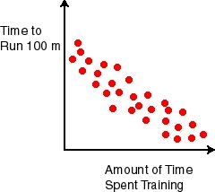


The outside temperature and the amount of layers you wear.
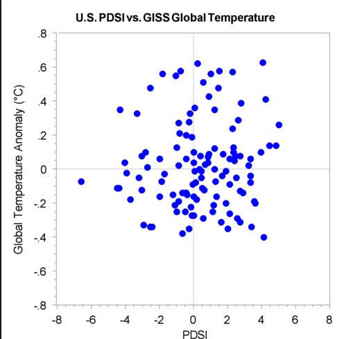


What type of correlation does this graph have?
Negative
no association
positive

Which sentence describes the relationship shown on this scatter plot?
As the temperature decreases, the visitors increase.
As the temperature increases, the number of visitors increases.
As the visitors increase, the temperature decreases.
No correlation
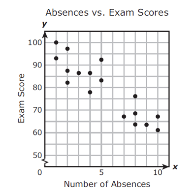
Mrs. Collins made a scatterplot to show the relationship between the number of absences and a student’s final exam score. Based on this scatterplot, a student with 12 absences should get approximately what score on the final exam?
60
92
70
76

Describe the correlation in the graph shown.
Strong Negative
Strong Positive
Weak Negative
Weak Positive

What type of correlation does this scatter plot show?
positive
negative
no correlation
nonlinear association

The scatter plot shows the relationship between the number of chapters and the total number of pages for several books. Use the trend line to predict how many pages would be in a book with 19 chapters.
150 pages
170 pages
190 pages
210 pages
The scatter plot shows the relationship between the number of chapters and the total number of pages for several books. Use the trend line to predict how many pages would be in a book with 19 chapters.
150 pages
170 pages
190 pages
210 pages

Based on the graph, if Joe earned $400, how many hours did he work?
25 hours
35 hours
45 hours
15 hours

Describe the correlation in the graph shown.
Strong Negative
Strong Positive
Weak Negative
Weak Positive

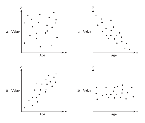
Which scatter plot show a positive relationship?
Graph A
Graph B
Graph C
Graph D

Based on the scatterplot, which of the following conclusions about the relationship between her height and weight is true?
There is a negative relationship between height and weight
There is a positive relationship between height and weight
There is a constant relationship between height and weight
There is no relationship between height and weight
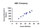
Estimate the correlation coefficient for this scatterplot.
r = 1.2
r = 0.89
r = 0
r = -0.89
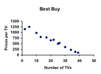
Estimate the correlation coefficient for this scatterplot.
r = -0.9
r = 1
r = 0.9
r = -1
r=-0.89
Strong positive
Weak positive
Strong negative
Weak negative
r=0.3
Strong positive
Weak positive
Strong negative
Weak negative
r=-0.89
Strong positive
Weak positive
Strong negative
Weak negative

What type of correlation does this graph have?
positive
negative
none
all of the above

The outside temperature and the amount of layers you wear.
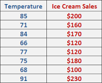



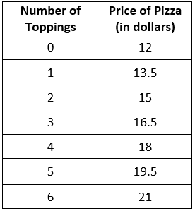


The temperature outside and the amount of ice cream sales.


is y= 1/2x +1. Use the equation to determine the amount of time it would take to bike 20 laps.
*Look at the x and y axis first before starting the problem


What is the equation of the line of best fit?
y = -25x + 170
y = -5/8x + 170
y = 25x + 170
y = 5/8x + 170

Which scatter plot shows both positive and non linear association?


Which of the scatter plots below shows a stronger association, and why?
Scatter plot B; it’s slope is positive.
Scatter plot B; it does not have any data points that are outliers.
Scatter plot A; it’s Slope is greater than B
Scatter plot A; it’s points of data are closer together than B.


JoBeth draws a scatter plot that shows as the outside temperature increases, sales at her lemonade stand increase. Which best describes the scatter plot?
The points show that as x-values increase, y-values increase.
The points show that as x-values increase, y-values decrease.
The points show that as x-values decrease, y-values stay the same.
The points show that as x-values decrease, y-values increase.

