
 Worksheets
Data and Graphing
Total questions: 20
Worksheet time: 20mins
When finding the median, what do you do if there are two middle numbers?
Add them together and divide by 2
Write them both as the answer
Find the value that is between the two middle numbers.
Pick one
What is the mode?
The average
The number that appears most often.
The largest number - the smallest number
The number in the middle.
To find the _________ you add up all the numbers and then divide by how many numbers you have.
Mean
Median
Mode
Range
Mary read six books in January, four books in February, and eight books in March. What was the mean number of books read each month? __________
18
6
14
A histogram shows the distribution of students' ages in a school. If the 10-12 age group has the highest frequency, what does this tell us?
Students aged 10-12 are the youngest.
Most students are aged between 10 and 12.
No students are older than 12.
Students aged 10-12 are the majority.
A line graph illustrates daily temperatures over a week. If the line peaks at 90°F on Friday, what does this mean?
The average temperature for the week is 90°F.
The temperature rose to 90°F on Friday.
Friday was the only warm day.
The temperature was 90°F all week.
A scatter plot shows the relationship between age and height of children. If older children are generally higher on the y-axis, what does this imply?
Older children are usually shorter.
Height decreases with age.
Older children are usually taller.
Age and height are not related.
A scatter plot illustrates the relationship between the number of hours played on video games and grades. If there is a downward trend line, what does this suggest?
Playing more video games leads to higher grades.
Playing more video games leads to lower grades.
There is no relationship between video games and grades.
Grades increase as video game hours decrease.
A scatter plot shows the relationship between hours studied and test scores. If there is a trend line going upwards, what does this suggest?
As study hours decrease, test scores increase.
As study hours increase, test scores decrease.
As study hours increase, test scores increase.
There is no relationship between study hours and test scores.
A histogram shows the scores on a math test. If the 70-79 range has the tallest bar, what does this indicate?
Most students scored between 70 and 79.
The test was out of 70-79 points.
One student scored between 70 and 79.
The average score was between 70 and 79.
A histogram displays the number of hours students spend on homework each week. If the 0-1 hour range has the smallest bar, what does this suggest?
No students spend 0-1 hour on homework.
Few students spend only 0-1 hour on homework each week.
Most students spend 0-1 hour on homework.
The data is incorrect.
A pie chart represents the types of books read by a class. If 30% of the chart is dedicated to fiction books, what does this percentage signify?
30% of the books are non-fiction.
30% of the students dislike fiction.
30% of the books read are fiction.
Each student reads 30 fiction books.
The number of miles that Kiki cycled each week for a 7-week period is shown:
36, 42, 28, 52, 48, 36, 31
What is the median number of miles Kiki cycled?
24
36
39
52
The mode score on the 6th grade math test was 94! Which of these interpretations must be correct?
99 was the highest score on the test.
More students received a 94 than any other score
No student scored below a 50
A score of 91 was slightly below average.
Lizzy had test scores of: 72, 94, 108, 60
What is the RANGE of her test scores?
12
72
48
98

What is the RANGE of this data
40
95
90
100
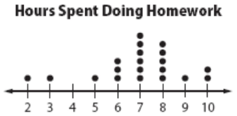
How many students spent 7 hours doing homework that week?
1
3
5
6

Identify the outlier of the data.
9
6
8
2

What is the shape of this data?
symmetric
skewed right
skewed left
uniform
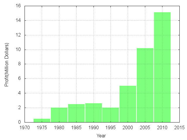
What is the shape of this bar graph?
Skew right
Skew left
Symmetrical
uniform

