
 Worksheets
Interpreting Scientific Graphs
Total questions: 25
Worksheet time: 25mins

What is this graph showing you?
The worlds population has been growing and will continue to grow
The worlds population was growing but now is decreasing
The worlds population is staying the same

What is the dependent variable on this graph?
Year
Number of Visitors
None of these

Mr. Swanson's science class used a thermometer to measure the outside temperature each day throughout the school year.
They used their results to make the graph below.
Which month had an average daily temperature of around 41 degrees?
May
April
December
March

What is the dependent variable on the graph (y-axis)?
Metro Bicycle Shop Weekly Sales
Bicycles Sold
Types of Bicycles
What is the purpose of interpreting graphs and charts in science?
To collect data
To form a hypothesis
To visually represent data and identify patterns
To conduct experiments
Why do we use graphs in science?
to record and display data
to show trends in data
to predict what will happen if we extend the experiment
all of these are correct

What type of graph do you see in the picture?
(a)
Which graph is best for showing the relationship between two variables?
Bar graph
Line graph
Pie chart
Histogram
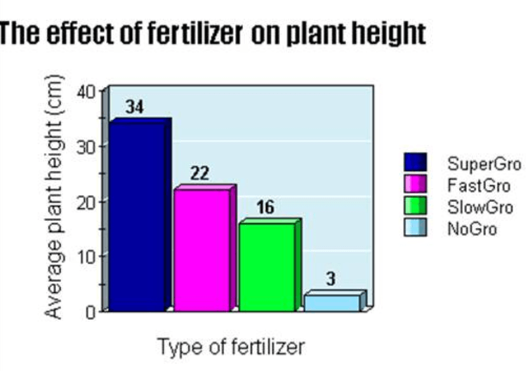
What is the independent variable?
Type of fertilizer
Average plant height
The effect of fertilizer on plant height
The effect of plant height on fertilizer

What is the BEST title for this graph?
The Relationship between Time Spent Studying and Test Grades
The effect of Time Spent Studying and Test Grades
Time Spent Studying
Test Grades

What is the best TITLE for this graph?
The effect of missed free throws on wins
The relationship between missed free throws and wins
Number of missed free throws
Number of wins

What is the general trend of this line graph?
The more you mow, the more money you make
The more you mow, the less money you make
You make the same amount of money regardless of how long you mow
What is the main advantage of using a line graph to represent scientific data?
To show the distribution of data
To compare different categories
To illustrate changes over time
To display parts of a whole
Which type of graph is most suitable for displaying the percentage composition of a mixture?
Line graph
Bar graph
Pie chart
Scatter plot
When interpreting a scatter plot, what does a positive correlation indicate?
As one variable increases, the other decreases
There is no relationship between the variables
As one variable increases, the other increases
The variables are inversely proportional
In a bar graph, what does the height of each bar represent?
The total number of data points
The frequency or value of the category
The average of the data set
The range of the data
What is the purpose of a trend line in a graph?
To connect all data points
To highlight the highest and lowest points
To show the general direction of the data
To separate different data sets
Which graph would be most appropriate to show the growth of a plant over time?
Pie chart
Line graph
Bar graph
Histogram
What does the slope of a line in a distance-time graph represent?
Speed
Distance
Time
Acceleration
How can outliers in a data set be identified using a graph?
By looking for data points that are far from the trend line
By finding the tallest bar in a bar graph
By identifying the largest slice in a pie chart
By calculating the average of the data set
What is the significance of the x-axis in a scientific graph?
It represents the dependent variable
It represents the independent variable
It shows the scale of measurement
It is used to label the graph
Why might a scientist choose a histogram over a bar graph?
To show changes over time
To display frequency distribution
To compare different categories
To illustrate parts of a whole
In a graph showing temperature change over a day, what would a flat line indicate?
Increasing temperature
Decreasing temperature
Constant temperature
Fluctuating temperature
What does a steep slope in a velocity-time graph indicate?
High acceleration
Constant speed
No movement
Decreasing speed
Which graph is best for showing the distribution of a single variable?
Line graph
Pie chart
Histogram
Scatter plot

