
Font size
 Worksheets
2/21: Scatter Plots and Data Unit Test
Total questions: 20
Worksheet time: 10mins
Which is a true statement about two numerical sets of data that have negative association?
As one variable increases, the other variable does not change.
As one variable increases, the other variable increases.
As one variable decreases, the other variable decreases.
As one variable increases, the other variable decreases.

Which of the following is NOT a true statement about scatter plots A and B?
Only scatter plot A shows negative association.
Neither scatter plot appears to have any outliers.
Scatter plot A has a stronger association than B.
Only scatter plot A shows linear association.

Write an equation in slope-intercept form for the trend line shown on the scatter plot below.
y=35x+40
y=−35x+40
y=−31x+40
y=31x+40

The scatter plot shows the number of days since several people filled their cars with gas and the gallons of gas in their tank. Which is the most reasonable estimate of the gallons of gas in a tank if it has been 3 days since filling up?
13 gallons
17 gallons
23 gallons
10 gallons
Which scatter plot shows both positive and linear association?


Which variables would the scatter plot shown be most likely to represent?
The number of siblings a person has and the person’s GPA
The number of guests at a hotel and the total water consumption
The total number of miles driven and the total gallons of gas used
The number of people at a concert and the total concession sales

The table shown shows the average temperature during the day and the number of snow cones sold for several days.
What type of graph would best represent this data?
Positive
Negative
None

The table below shows the average temperature during the day and the number of snow cones sold for several days. Which is true about the association seen in the data?
The association is positive and non-linear.
The association is positive and linear.
The association is negative and linear.
The association is negative and non-linear.

Are there any outliers in the data shown?
Yes; (93, 500) is an outlier since it is the greatest data point.
Yes; (66, 250) is an outlier since it is the lowest data point.
Yes; (88, 301) is an outlier since it does not fit the general trend of the data.
No; there are not any outliers in the data.
A scatter plot was made to show the number of homes in a town based on the year. A trend line was drawn on the graph with an equation of y = 84x + 625, where x is the number of years since 1995 and y is the total number of homes in the town. Predict the number of homes in the town in 2015. (Hint: how many years in between)
2,005 homes
2,425 homes
2,305 homes
2,185 homes
A scatter plot was made to show the number of homes in a town based on the year. A trend line was drawn on the graph with an equation of y = 84x + 625, where x is the number of years since 1995 and y is the total number of homes in the town. Predict the year the town had 1,213 homes.
2000
2002
2010
2015

Write an equation for the trend line shown on the scatter plot.
y=−5x+15
y=x+15
y=5x−15
y=5x+15
Use y=5x+15 to predict the weight of a suitcase for someone taking a 9-day trip.
The weight of the suitcase is 15 pounds.
The weight of the suitcase is 9 pounds.
The weight of the suitcase is 60 pounds.
The weight of the suitcase is 29 pounds.
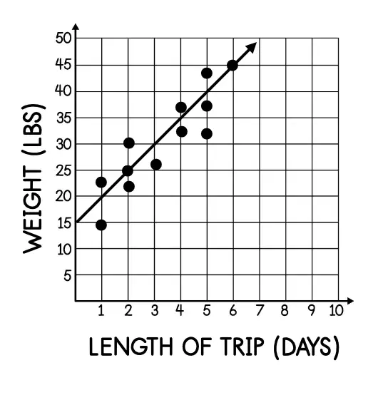
Which of the following is NOT a true statement about the scatter plot?
The association is positive.
The association is linear.
For every additional day of a trip, the weight of a suitcase increases 5 pounds.
For every 5 additional days of a trip, the weight of a suitcase increases one pound.
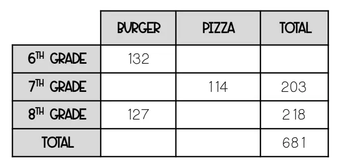
Which of the following is a true statement?
A total of 348 6th grade students ordered in the cafeteria.
Of the students in the 8th grade, 128 ordered pizza.
A total of 333 students ordered pizza.
Of the students in the 6th grade, 333 ordered pizza.

Which of the following ratios could be used to find the relative frequency of 8th grade students?
218127
681218
348127
681260
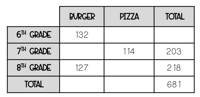
Of the 6th grade students, find the relative frequency of those who ordered pizza to the nearest percent.
51%
19%
23%
49%

Of the elementary school students, find the relative frequency of those who own a smart phone to the nearest percent.
24%
20%
30%
15%
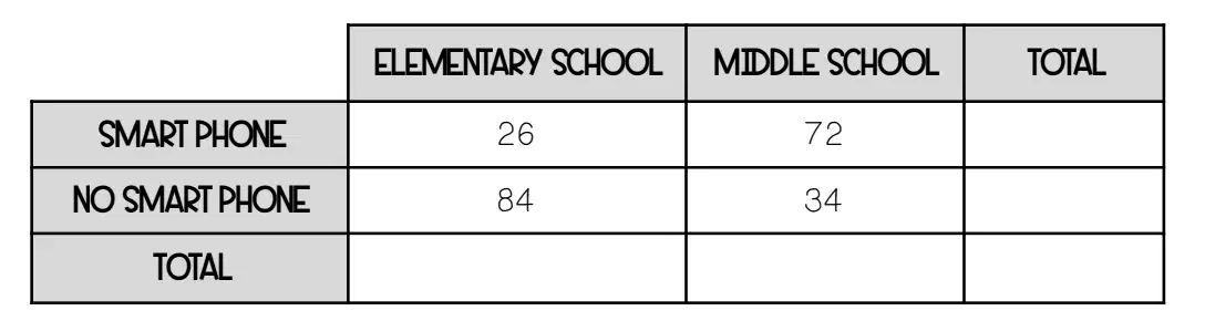
Of the middle school students, find the relative frequency of those who own a smart phone to the nearest percent.
68%
50%
75%
80%

Which of the following can you conclude from the two-way table?
A middle school and elementary school student are equally likely to own a smart phone.
An elementary school student is more likely to own a smart phone than a middle school student.
A middle school student is more likely to own a smart phone than an elementary school student.
There is no association between a student’s grade level and owning a smart phone.

