
 Worksheets
Monument Valley
Total questions: 14
Worksheet time: 12mins

What type of perspective is used in Monument Valley’s level design?
One-point perspective
Two-point perspective
Isometric perspective
Atmospheric perspective

Which of these best describes Monument Valley’s colour scheme?
Dark, moody, and high contrast
Soft, pastel, and atmospheric
Highly saturated with neon accents
Black and white minimalism

How does Monument Valley guide players through levels without using text?
It uses colour, light, and movement to direct attention.
It relies on pop-up instructions.
It lets players randomly explore with no direction.
It has a voiceover explaining each step.
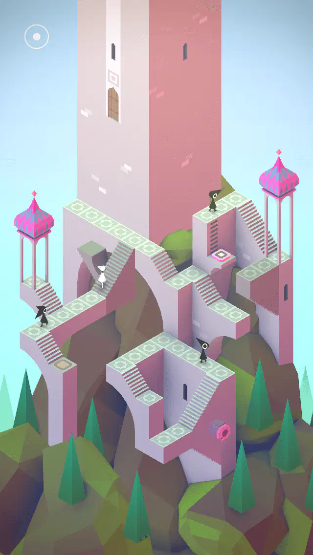
Monument Valley is inspired by the works of artist (a) , known for his impossible geometric illusions.

The game’s use of colour helps create an emotional atmosphere. Warm colours like red and orange suggest (a) , while cool colours like blue and purple create a feeling of (b) .

In isometric design, objects do not follow traditional perspective rules. Instead of converging towards a vanishing point, they remain at a constant (a) ° angle.
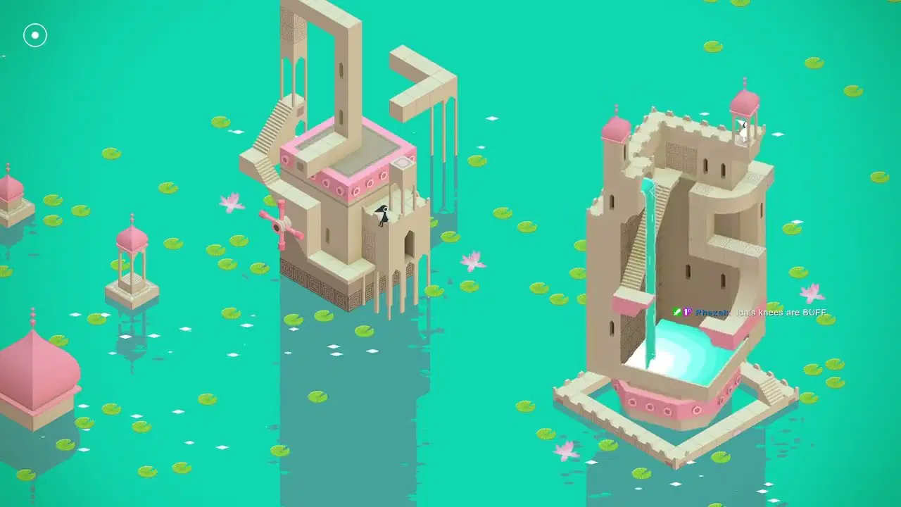
Match the following: Design Principle and Effect in Game
Minimalism
Creates a clean, uncluttered feel
Isometric Perspective
Helps maintain depth, no vanishing point
Optical Illusions
Allows for impossible structures
Colour & Lighting
Guides the player’s eye

Place the following design elements into the correct category:
Gradients
Symmetry
Soft Pastel Colours
Optical Illusions
High Contrast Shadows
Flat Colour Blocks
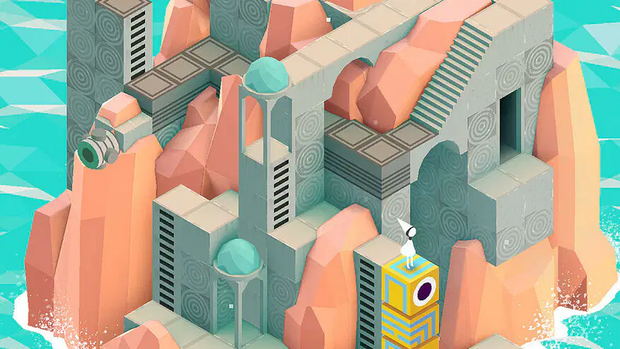
How does Monument Valley use negative space in its composition?
To create a sense of mystery and minimalism
To create a sense of love and romance
To create a sense of horror and fright
To create a sense of confusion and sickness

Monument Valley’s designs often use impossible geometry (like Escher-inspired illusions). Which of these is a key effect used to achieve this?
First-person perspective shifting
Realistic physics-based rendering
Optical illusion through isometric projection
Randomly generated environments
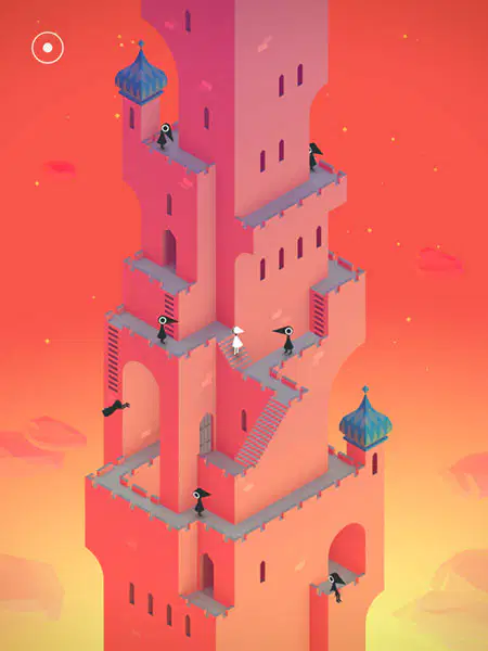
How does the game use colour psychology to guide players?
Only bright, saturated colours are used to grab attention.
Warmer colours (reds, oranges) indicate danger, while cooler colours (blues, purples) feel calm.
The colour scheme changes randomly with no meaning.
Dark colours are only used to hide level exits.
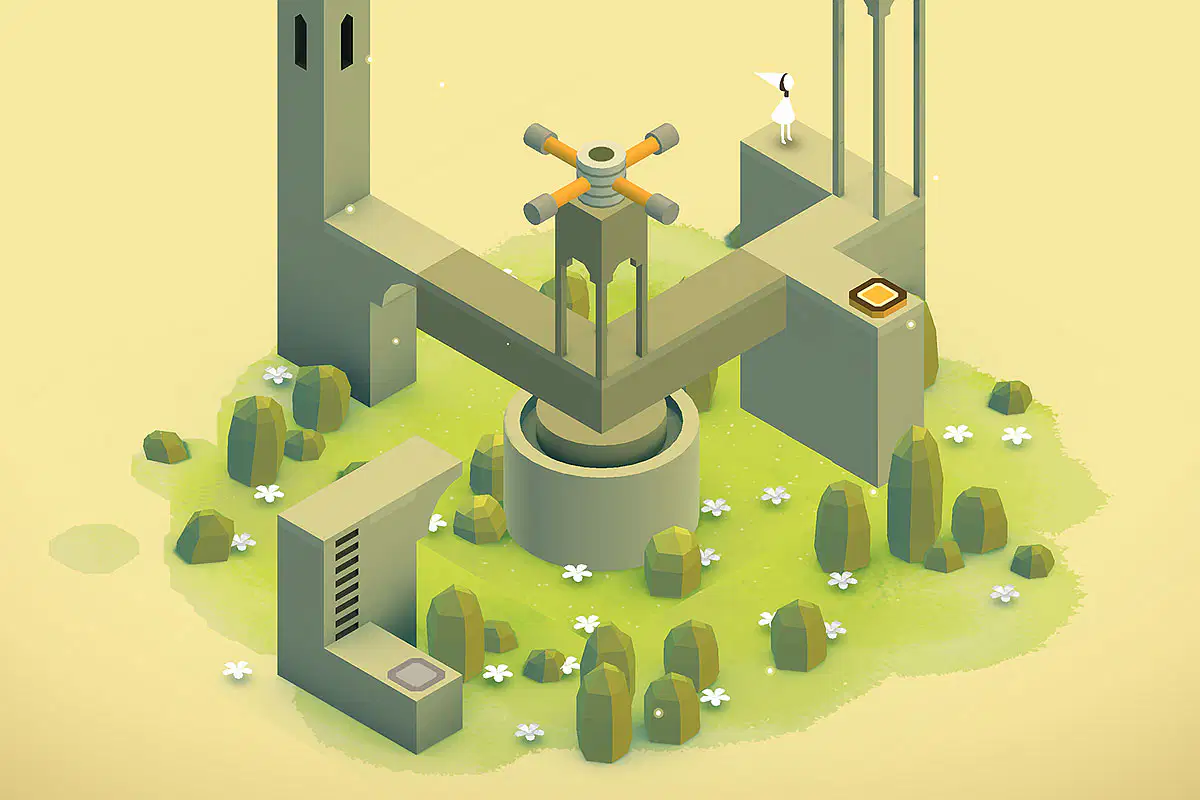
Monument Valley’s environments often feel surreal and dreamlike. Which design principle helps achieve this?
Heavy use of text and detailed backstory
Photorealistic landscapes
Clashing patterns and chaotic layouts
Symmetry and repetition

How does the game’s minimalist UI and typography affect the player experience?
It removes distractions so players can focus on the visuals.
It makes it harder to understand the game.
It forces players to read long tutorials before playing.
It hides all game mechanics, making the game confusing.
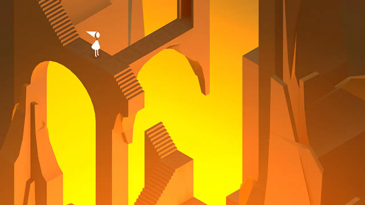
Monument Valley’s environments often feature floating structures and disconnected pathways. What emotion does this evoke in the player?
A feeling of frustration and stress
A sense of wonder and curiosity
A realistic and grounded atmosphere
A lack of engagement due to its simplicity

