
 Worksheets
[MATHS 5] Review Different kinds of graphs
Total questions: 25
Worksheet time: 34mins
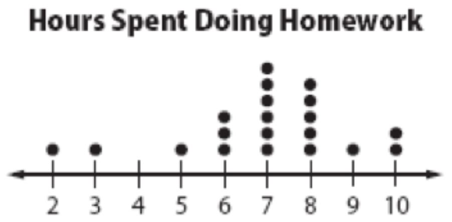

Students pushed toy cars to see how far they could roll. The table shows the number of cars that rolled different distances.
Which dot plot represents the data in the table?


The table shows the heights in inches of the students in Mr. Garrison's class.
Mr. Garrison made this dot plot to show the heights of his students. The dot plot is incomplete. What height in inches is missing a data point on the dot plot?
(a)


Students pushed toy cars to see how far they could roll. The table shows the number of cars that rolled different distances.
Which dot plot represents the data in the table?

How many people slept FEWER than 8 hours?
8
9
5
13

How many giraffes were less than 16 feet tall?
5
7
2
14

What is the highest number of goals that someone scored?
0 goals
7 goals
3 goals

The table shows the height of 10 seedlings. Which dot plot represents this data?


How many people have 4 or more pets?
8
3
6
4

Which relationship could be represented by this scatter plot?
As the number of muffins in a box increases, the price increases.
As the speed of a car increases, the distance the car travels increases.
As the population of a city increases, the number of schools in the
city increases.
As the number of daylight hours increases, the number of night hours decreases.

As the area of a garden increases, what happens to the number of plants in a garden?
The number of plants decreases.
The number of plants stays the same
The number of plants increases faster.
The number of plants increases.
How are the data points connected in a line graph?
By zigzag lines
By straight lines
By dotted lines
By curved lines
What type of graph is used to show the parts of a whole?
Pie chart
Bar graph
Scatter plot
Line graph
What is the purpose of using a scatter plot?
To show the relationship between two variables
To represent parts of a whole
To display trends over time
To compare different categories

What type of graph is the following.
bar graph
pie chart
scatter plot
line graph

What type of graph is this.
bar graph
line graph
pie chart
scatter plot

What type of graph is this.
bar graph
pie chart
line graph
scatter plot

What type of graph is this
bar graph
line graph
scatter plot
pie chart
Which type of graph is the easiest to identify lowest and greatest value?
bar graph
pie chart
line graph
scatter plot
Which type of graph is best for seeing changes over time?
scatter plot
line graph
bar graph
pie chart
Which type of graph uses ordered pairs?
scatter plot
bar graph
line graph
pie chart
Which of the following is best for comparing percentages?
bar graphs
line graphs
scatter plots
pie charts
The percentages on this chart add up to
100
41
82
99

Put these continents in order from largest to smallest.
Asia
Africa
North
America
Europe

