
 Worksheets
Boxplots, Misleading/Bias Graphs
Total questions: 45
Worksheet time: 3hrs 46mins

The graph represents the scores of four students in an examination. Tell whether the graph is misleading or not and why.
No, it represents the data clearly
Yes, because the vertical (y-axis) increases by 5% instead of by 1%
Yes, because the vertical (y-axis) does not start at 0

Do the two graphs plot the same data?
Yes
No

The graph shows the rainfall in October and November at some location. Is the graph misleading?
Yes, because the vertical (y-axis) doesn't start at 0
Yes, because it makes it look like November's rainfall is twice as much as October, but it isn't
Yes, because none of the other months are shown
No, it's not misleading since the vertical (y-axis) zero-break

Compare these two graphs. Why is the graph on the blue side misleading?
The baseline is not starting at 0
The scales on the y-axis are not consistent
The intervals on the y-axis scale are too large.
Using the wrong graph

Why would this data misleading?
The scale on the x-axis is not consistent
The scales on the y-axis are not consistent
Using the wrong graph

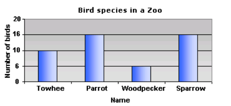
This graph represents the number of different types of bird species in a zoo. Why is it misleading?
broken scale
values on the y axis scale are not uniform (the same)
uneven spacing of values on the y axis
none of the above
Sort the following to the correct category ( misleading or not misleading graphs)


Sort the graphs below as Misleading and Not Misleading


What is wrong with this graph?
Not enough information.
The basketball ticket prices in 2001 were approximately 2 times as much as 1991, yet the size of the basketballs are about 4 times as big.
y axis scale is not uniform

7. The choir director in a high school wants to know how the students in the school feel about singing. If the director selects 100 girls and 100 boys to complete a survey, which method will result in a biased sample?
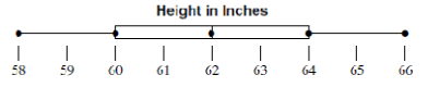
4. Which of the following lists all the five numbers needed to make a box plot?
Mean, Median, Mode, Range, and Total
Minimum, Quartile 1, Median, Quartile 3, and Maximum
Smallest, Q1, Q2, Q3, and Q4
Minimum, Maximum, Range, Mean, and Median
In order to find the median, the very first thing you must do is to..
find the difference between biggest and the smallest number.
find the middle number
list the numbers in order
find the most repeated number


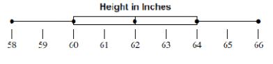

What is the range of homework assignments for class 2?
(a)
What is the IQR for class 1?
(a)

What do points B and D represent on the box plot?
Mean and Mode
Mean and Median
Least and Greatest Value
First and Third Quartiles

What amount of cupcakes makes up the middle 50% of the data?
16-22 cupcakes
12-32 cupcakes
22-28 cupcakes
16-28 cupcakes

Which statement is TRUE!
A
B
C
D

Which group has the greatest age?
Group A
Group B
They're the same.
You can't tell.

Which club has the smaller spread?
Cruisers
Car Hops
Neither, they are the same

The box-and-whisker plots shown below represent the salaries of employees at two different
companies.
What is the difference between the median salaries of the employees at the two companies?
$0
$500
$1000
$2000
The list below shows the most recent test scores for students in Mr. Garcia’s study group.
78, 90, 94, 72, 80, 68, 72, 88, 94, 98, 86, 96
Which box-and-whisker plot correctly represents the data in the list?


The mode of the data is found at which number?
0
10
3 & 5
6 & 7

If 60 values were used for the data, about how many data values are greater than the 1st quartile?
15
30
45
60

What percent of the data is between 30 and 35 on the number line?
25%
50%
75%
100%

What percentage of the data is between 40 and 90?
25 %
50%
75%
100%
What percentage of the data is between 90 and 140?
25 %
50%
75%
100%

The table shows the favorite activities of 200 students. What type of graph would be most appropriate to show the data as parts of a whole?
Bar Graph
Pie Chart
Line Graph
Histogram
Scatterplot
Identify the graph that is most appropriate to represent the amount of money spent on military over a period of time.
Bar Graph
Pie Chart
Line Graph
Histogram
Scatterplot
Which graph would be most appropriate to show the monthly rainfall of Virginia?
Bar Graph
Pie Chart
Line Graph
Histogram
Scatterplot
A _______ shows the number of values within an interval and not the actual values.
Dot Plot
Histogram
Bar Graph
Box Plot

Which graph is best display of data?
Bar Graph
Line Graph
Histogram
Pie Chart

