
 Worksheets
Circle Graphs
Total questions: 80
Worksheet time: 4hrs 33mins

The total percent of a circle graph is?
Equivalent to the biggest section
10%
1000%
100%

According to the following circle graph, what is the least favorite beverage?
Coffee
Cola
Water
Tea

Which table represents the data in the graph?


80 sixth grade students picked their favorite elective. Which is closest to the total number of students that picked band and choir?
80
4
40
20

If 200 people were surveyed, approximately how many people like pepperoni and cheese as their topping?
100 people
150 people
50 people
75%

Which graph matches the table of values (not percents)?


Which bar graph matches the circle graph?


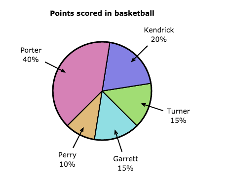


Which graph below shows the same information as this circle graph?


Look at both graphs, select all that you can tell from looking at both graphs.
How many people voted
What subject got the most amount of votes
How many more voted science than math
That the survey is about students' favorite subject
How many people picked math
What can we conclude by looking at both graphs?
Math got the most amount of votes
Math got no votes
More people like reading than history
Science is the least popualr

Which graph below shows the same information as this circle graph?


Look at both graphs, select all that you can tell from looking at both graphs.
Which two colors tied
What color got the least amount of votes
How many people voted
That the survey is about people's favorite color
That red more than doubled other

What can we conclude by looking at both graphs?
Green got double the votes of red
Yellow and blue tied
More people liked green than yellow and other combined
Red was the favorite color

Which circle graph below, matches this pictograph?


What can you tell by looking at both graphs below?
That apple and bananas tied
That apple and cherry tied
How many people voted
What fruit was collected the most
That this shows how many fruits were collected
Which statement is true based on the information in these graphs?
The fruit was collected over a week
The apple got collected the most
This is a survey about favorite fruits
Bananas got collected the most

What can you tell by looking at both graphs below?
Art, Drama and Chess have the same amount of members
Hobby and Writer's club have the same amount of memembers
Math Club has more than double the amount of members as Chess club
What club has the most memebers
How many students are in clubs after school

Which statement is true based on the information in these graphs?
People voted for their favorite hobby
More people are in Art Club than Drama Club
More people are in Art Club than Chess Club
Sports Club has the most amount of memebers

Which circle graph matches this pictograph?


Which circle graph matches this line plot?


Which statement is true based on the information in these graphs?
Basketball and baseball tied
Soccer got the third most amount of votes
Football was the second favorite sport
Baseball got the third most amount of votes

What can you tell by looking at both graphs below?
Basketball and Baseball tied
Soccer and football tied
Hockey got zero votes
What sport has the most votes
How many people voted for their favorite sport

Which circle graph matches this line plot?


Which statement is true based on the information in these graphs?
Apples, grapes and other tied
Banana and Oranges got exactly half the votes
Other and grapes tied
Other and apples tied
Which statements can be found by looking at both graphs?
Banana and oranges tied
How many people voted
Other and grapes tied
How many more people voted for apples than grapes
Oranges got 21 votes

The graph shows after-school activities students report doing most often. How many students spend time in an after school activity other than homework?
18
86
104
71
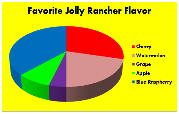
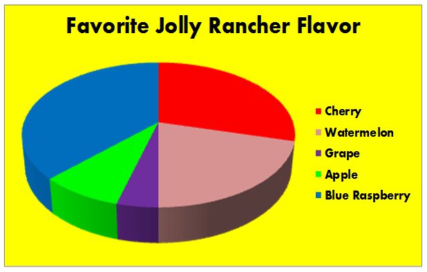
According to this graph, Blue Raspberry is the most popular flavor of Jolly Rancher?
True
False

There are 300 seventh graders, 75 students prefer choir.
True
False

Based on a recent survey of 500 students, the circle graph below shows how students communicate
with friends.
150 more students chose social media apps than phone calls to communicate with friends?
True
False

The cafeteria manager took a poll of 150 students to find the most popular lunch. The circle graph below displays the data.
24 more students chose spaghetti and pizza than corn dogs, tacos, and cheeseburgers as their favorite lunch?
True
False
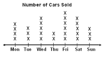
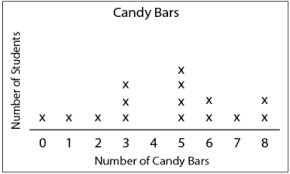


How many strawberries does Ed have?
2
20
6
4

How many people voted for pepperoni as their favorite pizza?
6
15
30
20

How many apples were sold in January?
1
10
5
7

What type of graph is this?
Bar Graph
Line Plot
Pictograph
Tally Chart

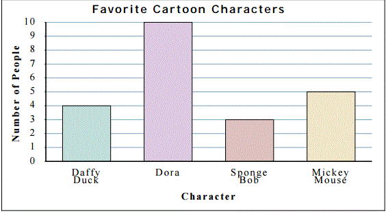


1) Mr. Johnson surveyed 24 students from his class. He asked each student to rate a television show. The circle graph represents the results from the survey. Which fraction best represents those who rate the show as "above average"?


2) Sara spent $15 each week for 10 weeks. The circle graph represents how Sara spent her money on five different types of items. Based on this graph, which appears to be the closest to the amount of money Sara spent on music and snacks?
$40.00
$60.00
$70.00
$80.00

7) The 6th grade class held elections for class president. The results are shown in the bar graph. Which circle graph best represents the same data set?


8) Lara has a bookcase in her room that is filled with various types of books. The graphs represent the data. Which type of book belongs in the box provided?
Fantasy
Math
Comic
Geography

10) The circle graph represents the ages of 32 people enrolled in an aerobics class. Select all the true statements.
25% of the people are between the ages of 20-29.
Half of the people are between 30-39 years old.
There are more people between the ages of 50-59 than 30-39.
16 people are between the ages of 40-49.
25% of the people are between 50-59 years old.


A
B
C
D

F
G
H
J

A
B
C
D

Which table represents the same data shown in the graph?


What is the title of the circle graph?
Sea cumbers
Kinds of echinoderms
Sea urchings and sand dollars
Seal lillies

HOW MANY of the 30 people said they did not own pets?
50%
15
10%
3

How many total people were surveyed?
6
4
10
20

What percent of total people surveyed liked Romance Movies?
1 out of 20; 5%
6 out of 20; 30%
4 out of 20; 20%
5 out of 20; 25%

How many more people liked sci-fi than drama?
3
1
4
5

What are the total number of balls for the sports?
(a)
Which table represents the data in the graph?
Which graph matches the table of values (not percents)?

Which circle graph best represents the same set of data as the bar graph?


Which bar graph matches the circle graph?
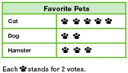
What fraction of votes did the hamster get?
6/10
3
6/20
30%
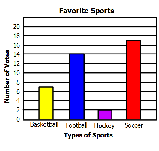
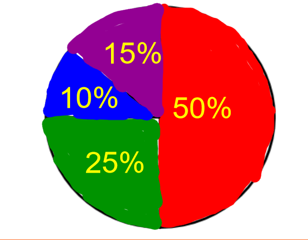
What percentage of students like hockey? (purple)
5%
50%
2%
0.05%
The total percent of a circle graph is?
Equivalent to the biggest section
10%
1000%
100%
A Title and a Key

