
Font size
 Worksheets
HGD MIXED PRACT-WRITTEN EXAM
Total questions: 113
Worksheet time: 1hrs 20mins


The line upon which letters sit.
baseline
x-height
cap-height

The height of a capital letter above the baseline for a particular typeface.
baseline
x-height
cap-height

The distance between the baseline and the upper part of lowercase letters that don’t have ascenders.
baseline
x-height
cap-height
Which of the following best represents the horizontal stroke connecting two vertical strokes?
Ascenders
Stem
Crossbar
Cross stroke
The dot above a lowercase “j” or “i” is called which of the following?
Swash
Tittle
Eye
Spur
Serif fonts are best used for
professional documents or publications like a resume or article.
anything on a computer screen.
old people.
nothing, they are outdated.
Sans serif fonts
have little lines or "tails" at the beginning and ends of the letters.
do not have the little lines or "tails."
are very decorative and fancy.
look like cursive letters.
Display fonts are best used for
professional documents like a resume or article.
documents on a computer screen.
small amounts of text like a title or header.
anywhere you want to use them.
Which image shows a serif font?


Which image shows a display font?


It controls the amount of space between lines of type.
Tracking value
Horizontal Scale
Kerning
Leading
It specifies the overall space between letters, which affects the density in a line of text.
Leading
Tracking value
Horizontal Scale
Vertical Scale
The space located between individual letters of a word
Aperture
Tracking
Kerning
Leading
The style or appearance of text is known as
Codicology
Fontology
Graphic Design
Typography

The best typeface to use for paragraphs in a book is _________.
serif
sans serif
script
ornamental
Setting all the text to start at the same point on the left side is the use of ____________.
contrast
alignment
proximity
repetition


The space between the lines of text or Paragraphs
-Example-
This First line is separated from
the second line.
X Height
Baselines
Kerning
Leading

The space located between an entire word.
(E x a m p l e)
X Height
Tracking
Kerning
Leading
It is the variation of weights of a typeface.
Font
Typeface
Typography
Font style
Which of the following is not considered as the anatomy of type?
Ascender Height
X-height
Cap height
Base Height
Letters that go above x-height
descenders
x-height
y-height
ascenders
What is typography?
Typography is the art of arranging type to enhance readability and visual appeal.
Typography is the process of creating animations.
Typography refers to the use of images in design.
Typography is the study of color theory.
List three key elements of typography.
Color contrast
Image resolution
Font choice, spacing, alignment
Text length
Why is typography important in design?
Typography is only about choosing pretty fonts.
Typography is important in design because it affects readability, establishes hierarchy, and conveys tone.
Typography has no impact on user engagement.
Typography is irrelevant in digital design.
What role does font choice play in typography?
Font choice has no impact on user experience.
Font choice only affects the color of the text.
Font choice is irrelevant to design aesthetics.
Font choice significantly impacts readability, tone, and branding in typography.
Define leading in typography.
Leading is the vertical space between lines of text.
Leading is the size of the text in points.
Leading is the horizontal space between characters.
Leading refers to the font style used in text.
What is kerning and why is it important?
Kerning is the adjustment of space between characters in typography, and it is important for improving readability and visual appeal.
Kerning is the process of changing the color of text in design.
Kerning is the alignment of text to the left or right margin.
Kerning refers to the size of the font used in a document.
Explain the difference between serif and sans-serif fonts.
Serif fonts have decorative strokes; sans-serif fonts do not.
Serif fonts are more modern than sans-serif fonts.
Serif fonts are used only for headings; sans-serif fonts are used for body text.
Serif fonts are always italicized; sans-serif fonts are not.
How does typography affect readability?
Readability is solely determined by content length.
Typography has no effect on readability.
Typography only affects the aesthetic appeal of text.
Typography significantly impacts readability by influencing how easily text can be processed and understood.
What is the purpose of white space in typography?
To create a distraction for the reader.
To reduce the overall size of the text.
To fill empty space with unnecessary elements.
The purpose of white space in typography is to enhance readability and visual organization.
Describe the impact of typography on branding.
Typography is only important for print media.
Typography is solely about font size and color.
Typography has no effect on branding.
Typography significantly impacts branding by shaping perception, enhancing recognition, and conveying the brand's personality.
Is a career in which people produce visual materials to convey messages.
Photograpy Design
Adobe Photohshop
Graphic Design
Adobe Indesign
Probably one of the most widely known types of graphic design
MARKETING AND ADVERTISING DESIGN
PUBLICATION DESIGN
ENVIRONMENTAL DESIGN
CORPORATE DESIGN
This specific type of design focuses on the structure and logic of the design elements that users interact with.
MOTION DESIGN
UI DESIGN
PACKAGING DESIGN
UX DESIGN
They are visual communicators and problem solvers.
GRAPHIC DESIGNER
PHOTOGRAPHER
FASHION DESIGNER
PROGRAMMER
SOFTWARE ENGINEER
Pertains to the interactive elements of a design.
User Experience Design
User Interface Design
Web Design
Packaging Design
Is the use of visual elements in environments to connect people to those places.
Packaging Design
UI Design
Environmental Design
Web Design
The most basic of the design elements.
Shape
Size
Space
Line
Refers to how things look like they’d feel if they were to be touched.
Shape
Texture
Line
Color
These areas include any distance or areas between, around, below, or above other design elements.
SHAPE
Line
Color
Typography
DO YOU NEED A FANCY COMPUTER WHEN STARTING OUT IN THE GRAPHIC DESIGN FIELD?
YES
NO
This Element one of the most basic visual elements of design, an be straight, curved, thick, thin, solid or dashed.
A. Color
B. Shape
C. Line
D. Size
The art, profession, and academic discipline whose activity consists in projecting visual communications intended to transmit specific messages to social groups, with specific objectives.
A. Programs in making Design
B. Graphic Design
C. Elements
D. Principles
Plays one of the biggest roles in graphic design, it can create impact and create specific look and feel in a piece of graphic design work.
A. Space
B. Texture
C. Line
D. Color
It is the way the surface feels or perceived to feel texture is used to create a visual tone, it can influence the look and feel or a piece of graphic design work.
A. Texture
B. Color
C. Line
D. Space
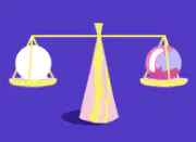
Refers to the distribution of the graphic design elements, such as shapes, text boxes, and images, of a design evenly throughout a certain layout.
A. Contrast
B. Hierarchy
C. Alignment
D. Balance
What is the type of element that it can be used as decorate, it can be symbolic and can be use patterns and texture.?
A. Space
B. Color
C. Shape
D. Lines
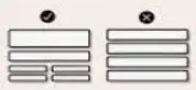
This method combines two aspects, dominance and priority, giving extra weight to certain elements of a design over others.
A. Alignment
B. Hierarchy
C. Contrast
D. Balance
It helps
develop a sharp and ordered appearance by eliminating any distortion within the layout.
A. Rythm
B. Contrast
C. Balance
D. Alignment
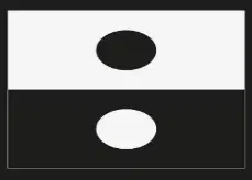
It is an important principle in any form of visual art as it guides the customer’s attention to the key elements of a design.
A. Contrast
B. Proximity
C. Hierarchy
D. Alignment
__________helps in decluttering the overall design by creating a relationship between related elements.
A. Hierarchy
B. Contrast
C. Balance
D. Proximity
What are the five basic design principles?
Balance, Contrast, Emphasis, Movement, Unity
Color, Shape, Line, Space, Pattern
Hierarchy, Alignment, Repetition, Variety, Depth
Symmetry, Texture, Rhythm, Scale, Proportion
Define contrast in design and give an example.
Using red text on a blue background.
Using the same color for text and background.
Using a gradient background with similar colors.
An example of contrast in design is using white text on a black background.
What is the importance of alignment in layout design?
Alignment improves organization, readability, and visual appeal in layout design.
Alignment is primarily about color choices in design.
Alignment is only important for text-heavy designs.
Alignment has no effect on user engagement.
Explain the difference between serif and sans-serif fonts.
Serif fonts are always italicized; sans-serif fonts are not.
Serif fonts have decorative strokes; sans-serif fonts do not.
Serif fonts have a uniform thickness; sans-serif fonts vary in thickness.
Serif fonts are used for digital screens; sans-serif fonts are for print.
What does the term 'leading' refer to in typography?
The alignment of text on the page.
The size of the font used in the text.
The vertical space between lines of text.
The color of the text in a document.
How does the rule of thirds apply to composition?
The rule of thirds is only applicable in portrait photography.
The rule of thirds suggests placing all subjects in the center of the frame.
The rule of thirds is a guideline for choosing camera settings.
The rule of thirds enhances composition by guiding the placement of subjects for a more dynamic and engaging image.
What is white space and why is it important in design?
White space is the empty space in design that enhances readability and visual hierarchy.
White space is the text used to fill gaps in a design.
White space is the color used in design to attract attention.
White space is the decorative elements added to a design.
Describe the concept of hierarchy in layout design.
Hierarchy is the use of color to create a uniform design.
Hierarchy refers to the physical size of elements in a layout.
Hierarchy involves random placement of elements without any order.
Hierarchy in layout design is the organization of elements to indicate their importance, guiding the viewer's attention.
What are the primary colors in design theory?
Red, Blue, Yellow
Black, White, Gray
Cyan, Magenta, Yellow
Green, Orange, Purple
How can typography influence the mood of a design?
Typography is only about font size and style.
Typography has no impact on design mood.
Typography can evoke different emotions and set the tone of a design.
Typography is irrelevant to visual communication.

in Graphic Design, which of these comes first?
The problem or need
The idea
The sketch
The prototype/draft
The polished copy/proof

In Graphic Design, which of these comes first?
A rough copy of the finished drawing
A big pile of sketches
Illustrator artwork
Tons of ideas, both good and bad.
Colour PRINTERS and PRESSES generally MIX THESE COLOURS
together to make any colour.


None of these are correct.

In this phase of the Design Process, you gain a deep personal understanding of what the client wants. You have to really engage with people to do this right!
Empathy Phase
Ideation Phase
Prototype Phase
Testing Phases
Defining Phase

In this phase of the Design Process, you gather your observations together and decide EXACTLY what the problem is.
Empathy Phase
Defining Phase
Ideation Phase
Prototype Phase
Testing Phase

In this phase of the Design Process, you generate as many ideas as you can, trying hard to "think outside of the box."
Empathy Phase
Defining Phase
Ideation Phase
Prototype Phase
Testing Phase

When you reach THIS STAGE of the Design Process, you are completely done the Design Process
Prototype Phase
Testing Phase
It's a trap! The Design Process NEVER ends.
Getting Paid Phase
The Design Process is only really appropriate for Graphic Design?
Yes.
No, it can be applied to ANY kind of design or creation.
It can be applied to any technical or construction design, but does not really apply to artistic design like writing.
This question is a trap for some reason.

Which stage of the Design Process are you pretty sure you have already used?
Empathy Phase
Defining Phase
Ideation Phase
Prototype Phase
Testing Phase

Who would win a fight between Spiderman and Batman
Clearly Spiderman.
Batman of course.
It would be a stalemate.
Spiderman and Batman would team up and punch the cr*p out of Aquaman.

In Graphic Design, which comes first?
Final Print Ready Proof
A whole bunch of ideas
Finding out what the client really wants
A polished draft to show the client.


