
NEW
Font size
 Worksheets
Circle Graphs
Total questions: 15
Worksheet time: 1hrs 22mins
Which method would be most appropriate to collect data on students' favorite school subjects?
Conducting a survey
Performing an experiment
Making observations
Reading a textbook
Formulate a question that would require collecting data to create a circle graph about students' favorite ice cream flavors.
What is the most popular ice cream flavor in the world?
How many students prefer chocolate, vanilla, or strawberry ice cream?
Why do students like ice cream?
How is ice cream made?
What is a key factor to ensure that the data collected from a survey about students' favorite sports is representative of the entire school?
Surveying only the basketball team
Including students from different grades and classes
Asking only the teachers
Surveying during a sports event
After creating a circle graph of students' favorite colors, what can you conclude if the largest section is blue?
Blue is the least favorite color
Most students prefer blue
No students like blue
Blue is equally liked as other colors

Which table represents the data in the graph?


Which circle graph best represents the same set of data as the bar graph?


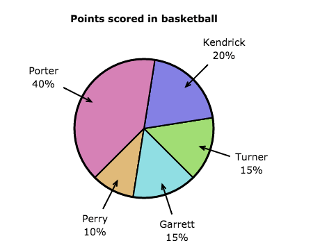


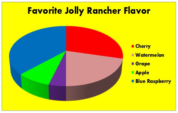


Which table represents the data in the graph?

Which table represents the same data shown in the graph?



