
Font size
 Worksheets
Graphic Design 101
Total questions: 21
Worksheet time: 11mins

What's wrong with this design?
Color palette is too minimal
Not enough use of white space
Too much contrast
Text is too large
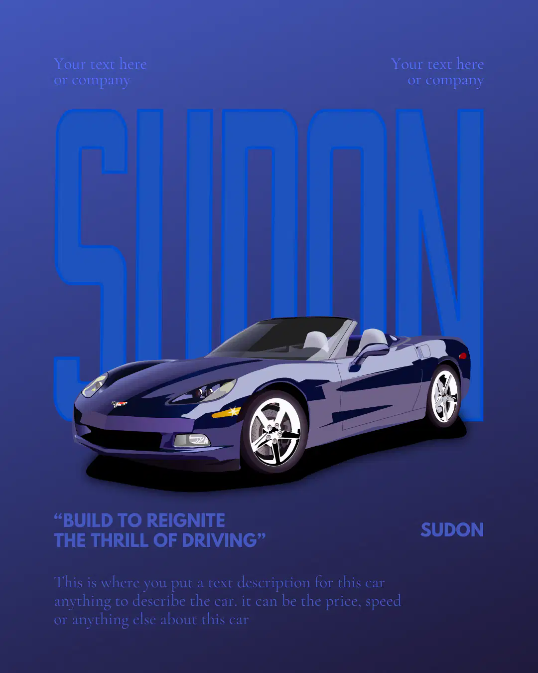
What's the issue here?
Poor color contrast
Too much spacing
hierarchy
High saturation

Why is this hard to read?
No visual hierarchy
Too many icons
Too much white space
Too little color

What principle is ignored here?
Alignment
Font choice
Color harmony
Use of icons

What’s the emotional problem here?
Font is too bold
Inappropriate color mood
Too little white space
Visual clutter
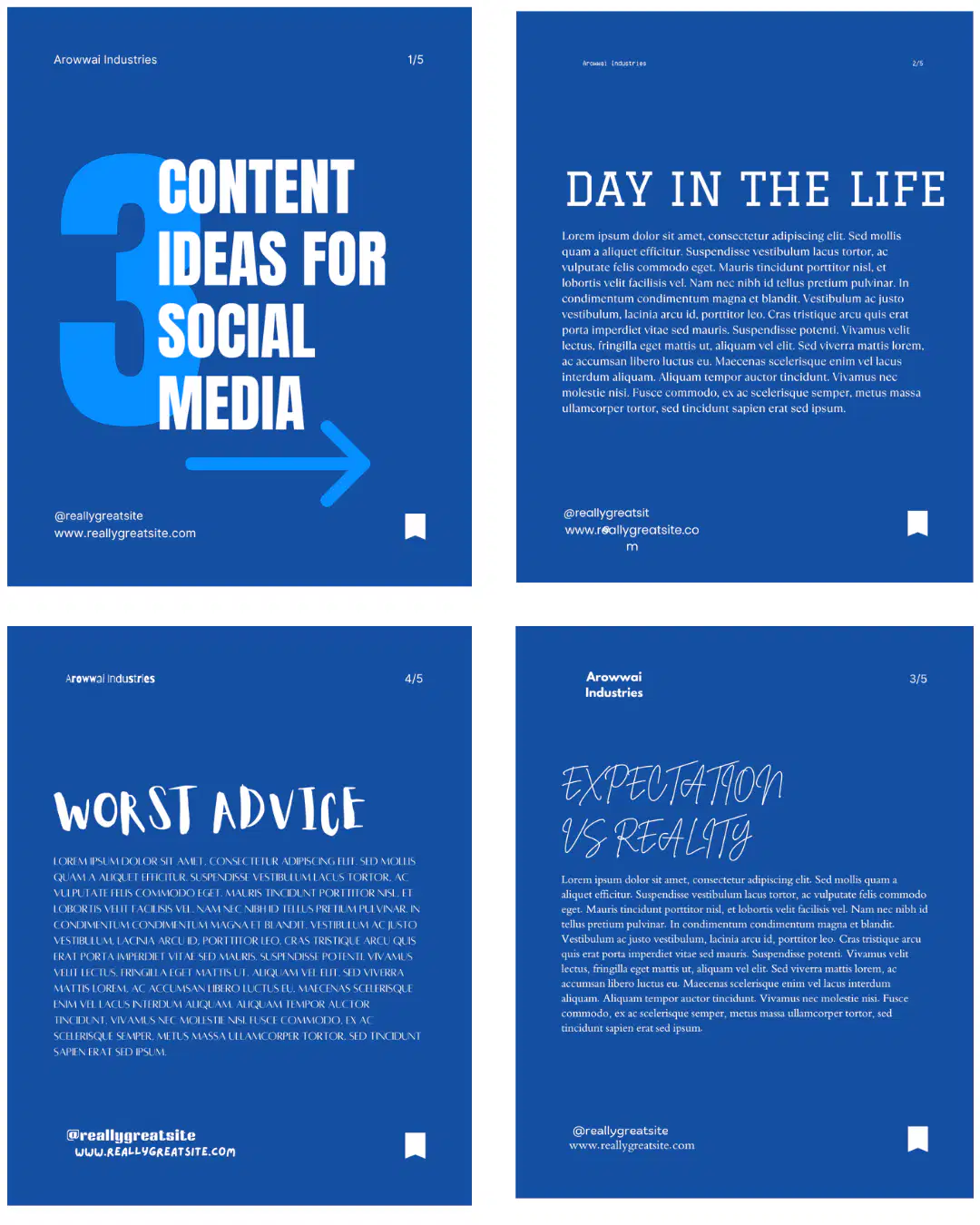
What design principle is missing?
Inconsistency
Too much white space
Repetition
Misused icons

What is the issue here?
Wrong alignment
Overuse of color
Too much white space
Minimalism

Why is this design confusing?
Too many icons
Poor text hierarchy
Too few colors
Spacing too wide

What’s off with this layout?
No alignment
Wrong font
Bad image quality
Too many shapes

What’s the key issue here?
Too many icons
Wrong platform
Ineffective use of negative space
Lack of data catagorization

Why is this unreadable?
Too much padding
Minimal font usage
Low controst between colours
Too much whitespace

What’s wrong here?
Balance
Color emotions
Too much white space
lack of consistency
What does 'visual hierarchy' help a viewer do?
Recognize colors faster
Understand what information to look at first
Align text correctly
Group images by theme
In color theory, what are 'tints'?
Colors mixed with black
Colors mixed with white
Colors mixed with gray
Pure hues on the wheel
What does ‘alignment’ ensure in a design?
Colors are consistently vibrant
Elements line up in a clean, organized way
Text is readable at all sizes
Icons match the layout
What principle is used to help viewers follow a consistent visual structure across slides or designs?
Repetition
Alignment
White space
Grid balance
Why is color psychology important in design?
To create 3D effects in 2D images
Because colors influence emotion and perception
To reduce printing costs
To pick a consistent brand font
What is the most effective way to apply hierarchy using typography?
Use the same font style throughout
Capitalize every letter
Change font size, weight, colour or spacing
Underline all headings
What is the purpose of using a grid layout in graphic design?
To choose the color palette for a project
To organize content into consistent and aligned sections
To add texture to background images
To reduce the file size of a design
What is the main function of a design brief?
To clarify the project’s objective, audience, and tone
To choose the final font and color
To layout the design elements
To create a mood board
What is the primary purpose of graphic design?
To make something look nice
To visually communicate messages clearly and effectively
To create content using only shapes and icons
To decorate a space using digital tools

