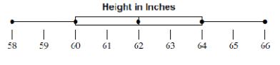
Worksheets
Unit One: One Variable Data
Total questions: 75
Worksheet time: 4hrs 45mins
Interquartile Range or IQR is a measure of variability and helps determine the spread of the data.
True
False

The total number of data values in this histogram is...
11
7
4
15
25

What is the interquartile range for the Checkers Club?
4
5
10
11

The minimum temperature for Reybold is lower than the minimum temperature for Picktown.
The median for Reybold and Picktown are equal.
The first quartile for Reybold is greater than the first quartile for Picktown.
Picktown has a greater interquartile range than Reybold.
The data set below has an outlier of 42.
2, 5, 12, 15, 19, 4, 6, 11, 16, 18, 12, 12, 42
What effect does removing the outlier have on the distribution of the data?
The mean will decrease
The median will decrease
The mean will increase
The median will increase
2, 3, 4, 5, 5, 7


What is the value of the upper quartile (Q3)?
3
8
10
15


Finding the mean in data is most like finding
The middle number
The average
The number most frequently occurring
The first number you get
Find the average of these three numbers: 3, 2, 4
2.5
3
4
3.5

Use the bar graph to rank the students’ favorite sports from greatest to least.
Soccer, softball, basketball, other
Other, basketball, softball, soccer
Soccer, basketball, softball, other
Other, softball, basketball soccer


Science: _________ Math: __________


Cars: skewed left
Cars: Skewed left

The double dot plots show the average wait times in minutes for two popular rides at an amusement park. Compare the measures of center and variation, which ride typically has a longer wait time?
No inference can be made from the graph.
Topsy Turvy
The wait times are the same for both rides.
Rocket Blast

What is the spread of the data?
2
1
4
12
What is the mode of the data?
2
1
4
12
What is the median of the data?
2
1
3
12
What is the mean of the data? (0's still count as numbers)
2.1333...
32
15
2.46

Kendra earned money by babysitting for 4 months.
In which month did she make the most money?
September
October
November
December
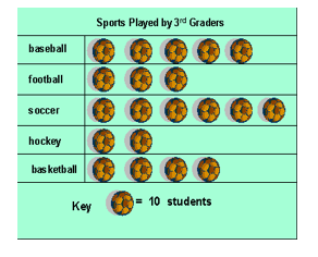
How many students liked basketball?
(a) students

How many students like soccer and softball?
(a) students
How many students like soccer and softball?
9
4
13
15

According to this graph, how many people own a dog?
8
11
6
3
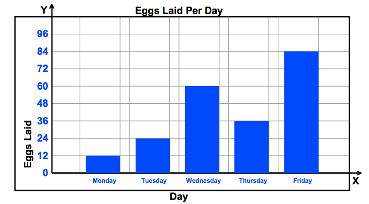
How many more eggs were laid on Friday than Wednesday?
84
36
24
60

Based on the graph, what percent of the books checked out was adventure or science fiction?
50%
62.5%
75%
80%

Which two teachers together received the same number of votes that Ms. Lopez received?
Mrs. Gomez and Mrs. Jones
Mr. Lang and Mr. Lawtin
Mrs. Jones and Mr. Lang
Mr. Lawtin and Mrs. Gomez

The bar graph below shows the names and the number of home runs for 6 players who have hit the most home runs in the World Series.
Based on the data in the bar graph, how many home runs did these 6 players hit in the world series?
70
60
74
76

Which day of the week had the most customers?
Sunday
Saturday
Friday
Monday


What is the mode for this data set? Remember the mode is the most common or most frequent data.
3
4
5
6

How many students were surveyed to collect this data?
11
13
15
17


What is the Maximum data item on this stem and leaf plot?
56%
88%
94%
8122348%

What is the Mode of this data?
96
97
68
802

What is the Minimum data item?
0
71
5
23

How many data items are on the plot?
16
21
22
100

How many data items are on this plot?
9
17
26
89

Which data set goes with this stem-and-leaf plot?
41,52,57,58,65,
66,70,75,78,78,
78,80,80,95
41,52,56,58,66,
70,75,78,78,78,
80,80,95,56
41,52,57,58,65,
66,70,75,78,78,
78,78,80,80
52,52,57,58,65,
66,70,75,78,78,
78,80,80,95

How does the median number of miles driven for Driver A compare to the median number of miles driven for Driver B?
The median for Driver A is more than the median for Driver B.
The medians are the same
The median for Driver A is less than the median for Driver B.

What is the range of data?
41
34
56
50
What is the mode of data?
47, 67, 97
41, 43, 63
45, 75
80
What is the mean of data?
53
53.9
50.1
56.6
What is the median of data?
53
54
97
62
Claudia correctly recorded her math grades using both the line plot and stem-and-leaf graph. Both items are using the same data. Which answer shows both the line plot and stem-and-leaf graph representing the same data?


Darius created a line plot to show the heights of several second graders in his brother's class. Choose the stem-and-leaf plot that matches the data on his line plot.


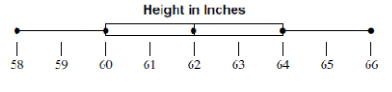
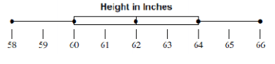
How do you calculate the IQR (interquartile range) ?
Q2 - Q1
Q1 - Q3
Q3 - Q2
Q3 - Q1

What is the interquartile range of these scores?
50
70
40
30

What is the range of homework assignments for class 2?
(a)
What is the IQR for class 1?
(a)

What do points B and D represent on the box plot?
Mean and Mode
Mean and Median
Least and Greatest Value
First and Third Quartiles


What amount of cupcakes makes up the middle 50% of the data?
16-22 cupcakes
12-32 cupcakes
22-28 cupcakes
16-28 cupcakes

What percentage of the data is between 40 and 90?
25 %
50%
75%
100%

What percent of the data is between 30 and 35 on the number line?
25%
50%
75%
100%

What percentage of the data is between 90 and 140?
25 %
50%
75%
100%