
NEW
Font size
 Worksheets
Grade 7 Yellow
Total questions: 55
Worksheet time: 2hrs 43mins


Which day of the week had the most customers?
Sunday
Saturday
Friday
Monday

What is the difference between the least amount of customers and the most amount of customers?
13
27
14
20

How many customers were there on Monday through Wednesday combined?
31
33
38
51

What color was chosen the most?
Green
Blue
Black
White

How many colors were chosen by 5 or more people?
0
4
5
1
A frequency table uses tally marks to display data in an organized way.
True
False

What is the frequency and how many tally marks should
1 43 cups have?
8
3
4
What is the frequency and how many tally marks should
3 cups have?
8
3
4

Make a frequency table to organize the data. What is the most common age when students are required to be in school for the states shown?
5
6
7
8

Which candy flavor had exactly 12 pieces?
Strawberry
Lime
Cherry
Banana
How many fewer Lime pieces were there than Strawberry pieces?
8 pieces
4 pieces
6 pieces
10 pieces
Which flavor had the most pieces in the bag?
Strawberry
Lime
Cherry
Banana

How many strawberries did Margaret have?
6 strawberries
8 strawberries
4 strawberries
2 strawberries
Who has the least amount of strawberries?
Margaret
Susan
Maria
Dorothy
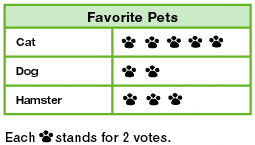
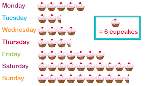
How many cupcakes where made on Thursday?
3 and half
18
21
19

On which day did James spend 6 hours revising?
Monday
Tuesday
Wednesday
Thursday
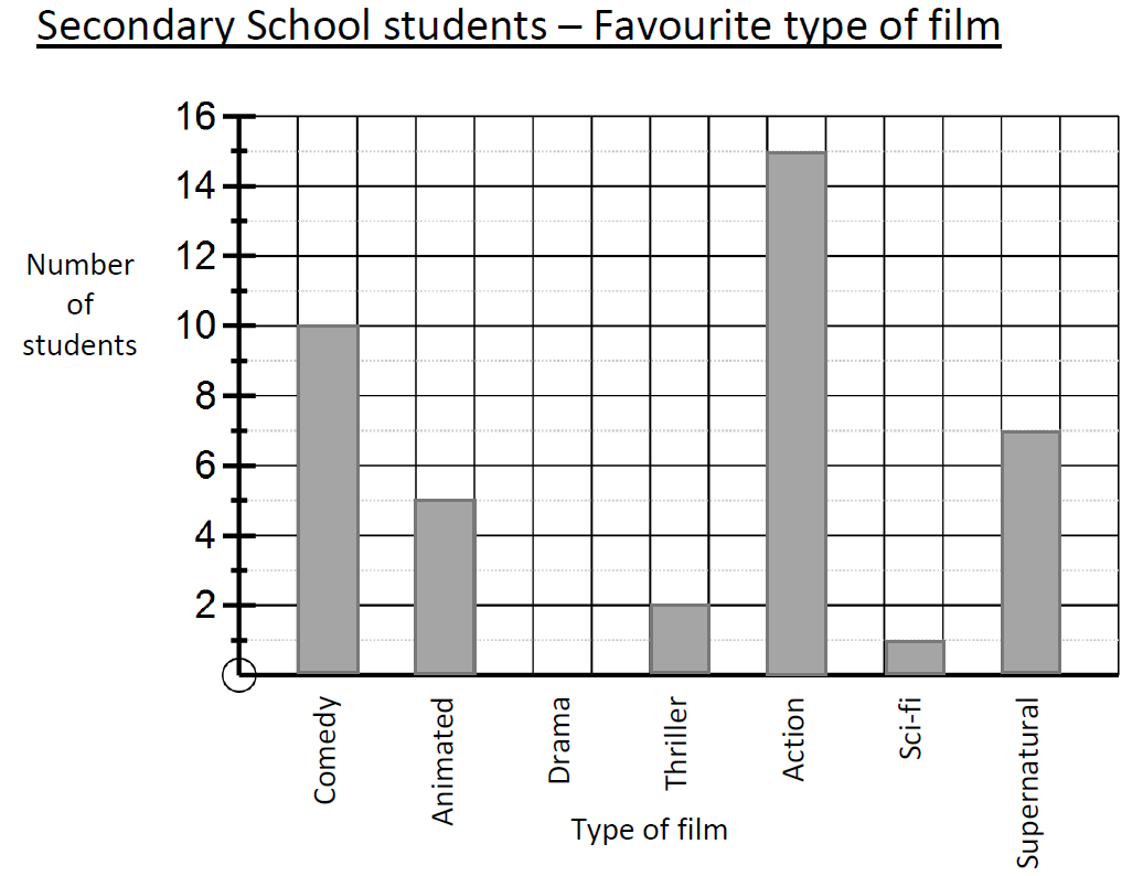
How many people said Drama was their favourite type of film?
0
2
1
7

How many students spent between 30 and 60 minutes doing homework?
7
3
10
16

Which fruit is the least popular?
Tangerines
Apples
Oranges
Cashews

Students at Center Jr. High were surveyed and asked about their favorite school after work snack. The bar graph shows the results of the survey.
Based on the graph, which statement is true?
Twice as many students chose ice cream as chose fruit for their favorite snack.
Twice as many students chose chips/ dips as chose ice cream for their favorite snack.
The same number of students chose chips/ dips as chose cheese & crackers as their favorite snack.
Fifteen more students chose ice cream as chose cheese & crackers as their favorite snack.

Based on the graph, what percent of the books checked out was adventure or science fiction?
50%
62.5%
75%
80%

The bar graph below shows the names and the number of home runs for 6 players who have hit the most home runs in the World Series.
Based on the data in the bar graph, how many home runs did these 6 players hit in the world series?
70
60
74
76

What percent of the tiles are green?
12
24
50
86

According to the bar graph, what percent of the people choose Country or Rock as their favorite type of music??
20%
40%
45%
60%

The graph shows the favorite colors chosen by some middle school students. Which statement is supported by the information in the graph?
Fewer than 30% of the students chose red, yellow, or orange as their favorite color.
More than 101 of the students chose pink as their favorite color.
Exactly 18% of the students chose blue as their favorite color.
Exactly 52 of the students chose green, black, or purple as their favorite. color.

Based on the graph,how many more sunny days than rainy days did this city have during the months of April, May, and June?

At what rate did the temperature decrease between the 20th and 25th minutes of the experiment?
10°C in 5 min
10°C in 10 min
5°C in 5 min
5°C in 10 min

A restaurant recorded the number of pizzas sold each month for one year. The data are shown in the graph below. During which month did the restaurant sell 40 pizzas?
March
May
July
August

Which month had the biggest difference between the high and low temperatures?
January
April
October
November
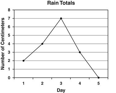
Annie recorded the amount of rain that fell each day. The results are shown in the line graph below. How many centimeters of rain fell on the third day?
2
3
4
7


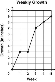
The graph shows the number of inches a plant grew each week.
Between which 2 weeks did the plant grow the MOST?
Week 1 and Week 2
Week 2 and Week 3
Week 3 and Week 4
Week 4 and Week 5
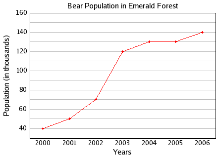
Between which two years did the bear population remain constant or the same?
2004 and 2005
2001 and 2002
2005 and 2006
2000 and 2001
What graph uses lines to join points which represent a data set?
Line Graph
Pie Graph
Bar Graph
Pictograph
What is the main purpose of a line graph?
to compare two things
to show trends over time
to have an independent variable
to have a dependent variable

At what age do the least amount of teens have a cell phone?
13
15
17
18
How many 17-year old teens have cell phones?
341
530
590
642
What is the trend of the line graph?
Increasing
Decreasing
Constant
Neutral
It is a graph that uses symbols to present and compare data. These graphs are often used where there are people who need to understand things, even if they do not read or speak the language.
Bar Graph
Line Graph
Pie Graph
Pictograph

0.2% of the 2017 Philippines Population is what age group
under 15
60-74
85+
not stated in the graph

This is an example of a inappropriate use of graph. What graph should be used?
Double Bar
Line
Circle
Double Line

Gian tracked the time he spent on his homework per subject for one week. Answer the questions based on the pie graph.
Which two subjects, when combined had the largest amount of time?
TLE and AP
ENGLISH and MATH
SCIENCE and FILIPINO
MAPEH and MATH
What percentage of time did Gian spend on his Math and English homework?
30%
32%
33%
34%
If Gian spent 100 minutes on his homework, how many minutes were spent on his ESP subject?
18 minutes
19 minutes
7 minutes
5 minutes
The total percentage in each set of data.
100%
180%
90%
What is the total of all interior angles in a pie chart?
270 ̊
180 ̊
360 ̊
380 ̊
It's a circular graph that shows how the categories are distributed.
pie chart
circular chart
round chat

