
 Worksheets
Frequency Distribution Table Questions
Total questions: 41
Worksheet time: 21mins
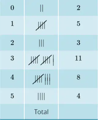
Use this frequency distribution table to answer the following questions. Score | Tally | Frequency 0 | || | 2 1 | ||||| | 5 2 | ||| | 3 3 | ||||||||||| | 11 4 | |||||||| | 8 5 | |||| | 4 b. State the most frequent score.
3
1
4
0
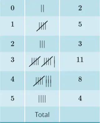
Determine the number of people who scored less than 3.
10
5
7
12
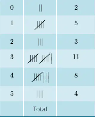
Determine the number of people who scored 3 or more.
23
15
30
10
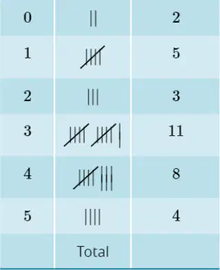
Use this frequency distribution table to answer the following questions. Score | Tally | Frequency 0 | || | 2 1 | ||||| | 5 2 | ||| | 3 3 | ||||||||||| | 11 4 | |||||||| | 8 5 | |||| | 4 e. Calculate the fraction of the people surveyed who scored 3.
11/33 or 1/3
8/33
5/33
4/33
Fill in the blank: One of the learning intentions is to display data as a ________ or bar graph.
column
circle
line
pie
Fill in the blank: One of the learning intentions is to display data as a ________ plot.
dot
bar
pie
line
Fill in the blank: One of the learning intentions is to analyse and interpret ________ and bar graphs and dot plots.
column
pie
line
area
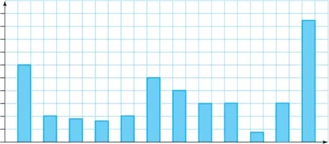
In which month were the most iPhones sold?
December
January
March
July
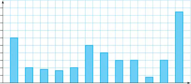
How many iPhones were sold in June?
20
30
50
40
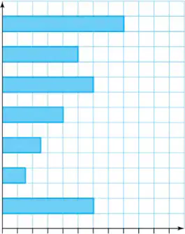
Refer to the 'Musical instruments learned by year 7 students' graph. Which instrument was learned by the fewest students?
Clarinet
Piano
Guitar
Violin
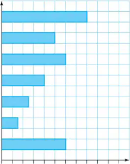
Refer to the 'Musical instruments learned by year 7 students' graph. How many students learned the saxophone?
10
12
16
18
Which of the following is NOT a feature that column graphs should have?
A) A title
B) Labelled axes
C) Uneven scale
D) Even gaps
Columns in a column graph should have the same width.
True
False
There should be space before the first column in a column graph.
True
False
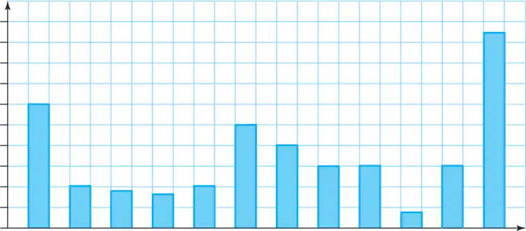
What is the title of the column graph shown in the image?
Monthly iPhone sales
Annual Android sales
Weekly Tablet sales
Quarterly Laptop sales
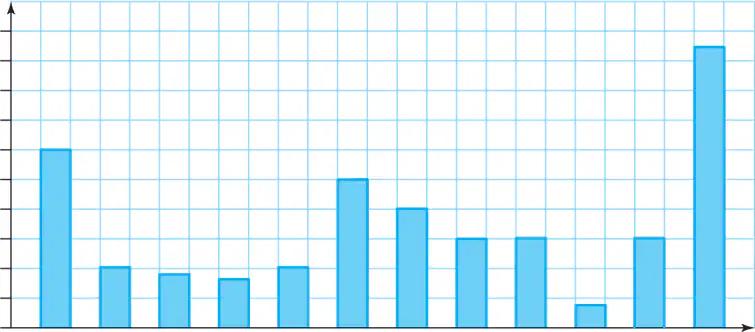
According to the column graph, in which month were the most iPhones sold?
December
January
March
July
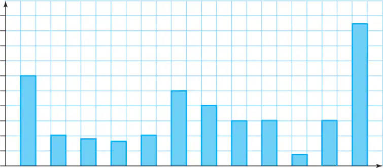
According to the column graph, how many iPhones were sold in January?
60
40
80
100
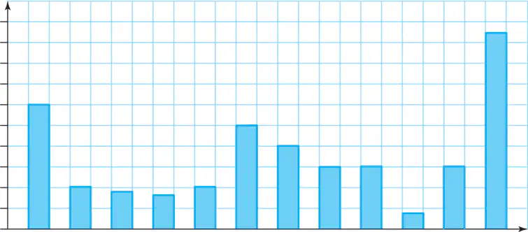
According to the column graph, which month had the lowest iPhone sales?
October
November
December
September
Which type of graph should Beth construct to display the results of her survey on school uniform preferences?
Column graph
Pie chart
Line graph
Scatter plot
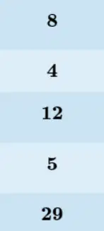
According to the table, what is the frequency of students who prefer a blue shirt and navy skirt/trousers?
12
8
15
20
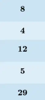
According to the table, how many students prefer a white shirt and navy skirt/trousers?
5
8
3
10
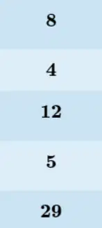
What is the total number of students surveyed according to the table?
29
25
32
21
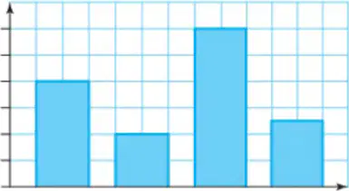
According to the column graph titled 'Uniform preferences', how many people prefer 'White shirt and black skirt/trousers'?
8
5
10
12
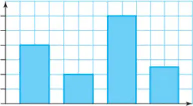
Which uniform type is preferred by the highest number of people according to the column graph?
White shirt and black skirt/trousers
Blue shirt and black skirt/trousers
Blue shirt and navy skirt/trousers
White shirt and navy skirt/trousers
What is the first step in drawing a column graph as described in the worked example?
Rule a set of axes on graph paper. Give the graph a title. Label the horizontal and vertical axes.
Draw the columns before labeling the axes.
Choose the colors for the columns first.
Write the data values on the graph before drawing axes.
According to the instructions, what should you do after drawing the first column in a column graph?
Leave a gap (measuring one column width) between the first column and the second column.
Draw all the remaining columns without any gaps.
Erase the first column and start again.
Label the first column with a different color.
Bar graphs can be used when category names are too long to fit at the bottom of a column.
True
False
Bar graphs should have the same features as a column graph.
True
False
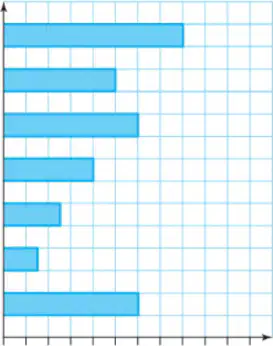
Refer to the bar graph titled 'Musical instruments learned by year 7 students'. Which musical instrument was learned by the most students?
Guitar
Violin
Saxophone
Drums
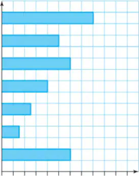
How many students learned the saxophone?
15
10
20
8
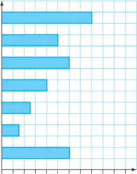
Refer to the bar graph titled 'Musical instruments learned by year 7 students'. Which musical instrument was learned by the fewest students?
Clarinet
Trumpet
Flute
Drums
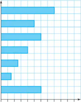
How many students learned the violin?
10
5
15
8
What are dot plots usually used to represent?
A) Categorical data
B) Numerical data
C) Text data
D) Image data
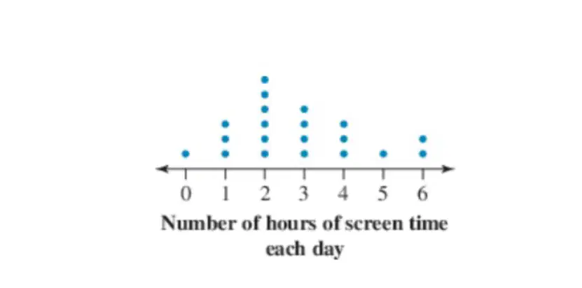
According to the dot plot, how many people had 2 hours of screen time each day?
5
2
7
9
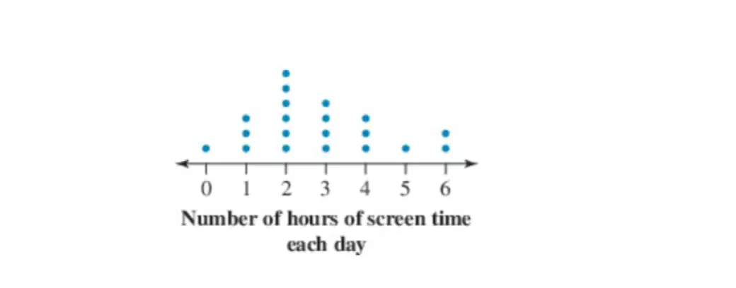
According to the dot plot, what is the most common number of hours of screen time each day?
2
1
3
4

According to the dot plot, how many people had 0 hours of screen time each day?
1
2
3
4
Which of the following dot plots correctly represents the number of packets of potato chips sold from a vending machine each day over a 2-week period: 10, 8, 12, 11, 12, 18, 13, 11, 12, 11, 12, 12, 13, 14?
A dot plot with 8: 1 dot, 10: 1 dot, 11: 3 dots, 12: 5 dots, 13: 2 dots, 14: 1 dot, 18: 1 dot
A dot plot with 8: 2 dots, 10: 1 dot, 11: 2 dots, 12: 4 dots, 13: 3 dots, 14: 1 dot, 18: 1 dot
A dot plot with 8: 1 dot, 10: 2 dots, 11: 2 dots, 12: 3 dots, 13: 2 dots, 14: 2 dots, 18: 1 dot
A dot plot with 8: 1 dot, 10: 1 dot, 11: 2 dots, 12: 4 dots, 13: 2 dots, 14: 1 dot, 18: 2 dots
Over a 2-week period, the number of packets of potato chips sold from a vending machine each day was recorded. The results are listed below. 10, 8, 12, 11, 12, 18, 13, 11, 12, 11, 12, 12, 13, 14. Which of the following best describes the distribution of the data?
The data is approximately symmetric and centered around 12.
The data is bimodal with two peaks at 11 and 13.
The data is skewed to the left with most values higher than 12.
The data is uniform with all values occurring equally often.
What are the steps to create a dot plot?
Place a dot
Draw a bar
Connect the dots with lines
Shade the area under the curve
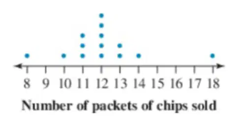
2. Look at the dot plot below showing the number of packets of chips sold. Which of the following best describes the clustering, outliers, and range of the data?
Most scores are clustered in the middle, there are no significant outliers, and the data ranges from the lowest to the highest value shown.
Most scores are at the extremes, there are several outliers, and the data has a very narrow range.
The data is evenly spread with many outliers and a wide range.
There is no clustering, no outliers, and the data is only at one value.
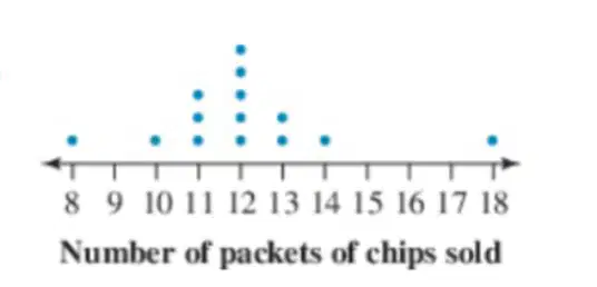
According to the dot plot, what is the range of the number of packets of chips sold?
10
5
15
8

