
 Worksheets
Principles of Design: P.A.R.C.H.
Total questions: 20
Worksheet time: 37mins

Match each P.A.R.C.H. principle to its definition.
The use of visually different elements
Contrast
The idea that related things should be placed close together
Proximity
Using one or more elements multiple times
Repetition
The purposeful arrangement of elements relative to other elements or to a common baseline
Alignment
The control of visual information to suggest relative importance
Hierarchy
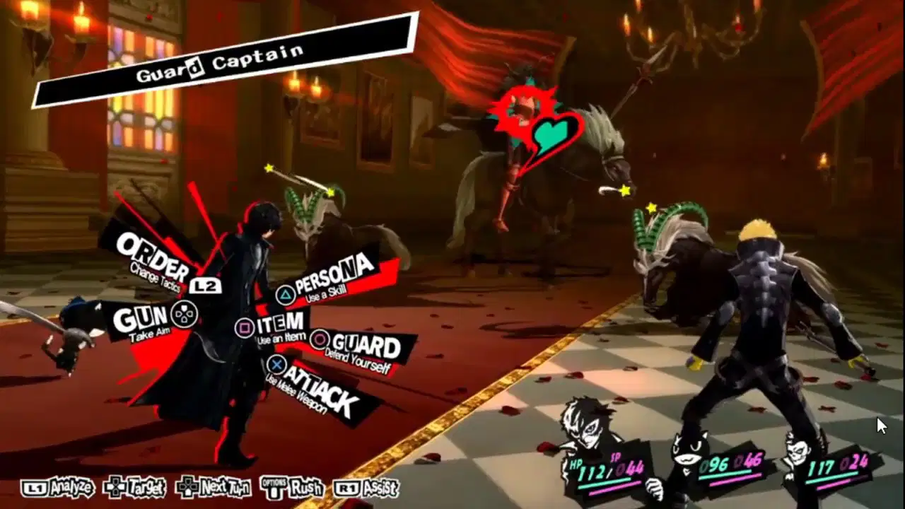
This screenshot from Persona 5 shows the player's battle controls placed in close proximity around their current attacker. It also shows additional controls placed together in the bottom-left corner. The player's party members are depicted together in the bottom-right corner.
This exemplifies which Proximity concept?
Grouping
Hierarchy
Negative space
Alignment

By grouping related elements together in a design, you are creating (a) around your content, which increases readability.
continuity
positive space
hierarchy
Match each kind of alignment to its example.

Left

Right

Center

Justified

What kind of alignment is BEST for bulleted lists?
Left alignment
Right alignment
Center alignment
Justified alignment

Which of the following would be BEST suited for center alignment?
Select ALL that apply.
Titles
Big body paragraphs
Works cited
Short bodies of text like taglines

In the music video for Seven Nation Army by The White Stripes, triangles and the colors red, white, and black are used multiple times throughout.
This BEST exemplifies which design principle?
Contrast
Repetition
Alignment
Proximity

Netflix shows repetition in their website design through the repeated use of their logo in the top-left corner, menu options at the top, and a search function and account login in the top-right corner.
What is the MOST likely reason for this repetition?
To improve the user interface
To add emphasis
To convey a message
To create a sense of unity

Target shows repetition in their advertising through the repeated use of red and white as well as their logo.
What is the MOST likely reason for this repetition?
To improve user interface
To convey a message
To establish brand identity
To create a sense of texture
Match each type of contrast to the design that BEST exemplifies it.

Proximity contrast

Color contrast

Typography contrast
Match each type of contrast to the design that BEST exemplifies it.

Shape contrast

Size contrast

Value contrast
Which of the following designs creates contrast through the use of complementary colors?


Which term BEST fits this definition?
"Big things are important and smaller things are less important."
Hierarchy
Closure
Continuity
Grouping

According to __________, humans notice a group with an odd number of things sooner than they'll notice a group with an even number of things.
Rule of Odds
Negative Space
Ockham's Razor
Hick's Law

The most important part of this poster is the minion.
What method of adding hierarchy did the designer use?
Size & Scale:
Making the most important element the biggest.
Alignment:
Making the important element un-aligned with other elements
Typography:
Using a bolder, bigger, or heavier font for important text
Space:
Separating the important element from others with lots of negative space

Looking at the pictured design, consider this sentence: "Now food can tell you how fresh it is."
Which of the following is NOT something the designer did to make that sentence appear more important?
The designer used a heavy-weight font for that sentence.
The designer made that sentence bigger than the rest of the text.
The designer used a light-weight font for that sentence.
The designer chose a font color for that sentence that contrasts with the background.

Consider the pictured sign.
Based on the designer's choices, what text is the MOST IMPORTANT on this sign?
How do you know?

This poster was displayed in Lovelady during the 2025 - 2026 school year.
To increase readability, this poster would benefit MOST from which two design principles?
Contrast and alignment
Repetition and proximity
Proximity and alignment
Repetition and hierarchy

This acrostic PASSION design could be BEST fixed through proper use of which TWO design principles?
Pick TWO.
Alignment
Proximity
Contrast
Repetition

Consider the "Lake Miramar Recreation Area" text in the pictured sign.
This text could be more readable with better use of...
Proximity
Alignment
Repetition
Contrast

