
 Worksheets
Scattered Plot
Total questions: 160
Worksheet time: 7hrs 28mins

What type of relationship does this graph have?
Positive
Negative
No Relationship

What type of relationship does this graph have?
Positive
Negative
No Relationship
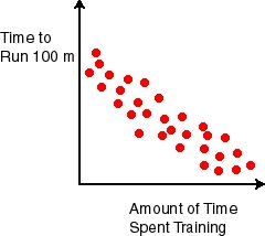
What type of relationship does this scatter plot show?
Positive
Negative
No Relationship

What type of relationship does this scatter plot represent?
Positive
Negative
No Relationship


The outside temperature and the amount of layers you wear.
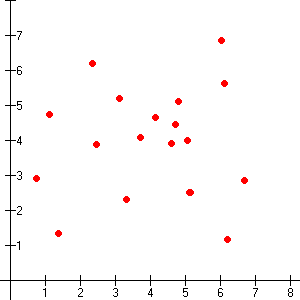
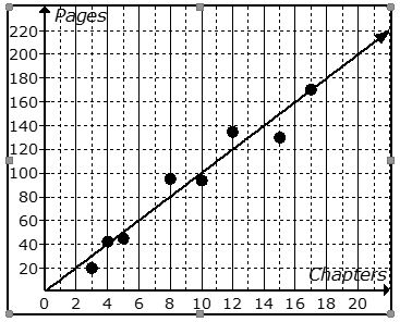
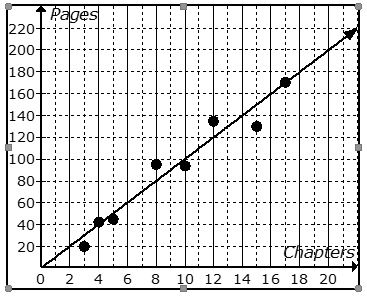
What would most likely have a negative association?
The radius of a circle and it's area?
How many layers of clothing a person wears and the temperature outside
The temperature outside and how long the air conditioner runs


Mrs. Collins made a scatterplot to show the relationship between the number of absences and a student’s final exam score. Based on this scatterplot, a student with 6 absences should get approximately what score on the final exam?
85
92
70
76

In the scatter plot, does the image show a "Line of Best Fit"?
Yes
No
Which of the following best models a linear function fitted to the data in the scatter plot?


Based on the graph, if Joe earned $400, how many hours did he work?
25 hours
35 hours
45 hours
15 hours

How many laps can a bicycle make around the park in 23 minutes?

What is the equation of the line of best fit?
y = -25x + 170
y = -5/8x + 170
y = 25x + 170
y = 5/8x + 170




What type of association does this graph have?
Negative
no association
positive

What type of association does this graph have?
positive
negative
non linear
all of the above

Which sentence describes the relationship shown on this scatter plot?
As the temperature decreases, the visitors increase.
As the temperature increases, the number of visitors increases.
As the visitors increase, the temperature decreases.
No correlation

What type of association does this scatter plot show?
positive
negative
no correlation
nonlinear association

Describe the association in the graph shown.
Strong Negative
Strong Positive
Weak Negative
Weak Positive
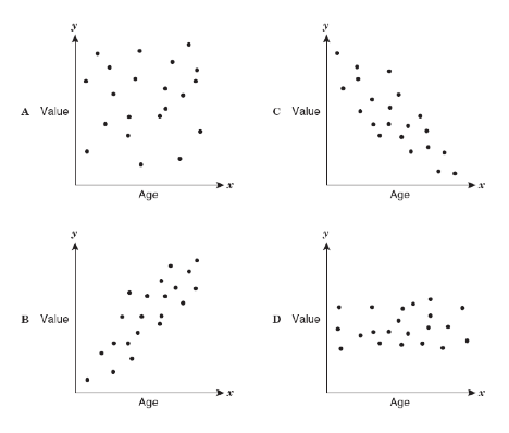
Which scatter plot show a positive relationship?
Graph A
Graph B
Graph C
Graph D
Based on the scatterplot, which of the following conclusions about the relationship between her height and weight is true?
There is a negative relationship between height and weight
There is a positive relationship between height and weight
There is a constant relationship between height and weight
There is no relationship between height and weight

Which statement best describes the association between the energy and light output of these lightbulbs?
As the energy increases, the light output increases
As the energy increases, the light output decreases
As the energy increases, the light output remans the same
There is no apparent association between the energy and light output

Which statement is best supported by the scatterplot?
There is a non-linear association between the number of lanes rented and the number of people who bowl.
There is a negative linear association between the number of lanes rented and the number of people who bowl.
There is no apparent association between the number of lanes rented and the number of people who bowl.
There is a positive association between the number of lanes rented and the number of people who bowl.

Which conclusion is best supported by the scatterplot?
As the length of a call increases, the cost of the call increases.
As the length of a call increases, the cost of the call remains the same?
As the length of a call increases, the cost of the call decreases.
There is no relationship between the length of a call and the cost of a call.
What type of correlation does this graph have?
positive
negative
none
all of the above

Which relationship could be represented by this scatter plot?
As the number of muffins in a box increases, the price increases.
As the speed of a car increases, the distance the car travels increases.
As the population of a city increases, the number of schools in the
city increases.
As the number of daylight hours increases, the number of night hours decreases.
What type of correlation does this graph have?
Negative
no association
positive
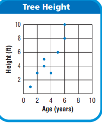
What is the age of the tree that is 8 feet tall?
6 Years
7 Years
8 Years
9 Years
JoBeth draws a scatter plot that shows as the outside temperature increases, sales at her lemonade stand increase. Which best describes the scatter plot?
The points show that as x-values increase, y-values increase.
The points show that as x-values increase, y-values decrease.
The points show that as x-values decrease, y-values stay the same.
The points show that as x-values decrease, y-values increase.
Which of the following best describes a scatter plot that shows no relationship between the x-values and the y-values?
As x-values increase, the points are higher on the graph.
As x-values decrease, the points are higher on the graph.
The points are scattered around the graph.
The points form a horizontal line.


Label the type of association shown by the scatter plot as positive, negative or none.
positive
negative
none

Label the type of association shown by the scatter plot as positive, negative or none.
positive
negative
none

Which best describes the association shown in the scatter plot below?
Negative and linear
Negative and non-linear
Positive and linear
Positive and non-linear

Which scatter plot appears to be linear?
Scatter plot A
Scatter plot B

What type of association does this scatter plot show?
positive linear association
negative linear association
no association
nonlinear association

What would most likely have a negative association?
The radius of a circle and it's area?
How many layers of clothing a person wears and the temperature outside
The temperature outside and how long the air conditioner runs
Mrs. Collins made a scatterplot to show the relationship between the number of absences and a student’s final exam score. Based on this scatterplot, a student with 6 absences should get approximately what score on the final exam?
85
92
70
76
In the scatter plot, does the image show a "Line of Best Fit"?
Yes
No
Which of the following best models a linear function fitted to the data in the scatter plot?
Based on the graph, if Joe earned $400, how many hours did he work?
25 hours
35 hours
45 hours
15 hours
How many laps can a bicycle make around the park in 23 minutes?
What is the equation of the line of best fit?
y = -25x + 170
y = -5/8x + 170
y = 25x + 170
y = 5/8x + 170

What type of correlation does this graph have?
positive
negative
none
all of the above
Which sentence describes the relationship shown on this scatter plot?
As the temperature decreases, the visitors increase.
As the temperature increases, the number of visitors increases.
As the visitors increase, the temperature decreases.
No correlation
What type of correlation does this scatter plot show?
positive
negative
no correlation
nonlinear association
Describe the correlation in the graph shown.
Strong Negative
Strong Positive
Weak Negative
Weak Positive
Which scatter plot show a positive relationship?
Graph A
Graph B
Graph C
Graph D


Name the type of association.
no association
nonlinear association
positive associtation
negative association
scatter association

Name the type of association.
no association
nonlinear association
positive associtation
negative association
scatter association

Name the type of association.
no association
nonlinear association
positive associtation
negative association
negipositive association

Name the type of association.
no association
nonlinear association
positive associtation
negative association
scatter association

Which scatter plot has a stronger association?
Scatter Plot A because the points are closer together.
Scatter Plot B because the points are further apart.
Which scatter plot appears to be linear?
Scatter Plot A
Scatter Plot B
Which is a true statement about two numerical sets of data that have negative association?
A. As one variable increases, the other variable does not change.
B. As one variable increases, the other variable increases.
C. As one variable decreases, the other variable decreases.
D. As one variable increases, the other variable decreases.
What kind of correlation exists if as x increases, y increases

What kind of slope would the graph of the model have?
Positive
Negative
There's no association

What kind of slope would the graph of the model have?
Positive
Negative
There's no association

What kind of slope would the graph of the model have?
Positive
Negative
There's no association

Which graph has no association?
A
B
C
D

F
G
H
J
What do you call when most of the data is located in a certain area on a graph?
Cluster
Gap
Peak
Data Party

Identify any outliers.
Outlier at x = 18
Outlier at x = 12
Outlier at x = 6
There aren't any outliers in this graph.

Identify any clusters.
Cluster at x = 14
Cluster at x = 18
Cluster at x = 24
There aren't any noteworthy clusters in this graph.

Is this line an accurate line estimate of best fit for the data?
Yes
No

Is this line an accurate line estimate of best fit for the data?
Yes
No

What are the coordinates of the outlier?
(1,9)
(9,1)
(2,2)
y=x

Which scatter plot shows a linear relationship between x and y?
Graph A
Graph B
Graph C
Graph D


What kind of slope would the graph of the model have?
Positive
Negative
There's no association
What kind of slope would the graph of the model have?
Positive
Negative
There's no association
What kind of slope would the graph of the model have?
Positive
Negative
There's no association
Which graph has no association?
A
B
C
D
F
G
H
J
What do you call when most of the data is located in a certain area on a graph?
Cluster
Gap
Peak
Data Party
Identify any outliers.
Outlier at x = 18
Outlier at x = 12
Outlier at x = 6
There aren't any outliers in this graph.
Identify any clusters.
Cluster at x = 14
Cluster at x = 18
Cluster at x = 24
There aren't any noteworthy clusters in this graph.
Is this line an accurate line estimate of best fit for the data?
Yes
No
Is this line an accurate line estimate of best fit for the data?
Yes
No
What are the coordinates of the outlier?
(1,9)
(9,1)
(2,2)
y=x
Which scatter plot shows a linear relationship between x and y?
Graph A
Graph B
Graph C
Graph D

