
 Worksheets
Data Display and Graph Types
Total questions: 25
Worksheet time: 33mins
Which display allows you to find the favorite cafeteria lunch item of the sixth-grade students?
bar graph
line graph
histogram
box plot
Which display allows you to find the temperature from 6 a.m. to 12 p.m.?
box plot
line graph
bar graph
box plot
A survey compared different brands of hair shampoo. Brand A: 35. Brand B: 12. Brand C: 42. Brand D: 24. Brand E: 8. Brand F: 11. What type of display compares the number of responses best?
Box Plot
Line Plot
Bar Graph
Histogram


Which type of graph would be best for displaying data about an experiment where a spring is heated to different temperatures and then stretched with a 500 milligram weight?
Bar Graph
Line Graph
Pie Chart
Scatter Plot
The table shows the kinds of pets the students have in class. What type of graph would be most appropriate for the data?
Scatter Plot
Line Graph
Bar Graph
Histogram

What type of Data Display is this?
Histogram
Pie Chart
Stem & Lead Plot
Scatter Plot

What type of Data Display is this?
Line Graph
Histogram
Scatter Plot
Bar Graph
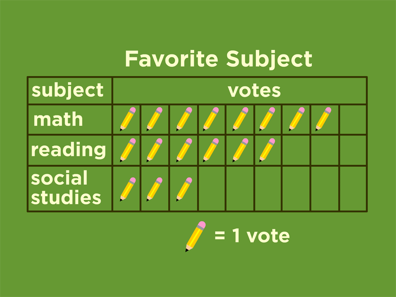

Which of the following is an appropriate display to show the heights of adults arranged by intervals?
F. bar graph
G. line graph
H. circle graph
I. histogram
What data display is the best to show a person's height compared to their shoe size?
Scatter Plot
Circle Graph
Stem-Leaf Plot
Historgram
What data display is the best to show the population of the United States divided into age groups?
Histogram
Dot Plot
Scatter Plot
Box Whisker Plot
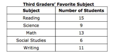
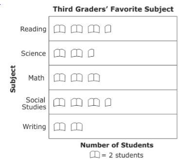
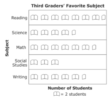
Students in 3rd grade collected data on their favorite subject and recorded it on the table shown. Which graph shows this information?
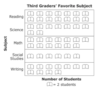

Which set of data would best be displayed on a box and whisker plot
The range of student quiz scores.
The frequency of tardies to each class.
The specific amount of sugar in different soft drinks.
The percentage of a 24 hour day a student uses for each of their activities.

6) Select all true statements.
More students play video games for 10-14 hours than 20-24 hours.
The interval used to create the histogram was 4.
Exactly half of the students that responded to the survey play video games for 10 or more hours.
Most students play video games for 15-19 hours a week.
Students who play video games for 10 or more hours during a weekend make lower math grades.
A graph that uses pictures or symbols to show the value of the data.
Pie Graph
Pictograph
Histogram
Bar Graph
The graph is divided into sectors, where each sector shows the relative size of each value. Used mainly with fractions, decimals and percents.
Bar Graph
Histogram
Line Graph
Pie Graph

Which table represents the same data shown in the graph?


Which is the best display for the favorite cafeteria lunch item of sixth-grade students?
Bar Graph
Box Plot
Which display allows you to easily find the median of the data?
Line Plot
Box Plot

