
 Worksheets
Understanding and Interpretation
Total questions: 35
Worksheet time: 18mins
What does the title of a bar graph tell you?
What kind of information is displayed on the graph
The exact value of each bar
The color code for each category
The number of bars in the graph
If you were to create a bar graph using the data table, which step should you follow to ensure your bars are easily distinguishable?
Use only one color for all bars
Do not create a key
Color your bars and create a key
Ignore the vertical axis range
What is the main purpose of a line graph?
To show how an amount or measurement changes continuously over a period of time.
To compare static values between different categories.
To display data in a circular format.
To show the relationship between two unrelated variables.
What does the horizontal axis on a line graph represent?
It runs along the side of the graph.
It describes individual time segments in a graph.
Some unit of time.
It shows the quantity or amount.
What is the function of the key in a multiple line graph?
It describes individual time segments.
It explains additional information on the graph.
It shows the measurement scale.
It indicates the title of the graph.
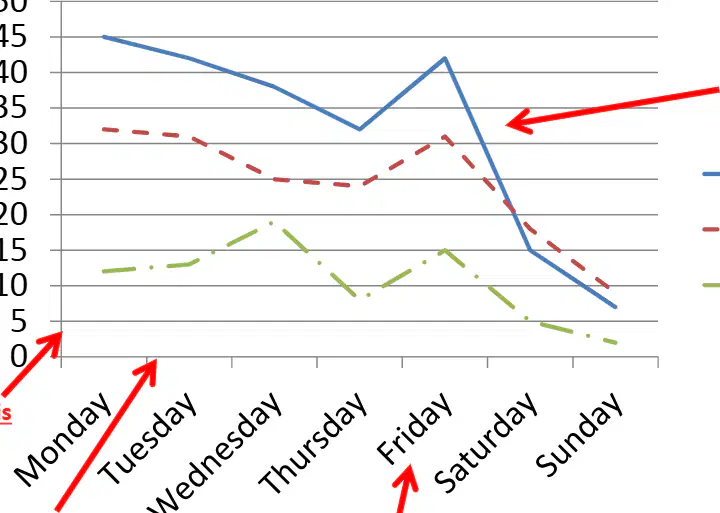
If you have three cars and want to compare their driving minutes over a week, which graph feature helps you distinguish between them?
Scale
Key
Labels
Title
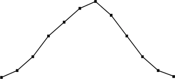
If the temperature graph was in Celsius instead of Fahrenheit, would the overall shape of the graph change?
No, the shape would stay the same
Yes, it would become a straight line
Yes, it would become a vertical line
No, it would become a zigzag
Why are pie charts commonly used in polls, surveys, and demographic information?
They show changes over time
They visually represent proportions of data
They list all data points individually
They are used for mathematical calculations
If you want to check if your percentages in the movie survey add up correctly, what should the total percentage be?
50%
75%
100%
200%
Suppose you surveyed 20 students and 5 chose "Comedy" as their favorite movie genre. What percentage of students chose "Comedy"?
10%
20%
25%
50%
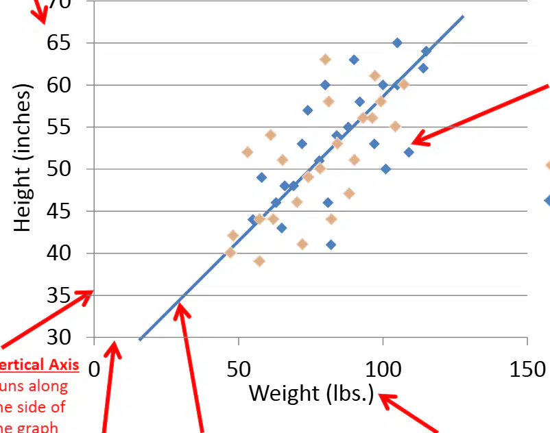
What does each dot on a scatter plot represent?
A single observation from a data set
The average of all data points
The maximum value in the data set
The total number of data points

The graph shows the number of popcorn bowls and cans of soda sold over the course of 4 days at a local movie theater.
Over the course of the 4 days 12 more bowls of popcorn were bought than cans of soda.
How many cans of sods were bought on Thursday?

How many more people ages 11-20 are at the park than people ages 21-30?

How many students in the class have 2 or fewer pets?

Which statement is true based on the information in the graph?
More time was spent on homework on Monday than Tuesday
No homework was completed on Friday
The same amount of time was spent on homework each night

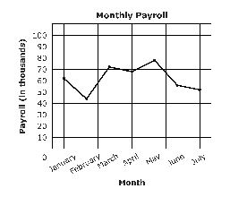
The line graph shows the monthly payroll at a large construction company.
In which month did the monthly payroll decrease the most?
February
March
June
July


The table shows the high temperatures and the numbers of snow cones sold at a snack bar on seven days.
Which scatterplot best represents the data in the table?


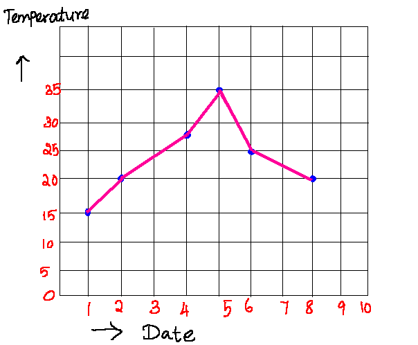

What is the label on the y-axis in this graph?
Rainfall in mm
Day of the month
Rainfall during the first 9 days of a month

Name this type of graph
bar graph
line graph
pie graph
scatterplot

A random survey of people at the mall was taken to determine favorite color. The results are shown in the circle graph. Based on the information in the graph, which inference about the general population is valid?
It is more likely someone will choose Blue than Red or Pink
It is certain that someone will NOT choose Black
It is less likely someone will choose Red than Green, Pink, or Purple
More people like Blue than all other colors combined

How many bacteria grew between the hours of 4 and 9?
16
81
65
100

Match the verbal description with the part of the graph it describes.
Section A
stays the same
slowly decreases at a constant rate
slowly increases at a constant rate
increases at an increasing rate
quickly decreases at a constant rate


According to the pie chart, what uses the most water in a house?
Shower
Faucet
Clothes Washer
Toilet
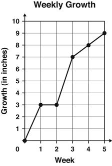
The graph shows the number of inches a plant grew each week.
Between which 2 weeks did the plant grow the MOST?
Week 1 and Week 2
Week 2 and Week 3
Week 3 and Week 4
Week 4 and Week 5
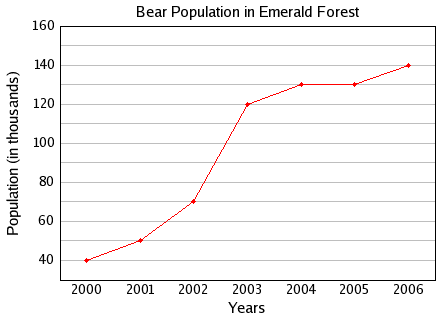

According to the graph, which animal has a life span that is longer than a giraffe's but shorter than a lion's?
Tiger
Chipmunk
Camel
Mouse


For this data, (a) and (b) (c) appear to be related.

This shows a (a) linear association

The scatterplot shows the number of people in a household and the average amount of money spent on water. Complete the statement to best describe the relationship between the number of people in a household and the average amount spent on water. Choose the correct answer from each drop down menu to complete the statement.
As the x-values increase, the y-values (a)
This represents a (b) (c) association between the number of people in a household and the average amount spent on water.

