
 Worksheets
Quiz về Trình bày dữ liệu bằng biểu đồ
Total questions: 40
Worksheet time: 20mins
What is one of the objectives of the lesson "Trình bày dữ liệu bằng biểu đồ"?
To learn how to create charts using software.
To memorize the history of charts.
To understand the importance of charts in literature.
To study the evolution of chart-making tools.
Which skill is emphasized under "Năng lực chung" in the lesson plan?
Memorizing historical facts.
Using technology to solve real-life problems.
Writing essays about charts.
Avoiding teamwork in learning.
What is one of the teaching aids mentioned for the teacher in the lesson plan?
A history textbook.
Microsoft Excel software.
A biology lab kit.
A literature anthology.
What is the main activity in the "Hoạt động khởi động" section of the lesson plan?
Students memorize definitions of charts.
Students discuss and compare data presentation in charts and tables.
Students write essays about charts.
Students create charts without any prior discussion.
What is the main focus of the activity described in the learning material?
Learning how to create diagrams
Understanding how to present data using tables and charts
Memorizing definitions from the textbook
Practicing group discussions
What is the purpose of dividing students into groups of 3-4 as mentioned in the learning material?
To encourage individual learning
To facilitate group discussions and collaborative learning
To assign different tasks to each student
To reduce the workload of the teacher
What type of data presentation is being emphasized in the activity?
Pie charts
Bar graphs
Line graphs
Scatter plots
What is the teacher's role during the group discussions as described in the learning material?
To provide answers to all questions
To guide and support students if needed
To evaluate students' performance immediately
To assign grades based on participation
What is the expected outcome of the activity mentioned in the learning material?
Students will memorize the textbook content
Students will learn to present data using bar graphs
Students will create their own textbook
Students will learn to write essays
What is the significance of comparing different methods of data presentation as mentioned in the learning material?
To identify the most colorful method
To understand the advantages and disadvantages of each method
To memorize all methods for exams
To create new methods of data presentation
Which type of chart is most suitable for comparing the percentage of students interested in different topics within a subject?
Bar chart
Line chart
Pie chart
Scatter plot
What type of chart is commonly used to observe trends over time, such as the decrease or increase in data?
Bar chart
Line chart
Pie chart
Histogram
Which chart is most effective for comparing data across categories, such as the number of students interested in different topics?
Bar chart
Line chart
Pie chart
Scatter plot
What is the main purpose of using charts in data representation?
To make data visually appealing
To compare and analyze data effectively
To replace numerical data completely
To confuse the audience
What is the purpose of using charts in data representation?
To make data visually appealing
To identify trends and changes in data
To replace textual information completely
To confuse the audience
Which type of chart is suitable for showing the percentage distribution of students' academic performance (excellent, good, average)?
Line chart
Pie chart
Bar chart
Scatter plot
What is the first step in creating a column chart using spreadsheet software?
Select the chart type
Enter data into the spreadsheet
Choose the Insert Column or Bar Chart option
Save the file
Which chart type is best for showing monthly rainfall in a specific region?
Pie chart
Line chart
Column chart
Scatter plot
What is the purpose of the "Insert Column or Bar Chart" option in spreadsheet software?
To create a pie chart
To create a column or bar chart
To delete data
To format text
What type of chart is selected in the "2-D Column" group to display results in a spreadsheet?
Clustered Column
Doughnut Chart
Line Chart
Pie Chart
Which menu option in Excel allows you to add information to a chart, such as labels and legends?
Chart Elements
Insert Menu
Data Tools
Format Chart
What type of chart is used to visually compare the percentage of students studying different topics in a survey?
Pie Chart
Clustered Column
Line Chart
Bar Chart
In Excel, what option should be selected to display data labels as percentages in a pie chart?
Percentage
Legend
More Options
Data Tools
Biểu đồ cột được sử dụng để:
Biểu diễn dữ liệu thống kê bằng các cột dọc.
Biểu diễn dữ liệu thống kê bằng các cột ngang.
Biểu diễn dữ liệu thống kê bằng các hình tròn.
Biểu diễn dữ liệu thống kê bằng các đường gấp khúc.
Biểu đồ tròn thường được sử dụng để:
Biểu diễn dữ liệu thống kê bằng các cột dọc.
Biểu diễn dữ liệu thống kê bằng các cột ngang.
Biểu diễn dữ liệu thống kê bằng các hình tròn.
Biểu diễn dữ liệu thống kê bằng các đường gấp khúc.
Trong biểu đồ cột, trục ngang thường đại diện cho:
Giá trị của dữ liệu.
Các phần tử của dữ liệu.
Đơn vị đo của dữ liệu.
Tên của biểu đồ.
Which type of chart is most useful for showing relationships between data groups?
Line chart
Pie chart
Bar chart
Scatter plot
What is the primary purpose of a pie chart?
To show changes over time
To compare individual values of data
To present percentages of a whole dataset
To display relationships between data groups
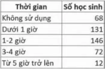
What does the table in the image represent?
The number of students using digital devices in different grades
The number of students using digital devices in different time intervals
The number of students using digital devices in different subjects
The number of students using digital devices in different schools
What is the function of the SUM formula in Excel as mentioned in the text?
To calculate the average of a dataset
To find the total sum of values in a dataset
To count the number of entries in a dataset
To sort the values in a dataset
What conclusion can be drawn from a pie chart showing the percentage of students using digital devices in different time intervals?
The total number of students in the school
The distribution of time spent using digital devices
The average time spent using digital devices
The relationship between device usage and academic performance
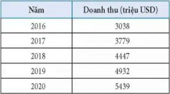
What trend can be observed in the revenue of the software industry from 2016 to 2020 based on the bar chart provided?
The revenue decreased steadily over the years.
The revenue remained constant throughout the years.
The revenue increased steadily over the years.
The revenue fluctuated without a clear trend.

Based on the pie chart (Hình 7.2), what does it represent regarding the usage of digital devices by students?
The pie chart represents the revenue of the software industry.
The pie chart represents the percentage of students using digital devices for different durations.
The pie chart represents the number of students enrolled in different grades.
The pie chart represents the types of software used by students.
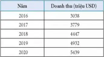
What is the purpose of creating a column chart based on the data provided in Hình 7.3?
To compare the revenue of different industries.
To visualize the trend in software industry revenue over the years.
To analyze the percentage of students using digital devices.
To calculate the average revenue of the software industry.
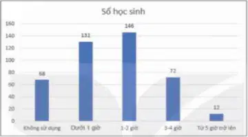
What observation can be made about the usage of digital devices by students outside school hours based on Hình 7.1?
Most students use digital devices for less than 1 hour.
Most students use digital devices for 1 to 2 hours.
Most students use digital devices for 3 to 4 hours.
Most students use digital devices for more than 5 hours.
What is the main task assigned to students in Step 1 of the learning activity?
Create a bar chart using data from 2016-2020.
Analyze the data and write a report.
Create a line chart using data from 2016-2020.
Memorize the data from 2016-2020.
What is the purpose of Step 3 in the learning activity?
To evaluate students' knowledge.
To allow students to report their results and discuss.
To assign homework to students.
To create a new dataset for analysis.
What is one of the homework tasks mentioned in the document?
Create a new chart using different data.
Read and understand "Bài 8a – Làm việc với danh sách dạng liệt kê và hình ảnh trong văn bản."
Memorize the steps of the learning activity.
Write a summary of the lesson.
Câu 1: Biểu đồ cột được sử dụng để:
A. Biểu diễn dữ liệu thống kê bằng các cột dọc.
B. Biểu diễn dữ liệu thống kê bằng các cột ngang.
C. Biểu diễn dữ liệu thống kê bằng các hình tròn.
D. Biểu diễn dữ liệu thống kê bằng các đường gấp khúc.
Câu 2: Biểu đồ tròn thường được sử dụng để:
A. Biểu diễn dữ liệu thống kê bằng các cột dọc.
A. Biểu diễn dữ liệu thống kê bằng các cột dọc.
C. Biểu diễn dữ liệu thống kê bằng các hình tròn.
D. Biểu diễn dữ liệu thống kê bằng các đường gấp khúc.

