
 Worksheets
Page 1
Total questions: 25
Worksheet time: 13mins
A designer planning a flyer wants to elicit responses. Which two elements should they prioritize assembling skillfully, as emphasized in the poster?
Paper size and bleeds
Headlines and graphics
Stock weight and finish
Binding and pagination
What visual metaphor is used on the right side of the poster?
A person measuring with a ruler
A person painting with a brush
A person typing on a keyboard
A person looking through a telescope
Which statement aligns with the poster’s rationale for seminars?
Specialized training improves page composition
Aesthetic instincts replace practical training
Technology alone ensures visual hierarchy
Random layouts engage readers consistently

The layout uses which hierarchy technique to direct attention to the call to action?
Oversized outlined typography for a single word
Dense paragraphs with uniform body text
All-caps body copy with narrow tracking
Symmetrical columns with equal emphasis

In terms of composition, what balances the heavy headline on the left?
A grid of small technical drawings
A dense block of legal disclaimers
A large logo repeated multiple times
The illustration of the figure on the right
When initiating a site analysis, which factor most affects massing and orientation decisions?
Furniture brand standards and colors
Owner’s digital model file format
Interior finish lead times and costs
Climate, sun path, and prevailing winds
Which procurement route most closely aligns with fast-tracking overlapping design and construction?
Public private partnership lease
Lump-sum turnkey developer sale
Design–bid–build with long pause
Construction management at risk
Which sustainability move is most appropriate to test first in early massing studies?
Custom metal panel rib spacing
Premium low-VOC furniture finish
Orientation and envelope porosity
Art installation lighting scenes

Which feature emphasizes understanding who will engage with your architectural narrative?
Your texts: use heads and subheads
Your arts: know your objective
Your message: compose your ideas
Your reader: know your audience

A competition entry asks for sustainability emphasis. Which alignment step ensures visuals reinforce that aim?
Discard headings entirely
Target no specific audience
Expand every caption equally
Align arts with the objective

While drafting a booklet, what practice improves scanability for jurors skimming pages?
Use heads and subheads consistently
Present text as dense paragraphs
Remove section breaks throughout
Place captions after references

In the phrase “Know your audience,” what is the most immediate implication for designing public-facing architecture and signage?
Hide information to create curiosity
Prioritize complex narratives over clarity
Use rare materials to attract critics
Select legible scale for intended viewers
A designer must present sandals to a youth market while keeping the mood playful. Which adjustment best maintains coherence?
Shoot against concrete with industrial textures
Place on technical drawings with dimensions
Use grayscale lighting with harsh shadows
Photograph on colorful backgrounds with curvy forms
For architecture presentations targeting families, which visual strategy parallels the kids-oriented collage?
Warm palettes and soft forms for welcoming spaces
Cold palettes and high contrast for stark minimalism
Technical lineweights prioritized over atmosphere
Monochrome diagrams replacing experiential renders
What is the role of a subheadline like “9 million tons of plastic waste ends up in the ocean every year” in a poster?
Provide concrete evidence supporting the claim
Offer unrelated trivia about ocean depths
Replace the need for any imagery entirely
Serve only as decorative filler text
The paired images of a calm sea, one with a shark fin and one without, are used to illustrate which communication strategy?
Repetition to create rhythm
Texture for material realism
Symmetry for visual balance
Contrast to emphasize meaning
Why might the image without the fin be labeled “more horrifying” in an architectural presentation context?
Ocean scenes distract from core message
Water surfaces communicate sustainability
Minimalism always reduces fear response
Absence can imply larger unseen risks
In presentation design, ‘compose your ideas’ most directly refers to which action?
Structuring key points clearly
Estimating glazing U-values
Drawing HVAC duct layouts
Choosing concrete compressive strength
What design issue is most apparent in the left flyer compared with the right poster?
Underuse of color creates a dull message
Overdesign and weak hierarchy reduce legibility
Minimal text leaves viewers uninformed
Excessive grid alignment makes it rigid
If a client insists on adding more details, which response maintains clarity without overdesign?
Group details into secondary zones and keep headline dominant
Increase font count to separate each detail uniquely
Reduce white space so information feels complete
Scatter details around to fill empty spaces evenly

Which statement best defines visual hierarchy in a poster?
Ordering elements to guide attention
Decorating borders with patterns
Matching all colors to the logo
Aligning text to center only
Using identical type size everywhere
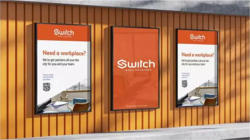
What role does the central poster play when flanked by two message posters in a three-frame set?
Display rotating maps of partner locations
Feature long testimonials from users
Provide detailed terms and conditions text
Anchor brand recognition through a bold mark
Which label best describes the grid of orange symbols shown as variations of a single mark?
Facade panels shading devices
Structural joints connection types
Logo drafts icon styles
Floor plans circulation paths
Which action best aligns typography with a clear objective for a public exhibit?
Use a bold title to communicate theme
Avoid contrast to appear subtle
Use five scripts to show variety
Set all text to 8 pt for minimalism
To keep visual hierarchy clear, which combination is most effective?
Small title, oversized body paragraphs
Random sizes to avoid predictability
Large title, medium subheads, smaller body
Identical sizes for all text elements

