
Font size
 Worksheets
Font Selection and Sizing
Total questions: 46
Worksheet time: 23mins
Look at the slide showing a single rule: “No more than 2 fonts per slide.” What guideline is being emphasized?
Use no more than two fonts
Use at least three fonts
Mix five different fonts
Change fonts every bullet
Which choice best follows the minimum font size advice for presentation text?
Use at least 18-point
Use at least 60-point
Use at least 30-point
Use at least 10-point
What is considered even better than the minimum size for easy viewing?
Twenty-point size
Thirty-one-point size
Fifty-point size
Forty-point size
PowerPoint’s default sizes shown on the slide are closest to which pairing?
44 for headers, 31 for bullets
40 for headers, 30 for bullets
30 for headers, 40 for bullets
31 for headers, 44 for bullets
Which practice helps the audience notice key words without hurting readability?
Change text color strategically
Switch fonts repeatedly
Write in all caps for emphasis
Use bold for emphasis
Use consistent sizing across slides
According to the guidance, which style is harder to read during a presentation?
Italics text
Regular text
Bold text
Colored text
Match each font rule to its purpose.
Limit fonts per slide
Reduces visual clutter
Keep size consistent
Prevents distracting jumps
Avoid all caps
Improves readability
The slide mentions a simple size algorithm: find the age of the oldest audience member and divide by two. What does this number represent?
Header-only size
Average font size
Maximum font size
Minimum font size

Which practice helps audiences process information on slides more easily?
Use concise key points only
Add repetitive sentences throughout
Include long detailed paragraphs
Fill slides with every detail

Why can excessive verbiage on slides cause students to lose interest?
Too many visuals to watch
Too few slides to follow
Too little information to read
Too much text to process

Choose the best strategy when you have many details but limited slide space.
Copy everything for the audience
Use more slides and speak details
Reduce content to one long slide
Put all details as full sentences

Which bullet breaks consistent wording in the list: Test scores will improve; Expanding knowledge; It will reduce time off task; Grades increase?
Grades increase
It will reduce time off task
Expanding knowledge
Test scores will improve

Select all bullets that show parallel structure with past participles: Improved test scores; Expanded knowledge; Reduced time off task; Increased grades.
Increased grades
Reduced time off task
Expanded knowledge
Improved test scores
Match each list to its quality of structure.
List with mixed tenses
Test scores will improve; Grades increase
List with consistent participles
Improved test scores; Increased grades
List that is overly wordy
Redundant lengthy text paragraphs
Which choice best follows the 6/6 rule for bullets?
Ten to twelve words per bullet is fine
Six to seven words per bullet is ideal
Two to three words per bullet is required
Eight words per bullet usually works
A slide shows nine short bullets. What is the best fix?
Keep all nine bullets as is
Combine ideas to reduce to six
Add periods to each bullet
Use three levels of sub-bullets
Which bullets follow recommended capitalization?
Capitalize first word and proper names
Use all lowercase everywhere
Capitalize only the first word
Capitalize every important noun
Match each guideline to its reason.
Limit bullets per slide
Prevents crowded slides
Keep bullets short
Speeds reading on screen
Avoid periods
Keeps style clean and consistent
One thought per line
Makes ideas clear and focused
A presentation draft includes: four bullets, each 12 words, with periods. Which change best aligns with best practices?
Trim each bullet to six to seven words
Expand to eight bullets per slide
Leave length and punctuation unchanged
Capitalize every word in each bullet

Which color and background pairing is best when you will print your slides for handouts?
Dark font on light background
Red font on blue background
Light font on dark background
Multicolor font on gradient background
You are presenting in a darkened room. Which choice improves readability on the screen?
Yellow text on yellow background
White or light text on dark background
Blue text on busy photo background
Black text on white background

Which set of actions aligns with using templates and keeping visuals simple?
Use built‑in templates for layout
Create many custom color schemes
Switch backgrounds on every slide
Limit colors to avoid eye strain
Match each guideline to its purpose in a presentation.
Simple background
Keeps focus on content
Single background across slides
Creates a consistent look
Light text on dark background
Improves readability in dark rooms

Which practice helps your audience stay focused during a presentation?
Set the stage and leave it alone
Use complex animated backgrounds
Add many bright colors to each slide
Change the theme every few slides

Which text alignment improves readability for bullet points on slides?
Left justification for bullets
Centered alignment for bullets
Right-aligned bullet paragraphs
Fully justified bullet lines
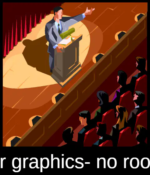
Why is centering graphics often a poor choice on a slide?
It increases file size
It hides the slide title
It leaves less room for text
It makes graphics pixelated
Match each placement choice with the design effect it creates.
Centered bullets
Ragged, harder-to-read lines
Left-justified bullets
Clear, easy-to-scan lines
Centered graphic
Less space available for text
Off-center graphic
More balanced layout with text room
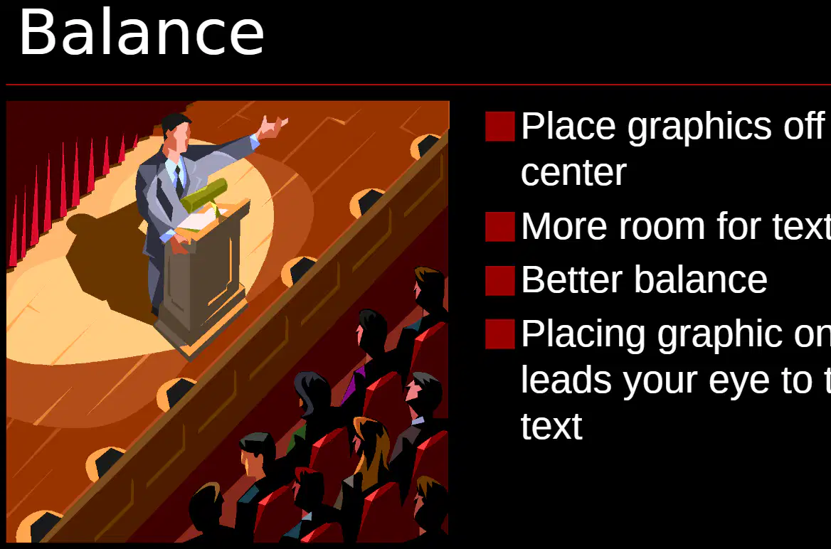
Which placements help create better visual balance on a slide? Select all that apply.
Place graphics off center
Center all bullet text
Left-justify bullet lists
Center the graphic and text
Place graphic on the left side

A slide has a large image centered in the middle. What is the most effective change to improve space for text while keeping balance?
Increase font size only
Shrink the image slightly
Add more bullet points
Move the image off center
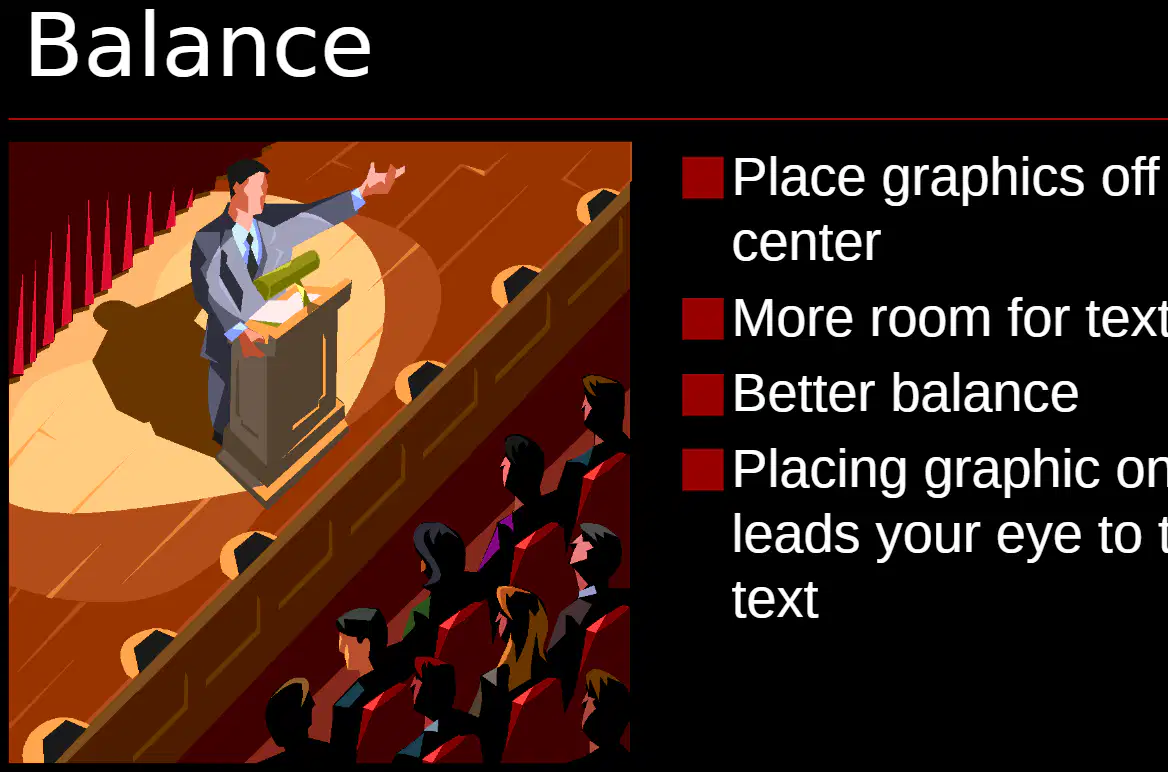
What is one benefit of placing the graphic on the left side of a slide with text on the right?
Makes titles harder to see
Audience looks only at the image
Leads the eye naturally toward text
Creates ragged text edges
Which choice best describes when to include an image in a presentation?
Only when the image supports the message
Add animated gifs to grab attention
Use random clip art to fill space
Every slide should have an image always

A class report has numbers for survey results. Which visual is the most appropriate to help readers understand quickly?
A collage of themed clip art
A bar graph or pie chart
A long table of raw numbers
A looping animated gif

Select the statements that show good animation practice for slides.
Add noisy effects to keep interest
Change transition style on every slide
Use consistent transitions throughout
Use builds to create dramatic emphasis
Reveal information step by step
Match each presentation choice to the likely effect on the audience.
Loud sound effects on transitions
Can feel annoying and distracting
Clip art used on many slides
Looks dated and may reduce credibility
Animated gifs across the page
Pulls attention away from the message
Pie chart summarizing survey results
Makes data easy to understand

A student wants to keep viewers focused while introducing key points one at a time. Which technique should they use?
Give all information at once
Insert multiple animated gifs
Switch to different transitions
Use builds to reveal points
Which choice best explains why a presenter should focus on information over graphics?
It lets the medium speak for the content
It avoids speaking and just shows images
It makes slides trendy and colorful
It keeps attention on the message itself
A classmate says, “The medium is the message.” Which response aligns with good presentation practice?
Disagree and prioritize clear information
Agree and design flashy animations
Disagree and remove all visuals entirely
Agree and add more fonts and styles
Which set of actions best prevents a boring presentation while still prioritizing content?
Use clear graphics to support key points
Speak confidently as the central storyteller
Fill slides with long paragraphs of text
Balance simplicity with engaging delivery
Match each guideline to its purpose in a strong presentation.
Keep it simple
Reduce clutter and distraction
Make bullet points
Improve quick reading on slides
Keep wording concise
Prevent long, hard-to-scan text
You are the star
Focus audience on the speaker
Which choice follows the rule to make slides easy to read?
Small font with dense paragraphs
All text, no visuals at all
Large font with short bullets
Fancy font with many colors
What does “You are the star—not the presentation” mean for a presenter?
Lead the explanation and use slides to support
Fill slides with complex charts and data
Stand behind the computer quietly
Let slides do all the talking
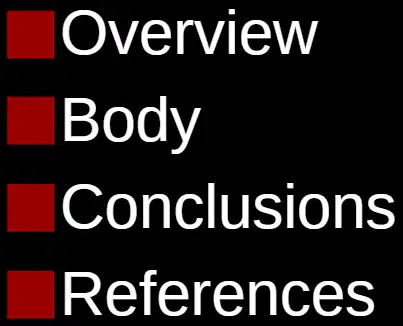
Which part of a presentation gives the main explanations and details?
Introduction section
Overview section
Body section
Conclusions section

Match each presentation part to its purpose.
Introduction
Opens and sets topic
Overview
Outlines what will be covered
Body
Explains ideas in depth
Conclusions
Summarizes key takeaways
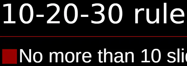
You are planning a talk. To follow the 10-20-30 rule, what should you limit the number of slides to?
About five slides
No more than ten slides
At least fifteen slides
Exactly twenty slides

Which combination follows the 10-20-30 rule?
8 slides, 25 minutes, 28-point font
10 slides, 20 minutes, 30-point font
9 slides, 18 minutes, 32-point font
12 slides, 20 minutes, 30-point font

A presenter uses 14 slides and speaks for 18 minutes with 30-point text. What single change makes it meet the 10-20-30 rule?
Add an overview slide
Reduce slides to ten
Speak for fifteen minutes
Increase font to forty

