Search Header Logo
  1. Resource Library
  2. Math
  3. Data And Graphing
  4. Analyzing Graphs
  5. Data Analysis Lesson
Data Analysis Lesson

Data Analysis Lesson

Assessment

Presentation

•

Mathematics

•

4th Grade - University

•

Practice Problem

•

Easy

•
CCSS
HSN.VM.C.6, 3.OA.D.8, HSF.IF.B.4

+12

Standards-aligned

Created by

Terrie Dabit

Used 32+ times

FREE Resource

8 Slides • 24 Questions

1

Data Analysis Lesson

Let's Learn About Tables, Pictographs, Line Graphs, Bar Graphs, Circle Graphs, and Histograms

media

2

Analyzing Data Tables

Watch the video. You will complete "The Cook Family Fishing Trip" in the Google resource. Move forward and answer a few questions.

3

Multiple Choice

Question image
How many students spent over 40 minutes but under 60 minutes studying?
1
22 Students
2
30 Students
3
8 Students
4
5 Students

4

Multiple Choice

Question image
How many more people studied for 0-30 minutes than people who studied for 121-150 minutes?
1
3
2
6
3
5
4
4

5

Multiple Choice

Question image

How many people were surveyed to collect this data?

1

18

2

20

3

22

4

24

6

Multiple Choice

Question image

How many baseball teams scored 0 runs per inning?

1

4

2

3

3

2

4

1

7

Reading Pictographs
  • The picture represents a value

  • Look for the legend or key

  • Half a pic means half the value

  • There is a resource in Google to answer about this pictograph

  • Answer some questions by moving forward

media

8

Multiple Choice

Question image

How many students play soccer and baseball?

1

90

2

40

3

50

4

110

9

Multiple Choice

Question image

How many strawberries does Ed have?

1

2

2

1

3

4

4

6

10

Multiple Select

A pictograph must always have a

1

Marker

2

Title

3

Cup of coffee

4

A key

11

Multiple Choice

Question image
How many more people like the color purple than blue?
1
1
2
3
3
6
4
8

12

Interpreting Bar Graphs

After watching this video go complete "A Walk in the Park". You will create your OWN questions. Ask a friend or your child what is the answer. Type what they say. Even if it is incorrect. Next head back here and answer a few questions.

13

Multiple Choice

Question image

Jack made this graph to show the number of movies that were rented from his store during four months. Which whole number shows how many more movies were rented in December than in September?

1

20

2

35

3

45

4

80

14

Multiple Choice

Question image

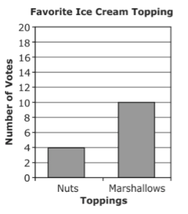
Students voted for their favorite ice cream topping. How many more students chose marshmallows than chose nuts?

1

4

2

6

3

10

15

Multiple Choice

Question image

Mary is recording her plant's growth in a journal. How many inches has the plant grown from week 1 to 7?

1

22

2

18

3

14

16

Multiple Choice

Question image
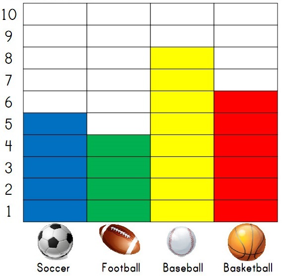
How many people like football and basketball?
1
9
2
4
3
10
4
2

17

Interpreting Line Graphs

Watch this video then you will complete the activity "Weather Watchers - Can You Interpret the Weird Weather?" Move forward and answer a few questions.

18

Multiple Choice

Question image
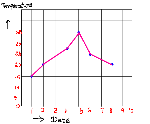
Did the temperature increase or decrease between day 1 and day 2?
1
increase
2
decrease

19

Multiple Choice

Question image

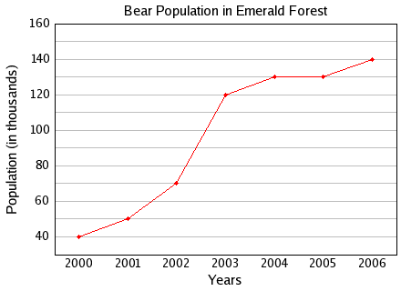
Between which two years did the bear population remain constant or the same?

1

2004 and 2005

2

2001 and 2002

3

2005 and 2006

4

2000 and 2001

20

Multiple Choice

Question image
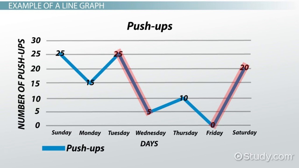
Between which two days was the greatest decrease in push-ups?
1
Friday and Saturday
2
Tuesday and Wednesday
3
Sunday and Monday
4
Thursday and Friday

21

Multiple Choice

Question image
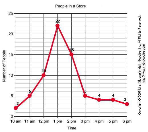
When was the greatest amount of shoppers at the store?
1
10am
2
1pm
3
6pm
4
2pm

22

Analyzing a Histogram

View the video. Complete the "Histogram Hike" resource. Try some of these questions next.

23

Multiple Choice

Question image
Mr. Semo is making a histogram to show the scores on the last science test. He first lists the scores in a stem-and-leaf plot. How many units tall should the bar be for the interval 70-79?
1
2
2
5
3
9
4
11

24

Multiple Choice

Question image
How many students have more than 1,000 songs on their MP3 player?
1
5
2
16
3
10
4
4

25

Multiple Choice

Question image
How many cities have temperatures between 70 degrees and 99 degrees?
1
44
2
34
3
26
4
62

26

Multiple Choice

Question image

Which interval has 400 employees?

1

33-43

2

0-10

3

77-87

4

66-76

27

Reading Circle Graphs

View this video then head to the next video.

28

Finding Percents Using Circle Graphs

View this video. You will be completing a Person Puzzle in your resource. Next answer a few questions.

29

Multiple Choice

Question image

Which table represents the data in the graph?

1
2
3
4

30

Multiple Choice

What is the total percent of a pie or circle graph?
1
10%
2
50%
3
100%
4
1000%

31

Multiple Choice

Question image
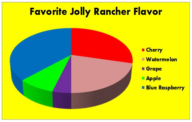
According to this circle graph, what is the least popular flavor of Jolly Rancher?
1
Blue Rasberry
2
Watermelon
3
Grape
4
Apple

32

Multiple Choice

Question image
There are 200 vegetable plants in a garden.  How many of the vegetable plants are green beans?
1
16
2
24
3
28
4
32
pattern-tertiary
Data Analysis Lesson

Let's Learn About Tables, Pictographs, Line Graphs, Bar Graphs, Circle Graphs, and Histograms

media

Show answer

Auto Play

Slide 1 / 32

SLIDE