
Interpret a scatter plot
Presentation
•
Mathematics
•
8th Grade
•
Medium
+7
Standards-aligned

Ashlyn Flock
Used 80+ times
FREE Resource
1 Slide • 18 Questions
1
Interpret a scatter plot

2
Multiple Choice

3
Multiple Choice

Which sentence describes the relationship shown on this scatter plot?
4
Multiple Choice

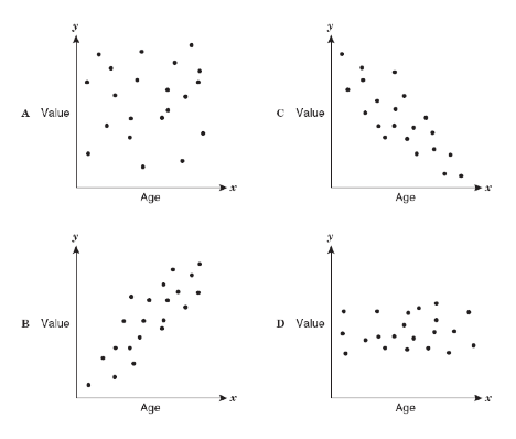
Which relationship is shown by this scatter plot?
5
Multiple Choice

Which relationship is shown by this scatter plot?
6
Multiple Choice

Which relationship is shown by this scatter plot?
7
Multiple Choice

Which relationship is shown by this scatter plot?
8
Multiple Choice

9
Open Ended

predict the year in which 38,000 clothing items were donated
10
Open Ended

Using the line of best fit, if your company wants to only pay $5.05 for each box of paper, how many boxes of paper should be ordered from Happy Paper company?
11
Multiple Choice

use the line of best fit to predict the temperature at 1000m of elevation
12
Multiple Choice

13
Multiple Choice

14
Multiple Choice
15
Multiple Choice
16
Multiple Choice

17
Multiple Choice
18
Multiple Choice
19
Multiple Choice
Interpret a scatter plot
Show answer
Auto Play
Slide 1 / 19
SLIDE
