
Interpreting Data and Graph
Presentation
•
Mathematics
•
1st - 4th Grade
•
Easy
+6
Standards-aligned

Maria N
Used 82+ times
FREE Resource
8 Slides • 15 Questions
1
Interpreting Data and Graph
Mathematics 3

2
Tally Chart
simple way to record and count frequencies
You can know the number of ladybug, ant, butterfly and mosquitoes here by looking a the tally.

3
Multiple Choice

How many cheese sandwiches sold?
4
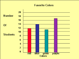
Bar Graph
Chart that shows data using rectangular bars or strips.
Bar graphs are used to compare different groups or track changes over time.

5

You can see parts of bar graph here
6
Vertical Bar Graph

7
Horizontal Bar Graph

8
Multiple Choice

How much is the quantity of kiwis sold?
9
Multiple Choice
10
Multiple Choice

How many burgers that sold in Wednesday?
11
Multiple Choice
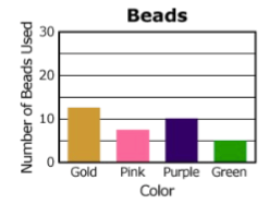
The graph shows the number of colored beads used to make a necklace. How many purple and green beads were used in all?
12
Multiple Choice

13
Line Graph
is a graph that uses points to decide the number and connect the line between the points.
You can use line graph to show changes over time.

14
Multiple Choice
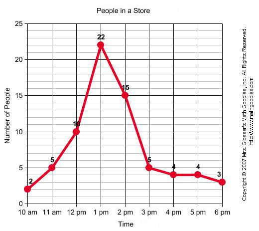
When was the greatest amount of shoppers at the store?
15
Multiple Choice
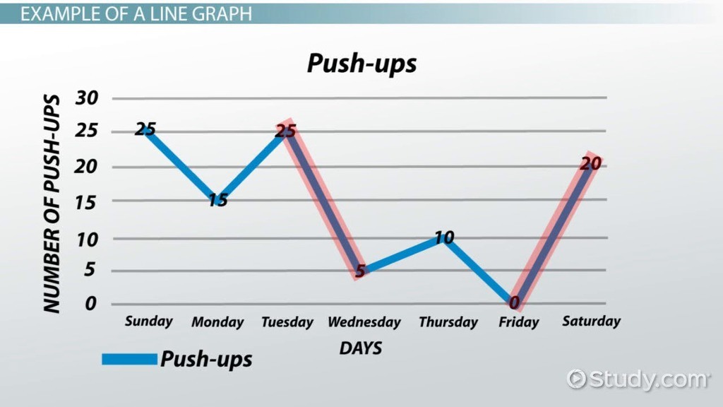
How many push-ups were done on Monday?
16
Multiple Choice

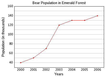
How many potatoes were grown in 2015?
17
Multiple Choice
18
Multiple Choice
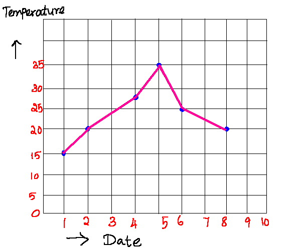
Did the temperature increase or decrease between day 1 and day 2?
19
Multiple Choice

What happened on Thursday?
20
Pie Chart
is a chart that looks like circle or pie.
It has sections (or 'slices') to represent values.
Pie chart usually use percentage to show the data.
You can conclude the smallest or the biggest data here.

21
Multiple Choice

What is the least pets that been owned by students here?
22
Multiple Choice

23
Multiple Choice
Which Continent has the smallest % of wild cats?
Interpreting Data and Graph
Mathematics 3
Show answer
Auto Play
Slide 1 / 23
SLIDE
