
Scatter Plots and Predictions
Presentation
•
Mathematics
•
8th - 12th Grade
•
Medium
+19
Standards-aligned
Mitchell Stanberry
Used 21+ times
FREE Resource
5 Slides • 45 Questions
1

2
3
Multiple Choice
4
Multiple Choice
5
Multiple Choice

6
Multiple Choice
7
Multiple Choice
8
Multiple Choice

9
Multiple Choice

10
Multiple Choice
11
Multiple Choice

12
Multiple Choice

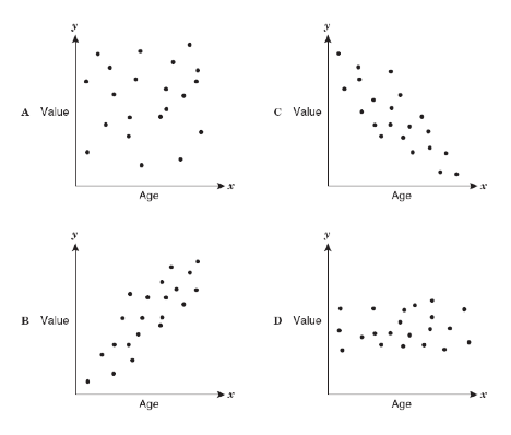
Describe the correlation in the graph shown.
13
Multiple Choice

14
15
Multiple Choice

16
Multiple Choice
17
Multiple Choice

18
Multiple Choice

Which of the following could be a possible line of best fit for the data?
19
Multiple Choice

20
Multiple Choice

21
Multiple Choice

22
Multiple Choice
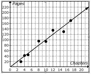
The scatter plot shows the relationship between the number of chapters and the total number of pages for several books. Use the trend line to predict how many pages would be in a book with 6 chapters.
23
Multiple Choice

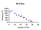
Choose the graph with a trend line that best fits the data.
24
Multiple Choice

25
Multiple Choice

26
27
Multiple Choice
28
Multiple Choice

29
Multiple Choice
30
Multiple Choice

31
Multiple Choice

Estimate the correlation coefficient
32
Multiple Choice
33
Multiple Choice
34
Multiple Choice
35
Multiple Choice
36
Multiple Choice
37
Multiple Choice
38
Multiple Choice
39
Multiple Choice
40
41
Multiple Choice

What is the Interquartile Range of this data set? The lower (first) quartile is 19 and the upper (3rd) quartile is 56.
42
Multiple Choice

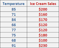
What is the range of this data set?
43
Multiple Choice
What is the median of this data set?
44
Multiple Choice

What does point C on the box plot represent?
45
Multiple Choice

46
Multiple Choice

47
Multiple Choice

Which is NOT ture?
48
Multiple Choice

49
Multiple Choice

Find the median of plot B
50
Multiple Choice
Find the median of plot B
Show answer
Auto Play
Slide 1 / 50
SLIDE
