Search Header Logo
Scatter Plots

Scatter Plots

Assessment

Presentation

Mathematics

8th Grade

Medium

CCSS
HSS.ID.B.5, 8.F.A.3, 8.SP.A.1

+5

Standards-aligned

Created by

Patricia Graham

Used 26+ times

FREE Resource

4 Slides • 25 Questions

1

Scatter Plots

Create a Scatter Plot

a) independent & dependent

b) plot points

Determine the Relationship

a) positive

b) negative

c) none

Determine the Relationship

a) linear

b) non-linear


Slide image

2

3

Multiple Choice

Question image

1. What type of correlation does this graph have?

1

positive

2

negative

3

none

4

all of the above

4

Multiple Choice

Question image

2. What is the correlation?

1

Negative correlation

2

No correlation

3

Positive correlation

4

All of the above

5

Multiple Choice

Question image

3. What type of association does this graph have?

1

positive

2

negative

3

none

4

all of the above

6

Multiple Choice

Question image

4. Which scatter plot shows a linear relationship between x and y?

1

Graph A

2

Graph B

3

Graph C

4

Graph D

7

Multiple Choice

5. In a scatterplot, an outlier...

1

...is something we didn't learn 8th grade

2

...is a puppet with a long nose named Pinocchio

3

...is a point that is far outside the main cluster of points/ordered pairs

4

...is a really naughty point who doesn't tell the truth when outside

8

Multiple Choice

6. What type of correlation (association)?

The outside temperature and the amount of layers you wear.

1

Positive correlation

2

Negative correlation

3

No correlation

4

All of the above

9

Multiple Choice

6. What type of correlation (association)?

The outside temperature and the amount of layers you wear.

1

Positive correlation

2

Negative correlation

3

No correlation

4

All of the above

10

Multiple Choice

Question image

7. Is the point in red an outlier?

1

Yes

2

No

11

Multiple Choice

8. The number of siblings you have and your weight.

1

Positive correlation

2

Negative correlation

3

No correlation

4

All of the above

12

Multiple Choice

Question image

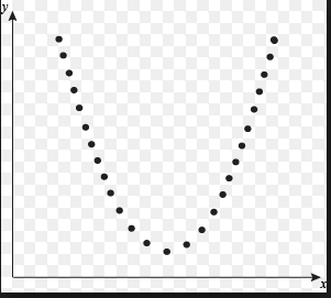
9. What type of association does this scatter plot represent?

1

positive linear association

2

negative association

3

no association

4

nonlinear association

13

Multiple Choice

Question image

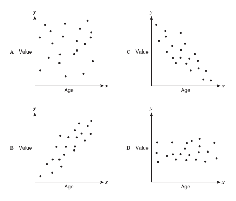
10. As the age of the car increases, its value decreases. Which scatterplot represents this relationship?

1

A

2

B

3

C

4

D

14

15

Multiple Choice

Question image

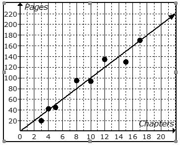
1. The scatter plot shows the relationship between the number of chapters and the total number of pages for several books. Use the trend line to predict how many chapters would be in a book with 140 pages.

1

12 chapters

2

19 chapters

3

14 chapters

4

21 chapters

16

Multiple Choice

Question image

2. The following scatter plot shows Pam's training as she prepares to run a 6 mile race at the end of the month. Which of the following would be a reasonable approximation for the length of time it would take for her to run 6 miles?

1

A. 50 min

2

B. 80 min

3

C. 45 min

4

D. 60 min

17

Multiple Choice

Question image

3. Based on the graph, if Joe earned $400, how many hours did he work?

1

25 hours

2

35 hours

3

45 hours

4

15 hours

18

Multiple Choice

Question image

4. What is the correlation between length of running start and distance of jump?

1

positive: the further you run the further you jump

2

negative: the less you run the less distance of your jump

3

positive: the further your running start the less your distance

19

Multiple Choice

5. As x increases, y increases

1

correlation coefficient

2

causation

3

positive correlation

4

negative correlation

20

Multiple Choice

6. As x increases, y decreases

1

correlation coefficient

2

causation

3

positive correlation

4

negative correlation

21

Multiple Choice

Question image

7. The following scatter plot shows Pam's training as she prepares to run a 6 mile race at the end of the month. Which of the following would be a reasonable approximation for the length of time it would take for her to run 6 miles?

1

A. 50 min

2

B. 80 min

3

C. 45 min

4

D. 60 min

22

Multiple Choice

Question image

8. About how many male math teachers were there in 2006?

1

15

2

30

3

35

4

45

23

Multiple Choice

Question image

9. What type of association does this scatter plot show?

1

positive linear association

2

negative linear association

3

no association

4

nonlinear association

24

25

Multiple Choice

Question image

1. What is the y-intercept?

1

-2

2

3

3

2

4

-3

26

Multiple Choice

Question image

2. What is the line of best fit?

1

y = 5/3x + 375

2

y = 1/3x + 475

3

y = 5/3x + 3

4

y = 1/3x + 375

27

Multiple Choice

Question image

3.  What is the equation of the line of best fit?

1

y= 2x+3

2

y=3x+2

3

y= 12x +3\frac{1}{2}x\ +3

4

y= 12x +3-\frac{1}{2}x\ +3

28

Multiple Choice

Question image

4. Which sentence describes the relationship shown on this scatter plot?

1

As the temperature decreases, the visitors increase.

2

As the temperature increases, the number of visitors increases.

3

As the visitors increase, the temperature decreases.

4

No correlation

29

Multiple Choice

Question image

5. What is the equation of the line of best fit

1

y= -2x + 10

2

y= 10x+ 2

3

y=2x+10

4

y= 10

Scatter Plots

Create a Scatter Plot

a) independent & dependent

b) plot points

Determine the Relationship

a) positive

b) negative

c) none

Determine the Relationship

a) linear

b) non-linear


Slide image

Show answer

Auto Play

Slide 1 / 29

SLIDE