
Scatterplots
Presentation
•
Mathematics
•
9th - 12th Grade
•
Medium
•
CCSS
HSS.ID.C.8, HSS.ID.B.5, HSA.CED.A.2
+5
Standards-aligned

Rachael Pearson
Used 261+ times
FREE Resource
8 Slides • 10 Questions
1
Scatterplots

2
3
Scatterplots
Only for numerical/quantitative data

4
5
Multiple Choice
6
Multiple Choice
7
Multiple Choice
8

9
Multiple Choice

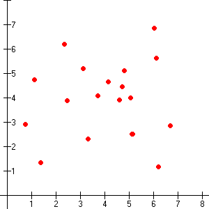
What type of association does this graph have?
10
Multiple Choice

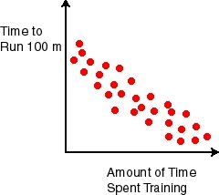
Which best describes the form of this scatterplot?
11
Multiple Choice
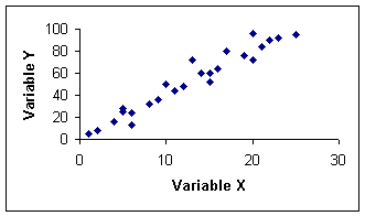
What type of association does this graph have?
12
Multiple Choice
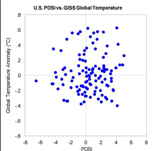
What type of association does this scatter plot represent?
13
Outliers
Extreme values that are either very large or very small with respect to the rest of the data points

14

15
16
Multiple Choice
Estimate the correlation coefficient
17
Multiple Choice

Estimate the correlation coefficient.
18
Multiple Choice
Estimate the correlation coefficient.
Scatterplots
Show answer
Auto Play
Slide 1 / 18
SLIDE
