Statistics 1: Types of Graphs
Presentation
•
Mathematics
•
5th - 10th Grade
•
Medium
+8
Standards-aligned
Melissa CHAPMAN
Used 16+ times
FREE Resource
8 Slides • 41 Questions
1
Statistics 1: Types of Graphs
by Melissa CHAPMAN
2
Poll
Rate your understanding of graph types and reading graphs before the lesson.
1
No idea
2
I know some of it but couldn't explain, and need some help from the teacher
3
I know it and can do it on my own
4
I know it and could explain to someone else
3
Tally Chart
A tally chart assists in counting a total after the observation has concluded.
From a tally chart, the observer collates data to analyse where you can then create many types of graphs to display this data.
4
Bar and Column Graph
While often called the same thing these are two different types of graphs. Columns go up and down (vertical), bars go side to side (horizontal).
5
Multiple Choice
6
Multiple Choice
7
Multiple Choice
8
Multiple Choice
What is the title of this column graph?
Wildlife
Orange and Blue
Dolphin Whales
Wildlife Population
9
Multiple Choice
What was the recorded population of dolphins in 2018?
60
78
110
65
10
Multiple Choice
In what year was the highest population of whales recorded?
2017
2022
2019
2020
2021
11
Multiple Choice
12
Pie Graph
This shows parts of a whole separated into percentages.
Using a tally chart you would find the total and divide each part of the total then multiply by 100 to turn it into a percentage.
13
Multiple Choice
14
Multiple Choice
15
Multiple Choice
25% of a circle is equal to:
one-fifth
a quarter
a half
two fifth
16
Multiple Choice
The pie chart shows the colours of 32 beads. How many green beads are there?
90
8
11
9
17
Multiple Choice
18
Multiple Choice
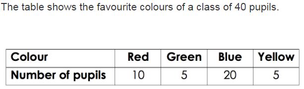
Which pie chart represents the same data as the table?
19
Multiple Choice
These pie charts show how people travel to work in 2 towns. In which town do more people travel to work by bike?
town A
town B
both the same
impossible to say
20
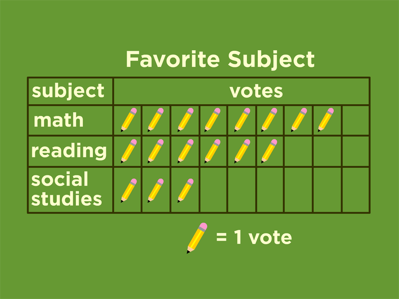
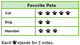
Pictograph
Instead of using an axis with numbers, it uses pictures to represent a particular number of items.
It must have a scale to show the numerical value for each picture.
21
Multiple Choice
How many votes did reading receive?
2
4
6
8
22
Multiple Choice
23
Multiple Choice
24
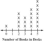
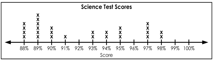
Dot Plot
A Dot Plot is a graphical display of data using dots.
One dot represents one measure at that category or value.
25
Multiple Choice
26
Multiple Choice
27
Multiple Choice
28
Multiple Choice
Which statement best describes the data shown in the dot plot?
The peak of the data is at 35
The data are clustered from 30 to 32
The data distribution has gaps
The data distribution is symmetrical
29
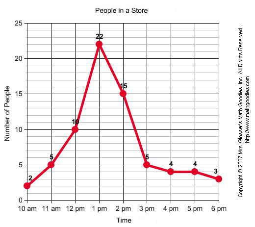
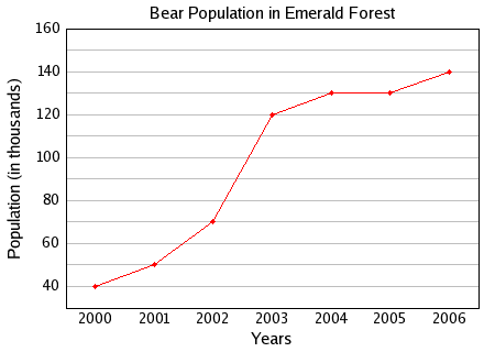
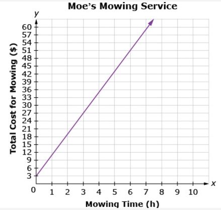
Line Graphs
Line graphs are drawn by connecting plotted points with a straight line.
They are used to show trends or comparisons in data sets.
The x-axis runs horizontally expressing an independent variable, where the y-axis is vertically expressing a dependant variable.
30
Multiple Choice
31
Multiple Choice
32
Multiple Choice
33
Multiple Choice
A restaurant recorded the number of pizzas sold each month for one year. The data are shown in the graph below. During which month did the restaurant sell 40 pizzas?
March
May
July
August
34
Multiple Choice
35
Multiple Choice
36
Multiple Choice
37
Multiple Choice
At what rate did the temperature decrease between the 20th and 25th minutes of the experiment?
10°C in 5 min
10°C in 10 min
5°C in 5 min
5°C in 10 min
38
Multiple Choice
Which month had the biggest difference between the high and low temperatures?
January
April
October
November
39
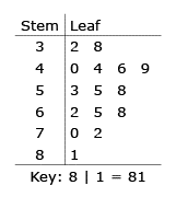
Stem and Leaf Plot
A Stem and Leaf Plot is a special table where each data value is split into a "stem" (the first digit or digits) and a "leaf" (usually the last digit).
40
Multiple Choice
32, 38, 40, 44, 44, 46, 49, 53, 55, 58, 62, 65, 68, 70, 72, 81
He put the data in a stem-and-leaf plot. What number did he leave out of the stem-and-leaf plot?
41
Multiple Choice
How many students scored more than 80%?
2
13
6
7
42
Multiple Choice
43
Multiple Choice
44
Multiple Choice
45
Multiple Choice
46
Multiple Choice
What is Mary's lowest test score?
49
40
42
45
47
Multiple Choice
How many times did Mary score below a 60 on her tests?
4
5
3
0
48
Multiple Choice
49
Poll
Rate your understanding of graph types and reading graphs after the lesson.
1
No idea
2
I know some of it but couldn't explain, and need some help from the teacher
3
I know it and can do it on my own
4
I know it and could explain to someone else
Statistics 1: Types of Graphs
by Melissa CHAPMAN
Show answer
Auto Play
Slide 1 / 49
SLIDE

Similar Resources on Wayground
44 questions
Anemiile la gravide.
Presentation
•
KG
45 questions
ENGLISH ENDING SOUND
Presentation
•
KG
42 questions
Participles
Presentation
•
KG
41 questions
Story Elements and Plot Review
Presentation
•
5th - 9th Grade
44 questions
Square and Cube Roots
Presentation
•
6th - 8th Grade
45 questions
Motion and acceleration
Presentation
•
6th - 9th Grade
42 questions
Understanding Quadrilaterals
Presentation
•
6th - 9th Grade
42 questions
Solving Quadrilaterals Lesson
Presentation
•
6th - 9th Grade
Popular Resources on Wayground
10 questions
HCS SCI 03 Summer School Assessment 1
Quiz
•
3rd Grade
15 questions
HCS SCI 05 Summer School Assessment 1 Review
Quiz
•
5th Grade
22 questions
Day 9 Equations and Inequalities Review
Quiz
•
9th Grade
10 questions
Writing and Identifying Ratios Practice
Quiz
•
5th - 6th Grade
7 questions
PYRAMID PERSPECTIVES part 1
Presentation
•
9th - 12th Grade
12 questions
Understanding the Fourth of July
Quiz
•
9th Grade
15 questions
Soccer World Cup Quiz Questions
Quiz
•
7th Grade