Search Header Logo
Unit 1 Test 1 Review (Lessons 1.1 - 1.3)

Unit 1 Test 1 Review (Lessons 1.1 - 1.3)

Assessment

Presentation

Mathematics

9th - 10th Grade

Easy

CCSS
6.SP.B.4, 7.SP.B.4, 6.SP.B.5C

+6

Standards-aligned

Created by

Kimber Norman

Used 101+ times

FREE Resource

14 Slides • 47 Questions

1

Statistics

Unit 1 - Test 1

boxplots, histograms & skew

2

Box and Whisker Plots (aka Boxplots)

  • Minimum - "lowest" data point

  • 1st Quartile (Q1) - median of lower 1/2 of the dataset (left of median)

  • Median - as the name implies

  • 3rd Quartile (Q3) - median of the upper 1/2 of dataset (right of median)

  • Maximum - "Highest" data point

media

3

The length of each section tells you if the data is spread out or compact

This boxplot is skewed right with two outliers indicated by the *'s. Notice that the left two sections are much narrower together than the right two sections, so that means the data is more compact in that range.

media

4

Multiple Select

Question image

The boxplots to the left demonstrate age of Oscar winning actors by gender where A is that of female actors and B is that of male actors

Which two descriptions are correct?

1

both sets of data are symmetrical with outliers in the higher ages

2

The female ages are skewed left

3

The males have higher ages in general such that over 50% of the winners are older than 75% of the female winners

4

The female ages are more variable than the males

5

media

​Both boxplots are symmetrical with outliers in the higher ages [if you ignore the *'s, everything else is pretty balanced]

The males have higher ages in general such that 50% of the males are older than 75% of the female winners [notice that three female sections are below the median line of the males]

6

Multiple Choice

Question image

The number of team wristbands sold in two stores is shown in the boxplot. Which store has the higher median sold?

1

Store A

2

Store B

3

they are the same amount

7

Multiple Choice

Question image

The number of team wristbands sold in two stores is shown in the boxplot. Which store has the larger range?

1

Store A

2

Store B

3

they are the same amount

8

Multiple Choice

Question image

The number of team wristbands sold in two stores is shown in the boxplot. Which store has the larger interquartile range?

1

Store A

2

Store B

3

they are the same amount

9

Multiple Choice

Which of item of a boxplot is also at the 25th percentile?

1

Minimum

2

Q1

3

Median

4

Q3

10

Multiple Choice

Which item is also known as the IQR?

1

Median

2

Q3 - Q1

3

1.5

4

Maximum

11

Multiple Choice

Which of the following is how a person could determine the range of the data from its boxplot?

1

Q3 - Q1

2

Median*2

3

Maximum - Minimum

4

Minimum + Maximum

12

Answers:

​-For each section containing 25% of the data, the 25th percentile would be at Q1 (minimum to Q1 contains 25%)

-The IQR or inter-quartile range is how wide the box is which is found with Q3 - Q1

​-The range of data is how wide it is, so Maximum - Minimum would determine the range

13

Either graph the data below by hand or enter into desmos to answer questions:

23, 52, 67, 18, 60, 78, 81, 12, 25, 26, 153, 40, 51, 72, 60, 68

14

Multiple Choice

Which shape best describes the boxplot?

must graph for above numbers

1

Skewed left

2

Skewed right

3

Symmetrical with one outlier

15

Multiple Select

Which two sections of the boxplot have the most compact data?

1

Between minimum and Q1

2

Between Q1 and median

3

Between median and Q3

4

Between Q3 and Maximum

16

Multiple Select

Which of the following make up the five-number summary?

1

min=12, max=153

2

Q1=25.5, Q3=70

3

x\overline{x} =55.375,

SxS_x =34.34 

4

Median = 56

17

Using the same data below, find the five-number summary to answer some questions and then perform outlier math

23, 52, 67, 18, 60, 78, 81, 12, 25, 26, 153, 40, 51, 72, 60, 68

18

Multiple Select

Perform the outlier math to determine the upper and lower fences

Q1=25.5, Q3=70

1

66.75 = IQR

2

-41.25 = LF

3

136.75 = UF

4

153 = UF

19

Multiple Choice

With an upper fence of 136.75, this means we have ___outlier(s)

1

0

2

1

3

Many

20

153 is the only data item outside of either fence, so there is exactly 1 outlier

1.5(70-25.5) = 66.75

25.5-66.75 = -41.25 LF

70+66.75 = 136.75 UF

summary:

Some text here about the topic of discussion

21

Multiple Choice

Question image

What is the median height among Math I students?

1

59 in

2

62.5 in

3

67 in

4

69.5 in

5

72

22

Multiple Choice

Question image

How many Math I students are 69.5" or taller?

1

25%

2

50%

3

75%

4

100%

23

Multiple Choice

Question image

Which of the following statements is true?

1

The median run times for females is 257.21

2

The median run time for males is more than 8 minutes faster than the median run time for females

3

The median run times for females is the same as the median run time for males

4

There is not enough information to compare the run times for males and females

24

Multiple Choice

Question image

Which squirrels are longer on average?

1

Red

2

Grey

3

They're the same

25

Multiple Choice

Question image

Which group has a larger interquartile range?

1

Group A

2

Group B

3

They're the same

26

Multiple Choice

Question image

Which group has a higher median reaction time?

1

Group A

2

Group B

3

They're the same

27

Fill in the Blank

Observations that fall far outside the overall pattern of the distribution

28

Fill in the Blank

_____________ data uses stemplots, histograms, boxplot to display data.

29

Multiple Choice

A characteristic of a individual that takes the numerical value (with a unit of measure) for which arithmetic average makes sense

1

quantitative variable

2

categorical variable

3

qualitative variable

4

individual

30

Multiple Choice

A characteristic of an individual that places it into one of several categories or groups

1

quantitative data

2

categorical data

3

individual

4

variable

31

Multiple Choice

Any characteristic of the individual

1

distribution

2

variable

3

outlier

4

skewed

32

A Review of Histograms

Another graphic to use for your data.​

media

33

media

A bar chart is used when you are looking at qualitative data, data that is descriptive while a histogram is used to describe quantitative data, or data that can be counted.

​Definition

NOT a bar chart!!

34

media

A histogram will use connected bars to summarize the data while a bar chart separates the data because of the categories.

​Definition

Histogram

35

Multiple Choice

Question image

Bar Chart or Histogram?

1

Bar Chart

2

Histogram

3
6

36

Multiple Choice

Question image

Name the type of graph.

1

circle graph

2

line graph

3

histogram

4

bar graph

37

media

x - axis: The values, or ranges of values, for the data set.

y - axis: The frequency of the values.​

Definition

The axis of a histogram

38

Multiple Choice

Question image

How many different age groups were surveyed about their favorite M & M?

1

5

2

6

3

7

39

Multiple Choice

Question image
How many students scored between a 86 and a 90?
1

1

2

3

3

6

4

10

40

Multiple Choice

Question image

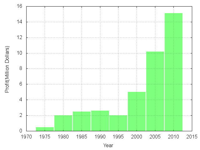
What is the range of ages shown in this histogram?

1

10 years

2

30 years

3

20 years

4

none of the above

41

Multiple Choice

Question image
How many people watched between 6 and 10 hours of TV last week?
1

31

2

22

3

15

4

35

42

Multiple Choice

Question image
If Raul measured another tree in the orchard, which is most likely the height of the tree?
1

12 feet

2

21 feet

3

3 feet

4

19 feet

43

Multiple Choice

Question image
How many students have more than 1,000 songs on their MP3 player?
1

5

2

16

3

10

4

4

44

media

You can use histograms to determine how your data is distributed and/or skewed. You consider the MEAN and the MODE of the data set.

Definition

45

Multiple Select

Which of the following are examples of intervals (bin size)? (Choose ALL that apply)

1

10

2

0-15

3

22

4

25-50

46

media

47

Fill in the Blank

An example of a right skewed distribution is when the _______ side of the histogram extend out dramatically

48

Multiple Choice

Question image
Describe the histogram:
1

Left Skewed

2

Normal/Symmetrical

3

Right Skewed

4

Uniform/Flat

49

Multiple Choice

Question image

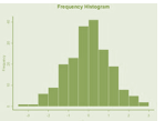
What is the shape of this bar graph?

1

Skew right

2

Skew left

3

Symmetrical

4

uniform

50

Multiple Choice

Question image
Shape?
1

Skewed right

2

Skewed left

3

Symmetric

4

Unimodal

51

Multiple Choice

Question image

The following dot plot is

1

skewed left

2

skewed right

3

symmetrical

52

Multiple Choice

Question image

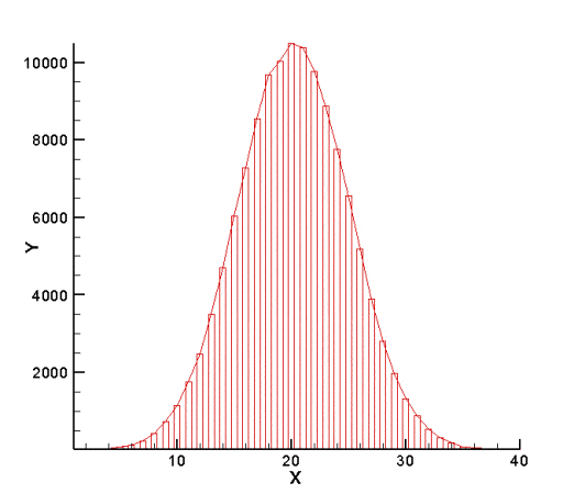
How would you describe this distribution?

1

Left skewed

2

Uniform

3

Right Skewed

4

Symmetrical

53

Multiple Choice

Question image

Which statement is true about the center of distribution?

1

The center is best described using the mean, because the distribution is skewed.

2

The center is best described using the median, because the distribution is skewed.

3

The center is best described by the mean and median, because the distribution is symmetric.

4

The center is best described by the outlier, because the distribution is symmetric.

54

Multiple Choice

Question image

Based on our class data histogram, what appears to be the approximate median hours of screen time?

1

0-2 hours

2

4-6 hours

3

6-8 hours

4

16-18 hours

55

Multiple Choice

Question image

Which best describes the shape of this histogram?

1

Left skewed

2

Symmetric

3

Right Skewed

56

Multiple Choice

Question image

Which of the following best describes the shape of the distribution?

1

SKEWED LEFT

2

SKEWED RIGHT

3

SYMMETRICAL OR BELL

4

UNIFORM

57

Multiple Choice

Question image

Shape?

1

Skewed right

2

Skewed left

3

Symmetric or Bell

4

Uniform

58

Fill in the Blank

In a left skewed distribution, the peak is more to the ______ side of the graph

59

Multiple Choice

Question image

Describe the shape of the graph.

1

Symmetrical or bell

2

Skewed left

3

Uniform

4

Skewed right

60

Multiple Choice

A symmetric distribution resembles

1

a one peak shape towards the left of the graph

2

a bell

3

a flat shape with no obvious peaks or valleys

4

a graph with wide gaps in the data

61

Multiple Choice

When data is left skewed, the center is

1

in the right side of the graph

2

in the left side of the graph

3

in the center of the graph

Statistics

Unit 1 - Test 1

boxplots, histograms & skew

Show answer

Auto Play

Slide 1 / 61

SLIDE