
Search Header Logo
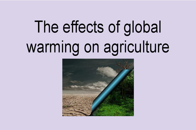
The effects of global warming on agriculture

The effects of global warming on agriculture

Assessment

Presentation

Other

9th Grade

Practice Problem

Medium

Created by

Michelle Bijkersma

Used 2+ times

FREE Resource

18 Slides • 23 Questions

1
media

2

How to work through this lesson.

Read, (discuss) and think about each slide, including the inforgraphics, then answer the quiz style questions that follow it. ​

The intention is for you to learn about global warming vs climate change, what some of the evidence is, how it affects agriculture and how to analyse graphs, maps and infographics correctly in geography. ​

3

media

4

Multiple Select

Question image

Climate is

(Select all of the correct answers)

1

the average temperature and rainfall over a long period of time

2

a fast changing weather pattern

3

the same as weather

4

not the same as weather

5

media

6

Multiple Select

Question image

Global warming is

(Select all correct answers)

1

the same as naturally occuring climate change

2

the temperature of the surface of the earth

3

caused by green house gas emissions

4

hot weather

7

​Interpreting graphs

Explaining your interpretations of a graph is like writing a paragraph. You have an introduction that is a general statement about the topic, followed by the specific evidence and explanations. This includes the exceptions. Then you write a concluding sentence that is a general closing statement to wrap up.

media

8

Reorder

Reorder the following on how to write a paragraph explaining a graph

Using the title, state what the graph is about.

State the general pattern or trend shown in the graph

Use specific details as evidence to support the trend

Identify and explain the exceptions in the data

Write a general concluding sentence to sum up.

1
2
3
4
5

9

When analysing graphs note the importance of headings, labelling of axes, scaling of axes, use of colour, choice of graph type (e.g line graph). When explaining graphs some sentence starters you can use are

  • This graph shows …

  • A pattern in the graph is …

  • An exception/outlier/different pattern in the graph is …

  • A difference between … and …. is …

  • A similarity between … and … is

  • If this pattern continued, I predict …

  • A probable reason for that pattern is …

  • A probable reason for this difference is …

Analysing graphs

media

10

Multiple Select

When writing an analysis of a graph, examples of starting sentences can be

(Select all correct answers)

1

This graph shows....

2

The graph is really interesting in my opinion.....

3

Similarities can be observes between....and.....

4

A significant exception to the pattern is ........

11

Multiple Select

When analysing a graph conclusions should be general such as

1

In conclusion, by 2100, the number of days over 40 degrees on the east coast of Australia will be between 0-2. Moving inland from the eastern seaboard, the number of days over 40C will increase from 60 to 90 days. Much of the north west will have over 130 days over 40C.

2

In conclusion, the graph shows that the number of days over 40 degrees around Australia will increase significantly.

12

Multiple Select

When analysing a graph, it is important to study the

(Select all correct answers)

1

the dates in the graph or when it was made so we know it is current

2

the heading, the labels and scaling of the axes

3

the use of colour and type of graph

4

the source of the graph so we know it is valid

5

the skills of the person viewing the graph

13

media

Look at the title. What does the graph show? 

Look at the pattern. What are the trends (x5)? 

Compare 1850 - 1950 with 1950 to 2000

Look at the evidence/data.

What is the supporting evidence for the trend?

(Study the X axis which is in increments of 25 years since 1850, the Y axis is millions of tonnes of CO2 emissions annually. Use the details to explain trends specifically)

​​

Look for any exceptions. ​

What is your conclusion? 

​CO2 Emmissions by Humans

14

Fill in the Blanks

media image

Type answer...

15

Fill in the Blanks

media image

Type answer...

16

media

What does the graph show?

What is the linear pattern / trend?

What are some specific details that provide supporting evidence for the trend?

Compare the trends 1850 - 1950 and 1950 - 2000

What is the scaling on the X and Y axes?

The baseline is 0.0 which is the average global land surface temperature​. What is the dotted line?

Are there any exceptions and how would you explain them?

What conclusions can you draw?

​Global Warming Temperature Trends

17

Match

Question image

Match the following questions and answers about the rising temperature of the earth's surf

What does the Y axis show?

(vertical )

What does the X axis show? (horizontal)

What were the temperature anomalies between 1880 and 1939?

What were the temperature anomalies between 1940 and 2000?

What were the temperature anomalies in 2016 and 2020

Temperature anomalies (= degree of change away from average temperature)

Years in 20 increments from 1880 to 2020

The temperature anomalies were between the average temperature 0.0 and 0.5 degrees cooler

The temperature anomalies were between the average temperature 0.0 and 0.5 degrees warmer

The temperature anomalies reached 1.0 degrees above the average temperature for 1880 to 1980

18

Total Solar Irradiance (TSI) measures the changes in energy the Earth receives from the Sun and solar flares in metres squared. 

The global surface temperature is measured in Celsius

What does the graph show?

What are the two trends in yellow and red? 1880 to 1950? 1950 to 2020?

What is the supporting evidence (Study Y axis,colours to measure TSI and Degrees C, Study X axis for years at 20 year intervals. ​ Use the specific data point details to explain the patterns

What are the exceptions? 

What is your conclusion?

Temperature vs Solar Activity

media

19

Match

Question image

Match the following

What trend does the thick red line show?

What trend does the thick yellow line show?

What exception can we see in the TSI 11 year average around 1960?

How does the period 1880 to 1950 differ from 1950 to 2020?

What conclusion can we draw from this graph?

The rapid rise of the earth's surface temperature of 1.0 C since 1950

Total Solar Radiation (TSI) has not risen but stays around 1361 parts per mil in the atmosphere

There is a rise in TSI around 1950, possibly due to a solar flare.

Degrees Celcius and Total Solar Activity were closely related until 1950, but this is no longer.

The Total Solar Activity cannot be responsible for global warming.

20

media

What is the trend?

What is the specific information (numerical data) to prove the trend? 

Check the axes and data points​ etc.

What are the exceptions?

What conclusion can you draw?

Analyse Carbon dioxide levels in the atmosphere

21

Fill in the Blanks

media image

Type answer...

22

media

What does the graph show?

What are the 5 trends? 

What is the evidence? (Study X axis, Y axis, dotted lines and / or baselines)

Use details from the data points.

What are the exceptions?

What is your conclusion?

Global warming in Australia

23

Match

Question image

Match the following graph coloured bands and lines to what they represent

The light blue band shows

The yellow band shows

The reddish brown dotted lines show

The light blue line and the dark blue lines show

The grey band shows

a simulation of the Australian average temperature from 1910 to 2020 (past)

a simulatution of the future Australian average temperature

previous models of Australian average temperatures if global warming is 1.5 C and 2.0 C

the Australian average temperature that has been observed annually and over a 20 year period

what the average temperature range would be without global warming.

24

Multiple Select

Question image

The graph shows that

(Select all correct options)

1

The simulations, models and observations of records are in accord (match) with each other

2

Climate modelling has proven to be correct to date as the models match the temperatures observed.

3

The models and simulations can predict the future climate with a high degree of accuracy

4

We can't trust models and simulations because we should only trust what we can observe.

25

Australian ocean warming

Based on what you have practiced, analyse the increase in temperature anomalies in the oceans surrounding Australia.

media

26

Reorder

Question image

Reorder the following sections of a paragraph to explain the graph.

This graph shows the rise in sea surface temperatures for Australian oceans 1910 to 2010

The temperatures ranges between a baseline average (0.00) and 0.5 degrees C below average prior to 1950

The temperatures began rising from baseline (0.0) to 1.0 degrees C from 1950 to 2010

The sea surface temps fell in the mid 1960s and early 1990s. This may be due to especially cold years

In conclusion, the evidence suggests that sea surface temperatures are rising for Australian oceans

1
2
3
4
5

27

media

​PQE: Pattern, Quantify, Exception

​'Quantify' comes from 'quantity' so it really means add amounts and other numeric data, including measurements as evidence. No opinions are to be included

28

Multiple Choice

When we add specific details like names, numerical data (numbers and measurements etc) to our analysis, in PQE this is

1

Pattern

2

Quantification

3

Exception

4

Conclusion

29

media

Use PQE to explain this map

What is the pattern? E.g What is the colour intensity and distribution? (P)

What is some specific information to support this? Use details such as continent names, crop yields, latitude, rough percentages and other numerical data. (Q)

What are some exceptions? How would you explain them?

​(E)

What are your conclusions?

Task 2

30

Multiple Choice

Question image

What patterns are shown in this map?

1

The patterns show that for agriculture, the higher producing countries cluster north of the equator and the less productive countries cluster south of the equator.

2

The patterns show that countries with predicted higher agricultural yields are scattered around the globe

3

The patterns show that agricultural production increases will be linear as they occur at the equatorial line.

31

Multiple Select

Question image

When we quantify our analysis of this graph we will

1

include the latitude of the countries with increased and decreased yields

2

name the countries or regions specifically

3

include the yield increases and decreases by percentage according to the legend

4

add a point about the exceptions

32

Fill in the Blanks

media image

Type answer...

33

Multiple Choice

Question image

A conclusion that can be reached by analysing the map with a PQE method is

1

Agricultural yields are not expected to change in most countries in the future as more CO2 will be available for photosynthesis by 2

2

Agricultural yields will increase closer to the poles and decrease closer the equator due to global warming by 2080

3

Agricultural yields will be scattered around the globe rather than clustered along certain latitudes by 2080

34

media

Use the skills you have practised in interpreting graphs and analysing maps to understand what will happen to the Australian climate in 2050 and 2100.

Extension: Add precipitation projections for the same time periods in Australia.

Projected days over 40C in Australia​

35

Open Ended

Question image

Write a short answer using PQE analysis for Australia's projected number of days over 40C by 2050 and 2100

36

Open Ended

Question image

Analyse the graph and write an explanation about Victoria's projected number of days that will be above 40C for 2050 and 210

37

media

Infographics are "graphic visual representations of information, data, or knowledge" that "present complex information quickly and clearly." Done well, they deliver a message by weaving together research and text  with an engaging design.They include maps, charts, graphs, images, hierarchies etc.

Analysing an infographic

  1. The First Impression: Gives the reader a first impression of what the text is going to present or argue. …

  1. The Story: What is the main argument of the infographic? …

  1. The Data: What are the supporting details of the main arguments? …

  1. The Strategy: Where does your eye travel?

Infographics

38

media

What does the infographic tell you about the impacts of global warming on agriculture?

Refer to the previous slide about infographics to help with what you can include in your analysis.

Global warming and food production​

39

Open Ended

Question image

What is your interpretation of the infographic about effects of climate change to food production?

40

media

​Use the infographic to analyse the affects of global warming on fishing and farming in Australia.

41

Open Ended

Question image

Last Task! What does your analysis of the infographic from the CSIRO tell you about the effects of global warming on fishing and farming in Australia in future?

media

Show answer

Auto Play

Slide 1 / 41

SLIDE
