
March 30- Scatterplots & Trend Lines
Presentation
•
Mathematics
•
6th - 12th Grade
•
Medium

Willie Davis
Used 3+ times
FREE Resource
11 Slides • 32 Questions
1
2

3

4


5


6
Multiple Choice

7
Multiple Choice

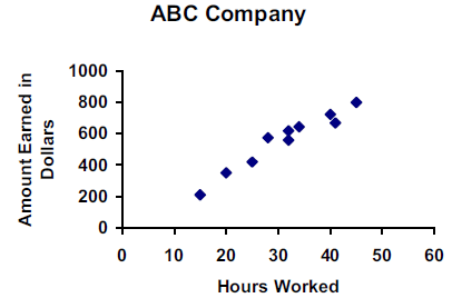
Describe the association for the graph.
8
Multiple Choice

The association value for this graph will indicate a
9
Multiple Choice

Describe the correlation in the graph shown.
10
Multiple Choice

Describe the association for the graph.
11
Multiple Choice

Describe the Association for the graph.
12
Multiple Choice

Describe the association for the graph.
13
Multiple Choice
14
Multiple Choice

Which best describes the form of this scatterplot?
15
Multiple Choice

Describe the association of the scatter plot.
16

17
Multiple Choice
18
Multiple Choice
19
Multiple Choice
20
Multiple Choice
21
Multiple Choice
22
Multiple Choice

Describe the relationship between the variables.
23
Multiple Choice

Describe the correlation in the graph shown.
24
Multiple Choice

25
Multiple Choice

26
Multiple Choice

27

28
Multiple Choice

29
Multiple Choice

30
Multiple Choice

Hint: create the trend line first
31
Multiple Choice
32
Multiple Choice

33
Multiple Choice

34
35

36

37
Multiple Select

What data points are outliers in the scatter plot?
38
Multiple Choice

Is there an outlier in this data set?
39
Multiple Choice
40
Multiple Choice

Is the point in red an outlier?
41

42
Multiple Choice

What is the correlation between length of running start and distance of jump?
43
Multiple Choice

What type of association does this scatter plot show?
Show answer
Auto Play
Slide 1 / 43
SLIDE
Similar Resources on Wayground

39 questions
Impact on Land
Lesson
•
6th Grade - University
40 questions
Combining Like Terms
Lesson
•
6th - 8th Grade
37 questions
Variables and Algebraic Expressions
Lesson
•
KG - University
39 questions
MS-LS1-3: Body Systems and Functions
Lesson
•
6th Grade - University
37 questions
Types of Functions Graphs Then Equations (After Part 2)
Lesson
•
7th - 12th Grade
39 questions
Greatest Common Factor
Lesson
•
7th - 12th Grade
42 questions
Figurative Language
Lesson
•
6th - 12th Grade
39 questions
Levels of Engagement
Lesson
•
KG
Popular Resources on Wayground
15 questions
Fractions on a Number Line
Quiz
•
3rd Grade
10 questions
Probability Practice
Quiz
•
4th Grade
15 questions
Probability on Number LIne
Quiz
•
4th Grade
20 questions
Equivalent Fractions
Quiz
•
3rd Grade
25 questions
Multiplication Facts
Quiz
•
5th Grade
22 questions
fractions
Quiz
•
3rd Grade
6 questions
Appropriate Chromebook Usage
Lesson
•
7th Grade
10 questions
Greek Bases tele and phon
Quiz
•
6th - 8th Grade
Discover more resources for Mathematics
20 questions
Writing Algebraic Expressions
Quiz
•
6th Grade
20 questions
Ratios/Rates and Unit Rates
Quiz
•
6th Grade
14 questions
Volume of rectangular prisms
Quiz
•
7th Grade
23 questions
TSI Math Vocabulary
Quiz
•
10th - 12th Grade
15 questions
Graphing Inequalities
Quiz
•
7th - 9th Grade
20 questions
Graphing Inequalities on a Number Line
Quiz
•
6th - 9th Grade
20 questions
One Step Equations
Quiz
•
6th Grade
12 questions
One-Step Equations
Quiz
•
6th Grade