
Data Distribution (Graphs)
Presentation
•
Mathematics
•
6th Grade
•
Medium
Standards-aligned
Justice Miller
Used 73+ times
FREE Resource
8 Slides • 12 Questions
1

Data Distribution
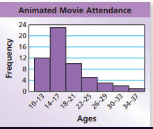
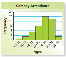
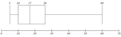
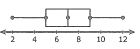
How can we describe the data model in a dot plot, box plot, or histogram?
2
There are seveal ways we can describe the shape of a data distribution.
3
The most common terms that we will use are Symmetrical
Right/Left Skewed
and Uniform
4
If you were to fold the data at the median, the data would almost match.
Symmetrical
There is a tail on the right side where data drops.
Right Skewed
There is a tail on the left side where data drops.
Left Skewed
The data values are consistent throughout.
Uniform
5
The data is distributed evenly. The mean and median and both found very near the center.
Symetrical
Tail on the right side. Data is heavily found on the left side. Median and Mean are pulled left (lesser).
Right Skewed
Tail on the left side. Data is heavily found on the right side. Median and mean are pulled right (greater)
Left Skewed
6
Multiple Choice
What is the shape of the data?
symmetrical
skewed left
skewed right
bell curve
7
Multiple Choice
What is the shape of the data?
symmetrical
skewed left
skewed right
bell curve
8
Multiple Select
What is shape of the data?
symmetrical
skewed left
skewed right
bell curve
9
Multiple Choice
What is the shape of the data?
symmetrical
skewed left
skewed right
bell curve
10
Multiple Choice
What is the shape of the distribution?
Skewed Left
Skewed Right
Symmetric
Bimodal
11
Multiple Choice
12
Multiple Choice
13
Areas were data is not present
Gaps
Also the Mode of the data set. The highest point.
Peaks
The area where data is heavily concentrated.
You can have multiple clusters.
**This example) The cluster is from 0 - 30.
Clusters
14
15
Find the range of the data set.
High - Low - Range.
This Example) 76 - 65 = a spread of 11.
Spread
Data values that are found far from the others.
Outliers can heavily impact your mean.
This example has an outlier of 21.
Outliers
16
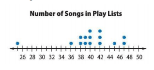
Multiple Choice
Which statement best describes this graph?
There is a peak at 47.
There is a cluster around 38-40.
The mode is 40.
There is a gap in the data between 39-40.
17
Multiple Choice
Which statement best describes this graph?
There is a peak at 2.
There is a gap in the data.
Most people own 1 pet.
There is no mode.
18
Multiple Choice
Which statement best describes the graph?
The data is skewed left.
The data is symmetrical.
There is a peak between 10 and 14 hours.
There is a cluster between 5 and 9
19
Multiple Choice
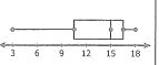
What is the spread of the data?
4
10
19
9
20
Multiple Choice
Where is the gap in the data?
between 23 and 25
between 17 and 20
at 18
at 22
Data Distribution
How can we describe the data model in a dot plot, box plot, or histogram?
Show answer
Auto Play
Slide 1 / 20
SLIDE

Similar Resources on Wayground
14 questions
(5th) Introduction to Exponents Lesson
Presentation
•
6th Grade
16 questions
6.G.1: Area Review
Presentation
•
6th Grade
16 questions
10.5 Dot Plots, Stem-and-Leaf Plots
Presentation
•
6th Grade
16 questions
Input Output Tables
Presentation
•
6th Grade
16 questions
Distributive property/ expressions
Presentation
•
6th Grade
16 questions
Fraction/Decimal/Percent Conversion
Presentation
•
6th Grade
15 questions
Evaluating Algebraic Expressions
Presentation
•
6th Grade
15 questions
Basic Ratios
Presentation
•
6th Grade
Popular Resources on Wayground
10 questions
GPA Lesson
Presentation
•
9th - 12th Grade
7 questions
Albert Einstein
Quiz
•
3rd Grade
31 questions
Bridge A Review
Quiz
•
3rd Grade
6 questions
Blue Sue and Red Ruth
Quiz
•
3rd Grade
8 questions
(Day12 HW) Inverse Trig Ratios
Quiz
•
9th Grade
20 questions
Summer Geometry QUIZ (Week3)
Quiz
•
9th Grade
16 questions
Theme Practice
Quiz
•
7th Grade
20 questions
Taxes
Quiz
•
9th - 12th Grade