
Previous Knowledge On Charts
Presentation
•
Mathematics
•
8th Grade
•
Practice Problem
•
Medium

Solomon Abalaka
Used 2+ times
FREE Resource
14 Slides • 81 Questions
1
Multiple Choice

2
Multiple Choice

What is the value of the upper quartile?
3
Multiple Choice

What is the median score?
4
Multiple Choice

5
Multiple Choice

What do the scores 65, 85 and 100 represent?
6
Multiple Choice

7
Multiple Choice
8
Multiple Choice

Which conclusion can be made using this plot?
9
Multiple Choice

What percent of the test scores are less than 72?
10
Multiple Choice

The accompanying diagram is an example of which type of graph?
11
Multiple Choice

12
Multiple Choice

Which box-and-whisker plot represents these data?
13
Multiple Choice

What is the interquartile range of the data?
14
Multiple Choice

What is the minimum of the data?
15
Multiple Choice

What is the maximum of the data?
16

17
Multiple Choice

How many people watched more than 6 hours of TV?
18
Multiple Choice

Which interval has 400 employees?
19
Multiple Choice

How many students are between 48 and 51 inches tall?
20
Fill in the Blanks

Type answer...
21
Fill in the Blanks

Type answer...
22
Multiple Choice

Mr. Semo is making a histogram to show the scores on the last science test. He first lists the scores in a stem-and-leaf plot. How many units tall should the bar be for the interval 70-79?
23
Multiple Choice
24
Multiple Choice

The amount of items that each student sold for the class fundraiser was recorded.Which stem-and-leaf plot represents the same data represented in the histogram?
25
Multiple Choice

Which of the following dot plots can be used to create the histogram?
26
Multiple Choice

Which circle graph best represents the same set of data as the bar graph?
27
Multiple Choice

The line plot shows the number of points David scored in 30 games. Which histogram represents the same set of data?
28
Multiple Choice

Which interval has the greatest number of employees?
29
Multiple Choice

How many students scored between a 86 and a 90?
30
Multiple Choice

Which interval has the greatest number of students?
31
Multiple Choice

How many people watched between 6 and 10 hours of TV last week?
32
Multiple Choice

Which histogram represents this stem-and-leaf table?
33
Multiple Choice

What is the difference between the number of cities in the 90 - 99 interval and the 60 - 69 interval?
34
Multiple Choice

35
Multiple Choice

36
Multiple Choice

37

38

39

40

41
Multiple Choice

42

43
Multiple Choice
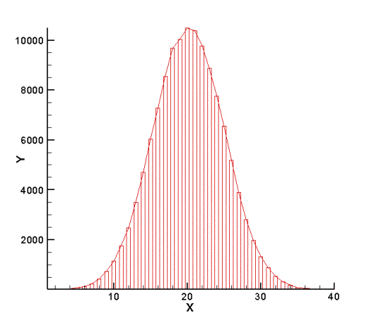
How would you describe this distribution?
44
Multiple Choice

Describe the histogram:
45

46
Multiple Choice
Which circle graph best represents the same set of data as the bar graph?
47
Multiple Choice

Which statement is true about the center of distribution?
48

49
Multiple Choice

What is the range of ages shown in this histogram?
50
51
Multiple Choice

Based on our class data histogram, what appears to be the approximate median hours of screen time?
52
Multiple Choice

Which best describes the shape of this histogram?
53
Multiple Choice

54
Multiple Choice
What is the difference between the number of cities in the 90 - 99 interval and the 60 - 69 interval?
55
Multiple Choice

56
Multiple Choice

Which interval has 400 employees?
57

58

59
Meet Google Drive – One place for all your files
You can open this webpage in a new tab.
60
Multiple Choice

How many scores were 26 or below?
61
Multiple Choice

What is the first number in the cumulative frequency column?
62
Multiple Choice

What is the missing number in the cumulative frequency column?
63
Multiple Choice

What is the missing number?
64
Multiple Choice

Find the cumulative frequencies.
65
Multiple Choice

A clumsy teacher spilled coffee over this table of his students' test results. How many students scored below 17?
66

67
Meet Google Drive – One place for all your files
You can open this webpage in a new tab.
68
Multiple Choice
69
Multiple Choice

How many students scored 40% or below on the test?
70
Multiple Choice

The graph shows the masses of some pumpkins grown on an allotment. How many pumpkins were grown altogether?
71
Multiple Choice

Find the number of passengers who waited for the bus for 15 min or less.
72
Multiple Choice

Find the number of patients who waited for more than 80 min for a doctor.
73
Multiple Choice

What percent of the college students surveyed have less than $5000 in debt?
74
Multiple Choice
75
Multiple Choice
76
Multiple Choice
77
Multiple Choice

32 people went to a ice hockey match. The pie chart shows the colours of their shirts. How many people wore black?
78
Multiple Choice
79
Multiple Choice

This pie chart shows the colour of hats that Tim owns. What fraction of Tim's hats are blue?
80
Multiple Choice

The pie chart shows colours of motorbikes in a shop. There are 20 more blue bikes than white. How many bikes are there altogether?
81
Multiple Choice

Which calculation is correct to find the number of degrees representing comedy in a pie chart showing the following info?
82
Multiple Choice

A diver wants to make a pie chart of his trip. Which one of these is a correct method for finding F?
83
Multiple Choice

90 yellow sheep are tested for a disease. How many sheep have the disease?
84
Multiple Choice

These pie charts show how people travel to work in 2 towns. In which town do more people travel to work by bike?
85
Multiple Choice
86
Multiple Choice

The pie chart shows the colours of 32 beads. How many green beads are there?
87
Multiple Choice

The under 13's played 28 matches.
The under 15's played 18 matches.
Which team won more matches?
88
Multiple Choice
Which pie chart represents the same data as the table?
89
Multiple Choice
90
Multiple Choice
91
Multiple Choice

92
Multiple Choice

93
Multiple Choice

If there are 300 seventh graders, how many students prefer choir?
94
Multiple Choice

95
Multiple Choice

There are 200 peaches. How many oranges are there?
Show answer
Auto Play
Slide 1 / 95
MULTIPLE CHOICE
