Search Header Logo
Intro to Graph of the Week GOW

Intro to Graph of the Week GOW

Assessment

Presentation

Science

6th - 8th Grade

Easy

NGSS
MS-PS3-1

Standards-aligned

Created by

Tamicka Bonnick

Used 6+ times

FREE Resource

14 Slides • 13 Questions

1

media

Graph of the Week

How to read, understand, and analyze real-world data

2

Poll

DId you learn anything about graphs while writing your Cornell Notes?

Yes

No

Not Really

3

Multiple Choice

What are graphs used for?

1

To show data in an understandable way

2

To keep track of things so you don't forget

3

To catch the eye and look colorful

4

To draw pictures on

4

Multiple Choice

Question image

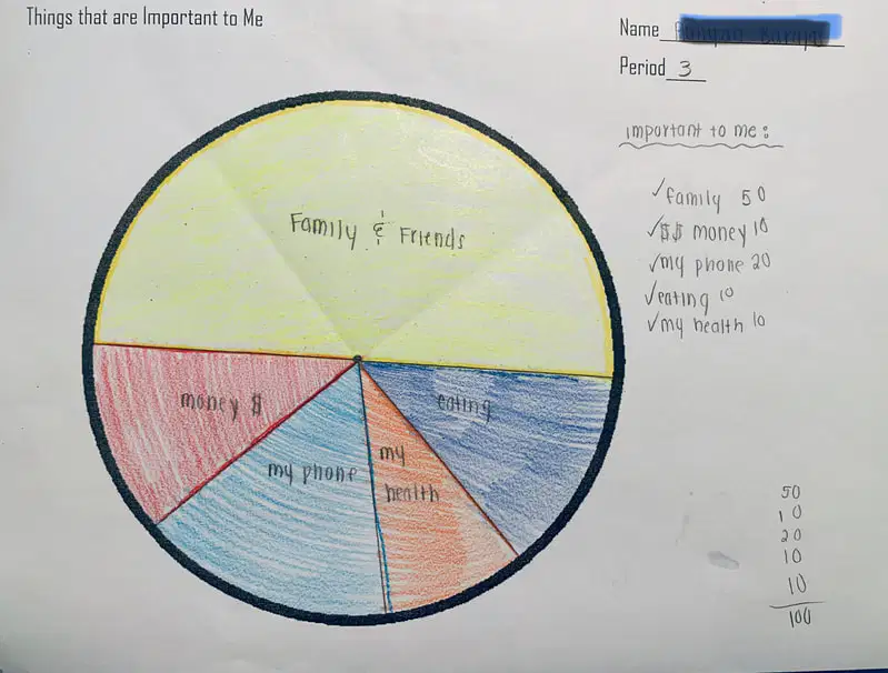
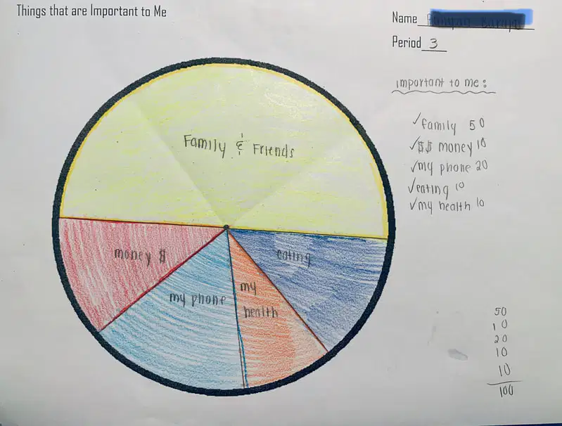
What type of graph is this?

1

Line Graph

2

Bar Graph

3

Pie Chart/Circle Graph

5

Multiple Choice

Question image

What is most important to this student?

1

Family & friends

2

Money

3

Phone

4

Eating

6

Multiple Choice

Question image

What is least important to this student?

1

Money

2

Health

3

Phone

4

Eating

7

Multiple Choice

Question image

Pie/circle graphs represent what kind of data

1

comparison of amounts

2

shows change over time

3

shows parts of a whole

4

spread of the data

8

media
media

Describe in your own words what you think is

happening in the graph below.

9

media
media

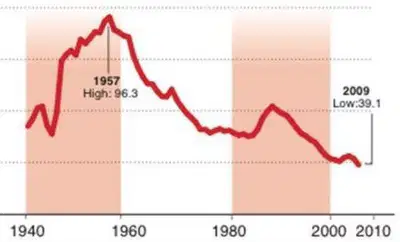
Describe in your own words what you think is

happening in thegraph below.

What information do you think we need to understand this graph better?

10

media
media

What information have you been given?

Does this help?

11

media
media

What could the y-axis represent?

12

media
media
media

Will this help…?

13

media
media

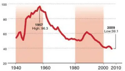
Do we have enough information now to figure
out what this graph is about?

We need a
TITLE or
HEADING for
the graph 🡨

To figure out
what the
numbers
along the
y-axis mean


🡨 A time
frame or
timeline along
the x-axis

media

14

Open Ended

Question image

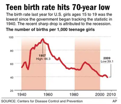
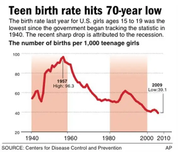
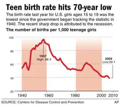
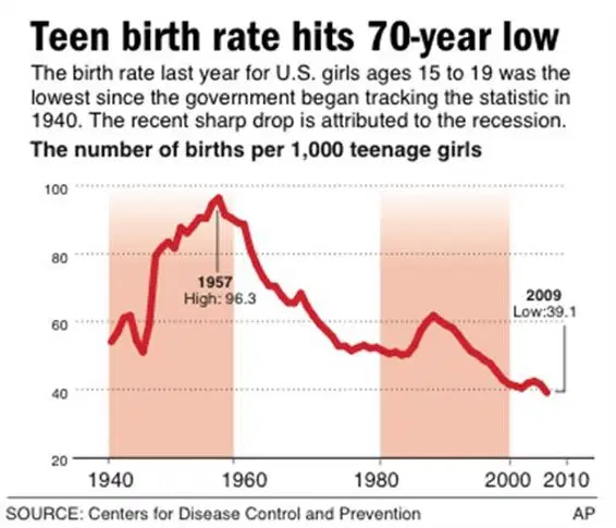
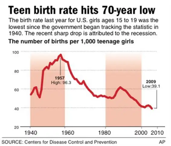
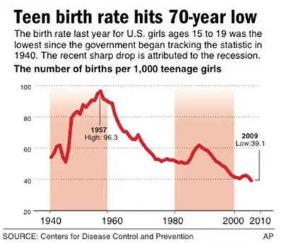
What do you think the teen birth rate might be in 2027?

Do you think there will be an upward or downward trend? Why?

15
media
media

16

media
media

What do you think the teen birth rate might be in 2027?

Do you think there will be an upward or downward trend? Why?

17

Multiple Choice

Question image
What is the name of this graph?
1
line plot
2
line graph
3
bar graph
4
frequency table

18

Multiple Choice

Question image

Line graphs represent what kind of data

1

comparison of amounts

2

shows change over time

3

shows parts of a whole

4

spread of the data

19

Multiple Choice

The X axis is _______?
1
vertical
2
diagonal
3
criss-cross
4
horizontal

20

Multiple Choice

The Y axis is _______?
1
Vertical
2
Horizontal
3
criss-cross
4
diagonal

21

Multiple Choice

Independent variable is the one controlled by the experimenter ex: time, date.... and is placed on the _____ axis of a graph

1

z

2

y

3

x

4

not on a graph

22

Multiple Choice

Dependent variable is the data resulting FROM the change made by the experimenter and is placed on the _____ axis

1

z

2

y

3

x

4

not on a graph

23

media
media

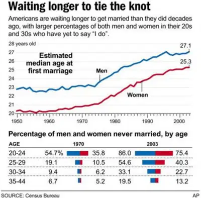
Let’s try another graph…discuss this one with your table partner

24

media
media

What is the topic of the graph?

What do the x- and y-axis represent?

What observations can you make about the graph?

What do you predict will happen in 2030?

25

media

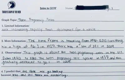
Let’s Write!

Write a few complete sentences that describe

what the graph is telling you.

26

media

27

media

1.

Think of something that
interests you (i.e. music,
movies, Angels baseball,
skateboarding, texting, law
enforcement, cats, etc.)

2.

In a publication or website,
find a graph that shows a
statistical graph on your
interest. (it can be a line
graph, pie chart, bar graph,
etc)

3.

Be sure to choose a graph
that is detailed and easy to
understand.

4.

Print out your graph (don’t
write about it just yet) with
your name on it or upload to
Canvas.

HW assignment

media

Graph of the Week

How to read, understand, and analyze real-world data

Show answer

Auto Play

Slide 1 / 27

SLIDE