
Statistical Graphs
Presentation
•
Mathematics
•
5th - 10th Grade
•
Hard

James Gonzalez
FREE Resource
8 Slides • 41 Questions
1
2
Poll
3

4

5
Multiple Choice

6
Multiple Choice

7
Multiple Choice
8
Multiple Choice

What is the title of this column graph?
9
Multiple Choice

What was the recorded population of dolphins in 2018?
10
Multiple Choice

In what year was the highest population of whales recorded?
11
Multiple Choice

12

13
Multiple Choice
14
Multiple Choice
15
Multiple Choice
16
Multiple Choice

The pie chart shows the colours of 32 beads. How many green beads are there?
17
Multiple Choice

18
Multiple Choice
Which pie chart represents the same data as the table?
19
Multiple Choice

These pie charts show how people travel to work in 2 towns. In which town do more people travel to work by bike?
20

21
Multiple Choice
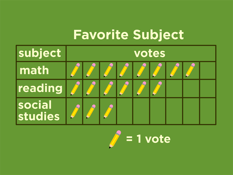
How many votes did reading receive?
22
Multiple Choice
23
Multiple Choice

24

25
Multiple Choice
26
Multiple Choice
27
Multiple Choice

28
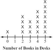
Multiple Choice

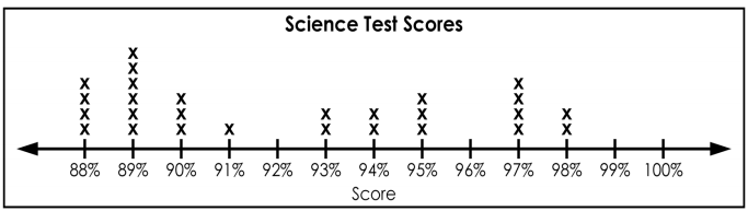
Which statement best describes the data shown in the dot plot?
29

30
Multiple Choice

31
Multiple Choice
32
Multiple Choice
33
Multiple Choice

A restaurant recorded the number of pizzas sold each month for one year. The data are shown in the graph below. During which month did the restaurant sell 40 pizzas?
34
Multiple Choice
35
Multiple Choice
36
Multiple Choice
37
Multiple Choice

At what rate did the temperature decrease between the 20th and 25th minutes of the experiment?
38
Multiple Choice

Which month had the biggest difference between the high and low temperatures?
39

40
Multiple Choice
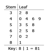
32, 38, 40, 44, 44, 46, 49, 53, 55, 58, 62, 65, 68, 70, 72, 81
He put the data in a stem-and-leaf plot. What number did he leave out of the stem-and-leaf plot?
41
Multiple Choice

How many students scored more than 80%?
42
Multiple Choice

43
Multiple Choice

44
Multiple Choice

45
Multiple Choice

46
Multiple Choice

What is Mary's lowest test score?
47
Multiple Choice

How many times did Mary score below a 60 on her tests?
48
Multiple Choice

49
Poll
Show answer
Auto Play
Slide 1 / 49
SLIDE
